Designed by: 2yolk | Country: Greece
Things have changed. Today, the world can clearly mark itself between the pre and post-Covid eras. While the pandemic is far from over, the world is moving on in hope of brighter days ahead. The pandemic saw many brands wither and fall away, and some reposition themselves in the market. Klinex was among many brands that held itself together in the hour of crisis and emerged stronger.
Established in 1950, the brand expanded from manufacturing bleaches to household care products such as floor cleaners, sprays, and wipes. The brand delivered everything the customers wanted in the pre-pandemic world. However, things changed after the outbreak of the deadly disease.
Klinex understood the need of the hour and quickly repositioned itself in the market. The repositioning was based on a two-fold idea: first, making a broad distinction between bleach-free items and bleached detergents, and second, displaying the strength of products’ antibacterial properties.
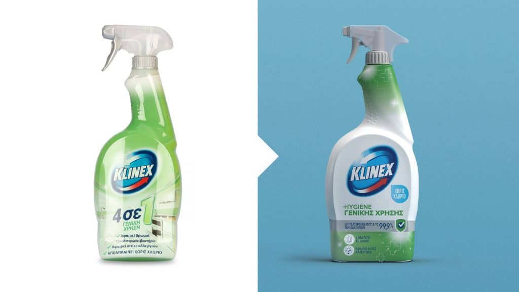
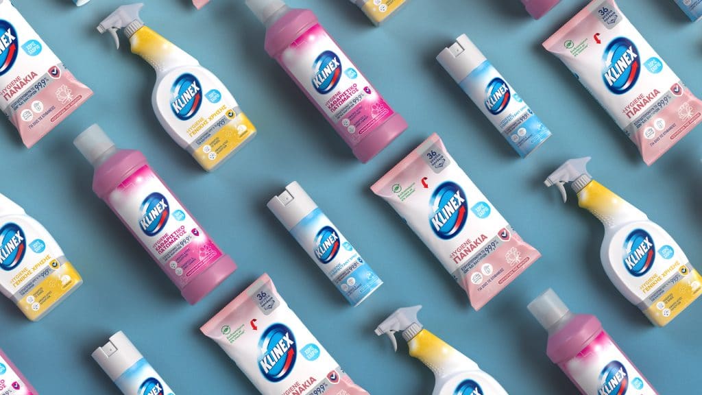
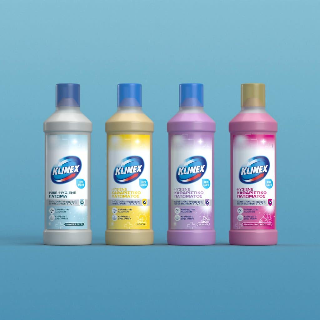
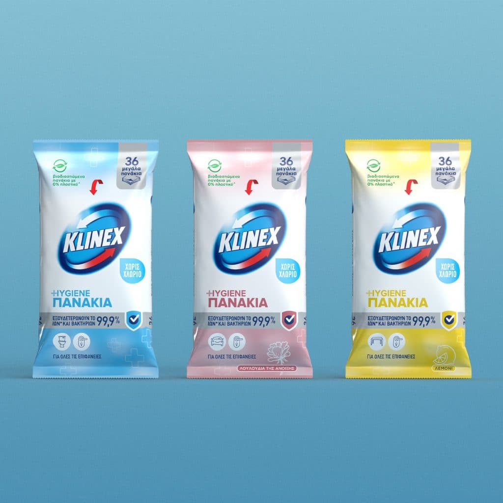
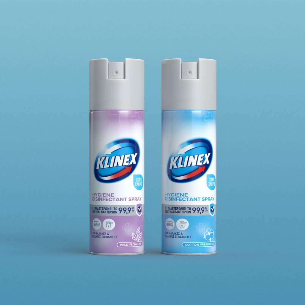
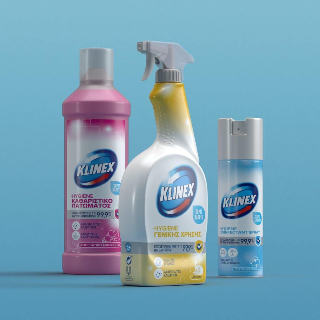
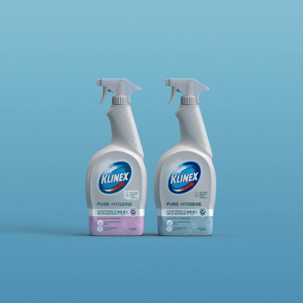

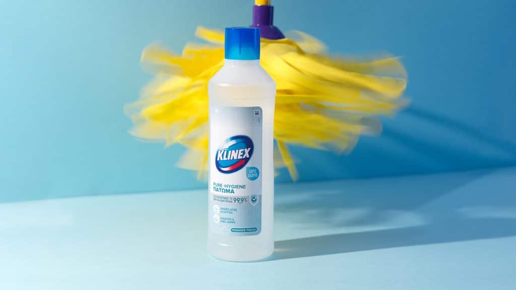
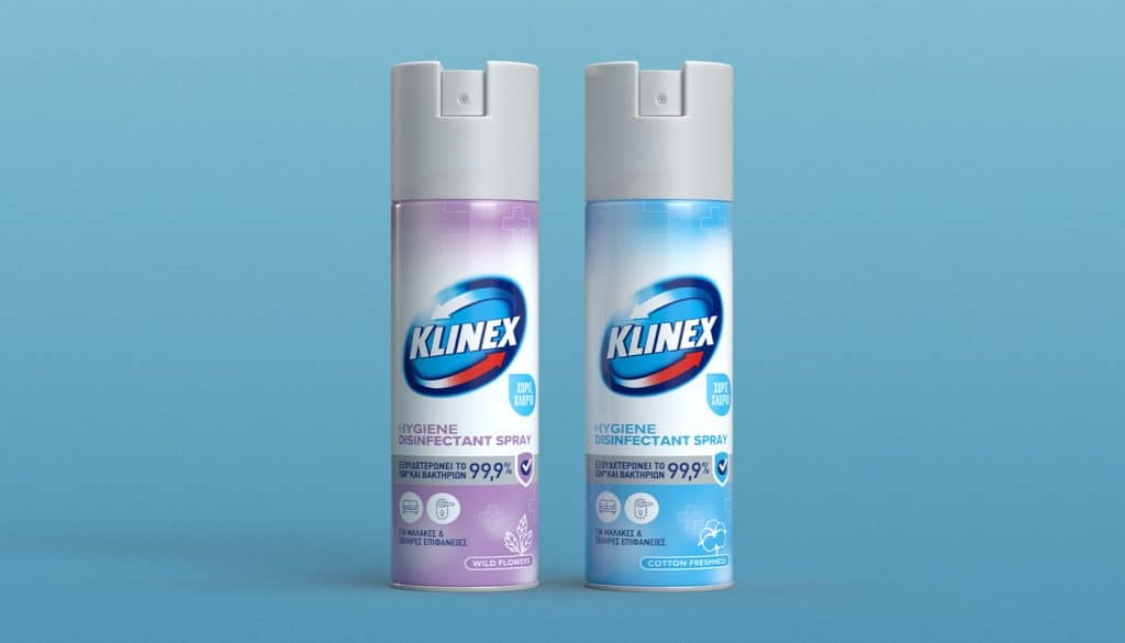
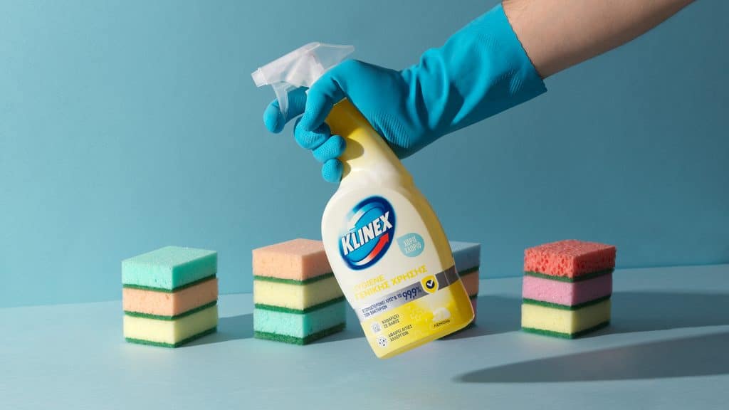
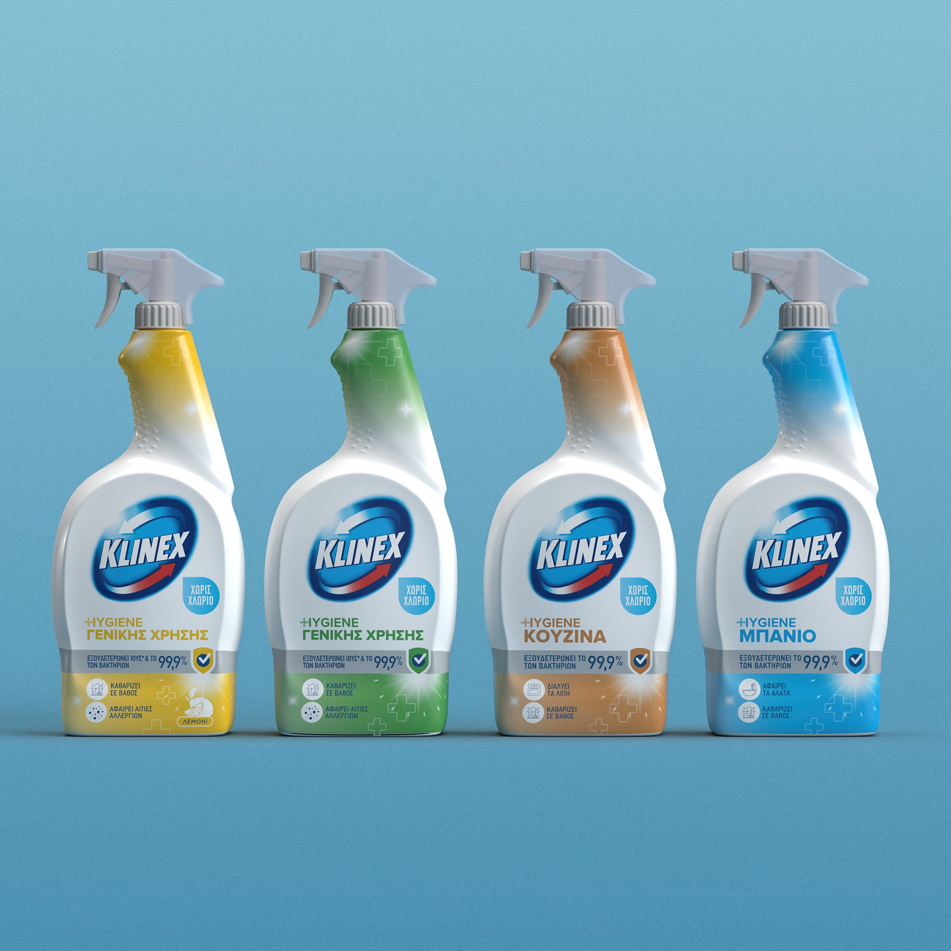
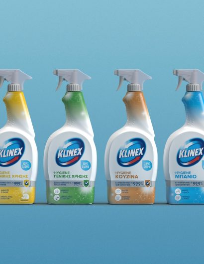
The rebranding allowed Klinex to project itself as a credible brand because it did away with showiness, a norm most brands followed in the pre-Covid world. The redesign was executed using soft pastel colors and clean fonts—designs associated with pharmaceutical disinfectants. Words and statements like “Hygiene,” “Kills 99.9% of viruses and bacteria,” and “Bleach-free” were added to symbolize safety and protection.
The Klinex repositioning is a prime example of what good rebranding strategies can do to a brand.

