Designed by Helms Workshop | Country: United States
“Kohana’s coffee is exceptional, but their brand identity was dated, out of sync with their values and missing the mark with contemporary coffee culture. With the brand poised to enter the national market and launch a new product line, it was a perfect moment to shun evolution in favor of revolution.
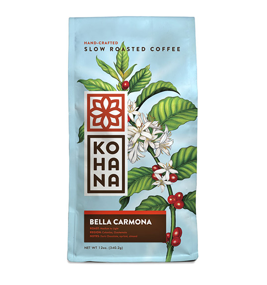
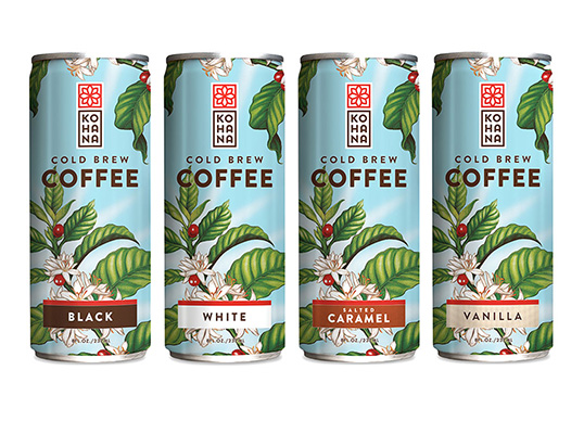
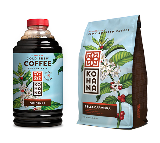
We proposed a bold transition from a dated packaging system to an identity focused on the islands that inspired the brand, its values and the ritual of enjoying a cup of coffee. To help, we invited artist Abi Daniel to capture the beauty and energy of the coffee plant. The result is a striking package that not only conveys a sense of Hawaii, but translates to just about anywhere people enjoy a moment of reflection.”

“Kohana” is the small, white Hawaiian flower that heralds the arrival of the coffee cherry. It signals the promise of coffee to come, and the beginning of an extraordinary experience. It’s a strong symbol for the brand, but it wasn’t being leveraged in a way that resonated with consumers.
Our solution was to let the flower speak for itself. Rather than just telling consumers that the coffee is organic and natural, we would show them— letting the inherent beauty of the coffee plant tell the story in an honest, pure way.”

“The Kohana name offered both opportunity and challenge. It’s unique and own-able, but it’s not an immediately recognizable combination of letters.
A distinctive characteristic of Hawaiian language is the building of words from small, truncated pairings of consonants and vowels. This structure makes large phrases more intuitive, and helps to create the language’s unique sound signature.
By clustering the Kohana name into three distinctive verbal cues, it allows for quick unpacking of the word, and an immediate understanding of pronunciation. Equally important, this treatment engages consumers in a moment of actual interaction with the name, which reinforces recognition.”


