


AGENCY: Episode Two
COUNTRY: United Kingdom
Just about thirteen years ago, Koko emerged as the pioneer in the UK, introducing a coconut-based alternative to dairy. Fast forward to today, the landscape of dairy-free products has evolved significantly, with new milk substitutes appearing on store shelves nearly every day.
Recognizing the need for a packaging overhaul to rejuvenate their image, Koko faced a challenge common to well-established brands: maintaining their brand identity while ushering in change. With a dedicated customer base affectionately referred to as the ‘Koko Nuts,’ it was crucial to ensure that their loyal consumers could still easily spot their product on the shelves.
https://vimeo.com/870316519


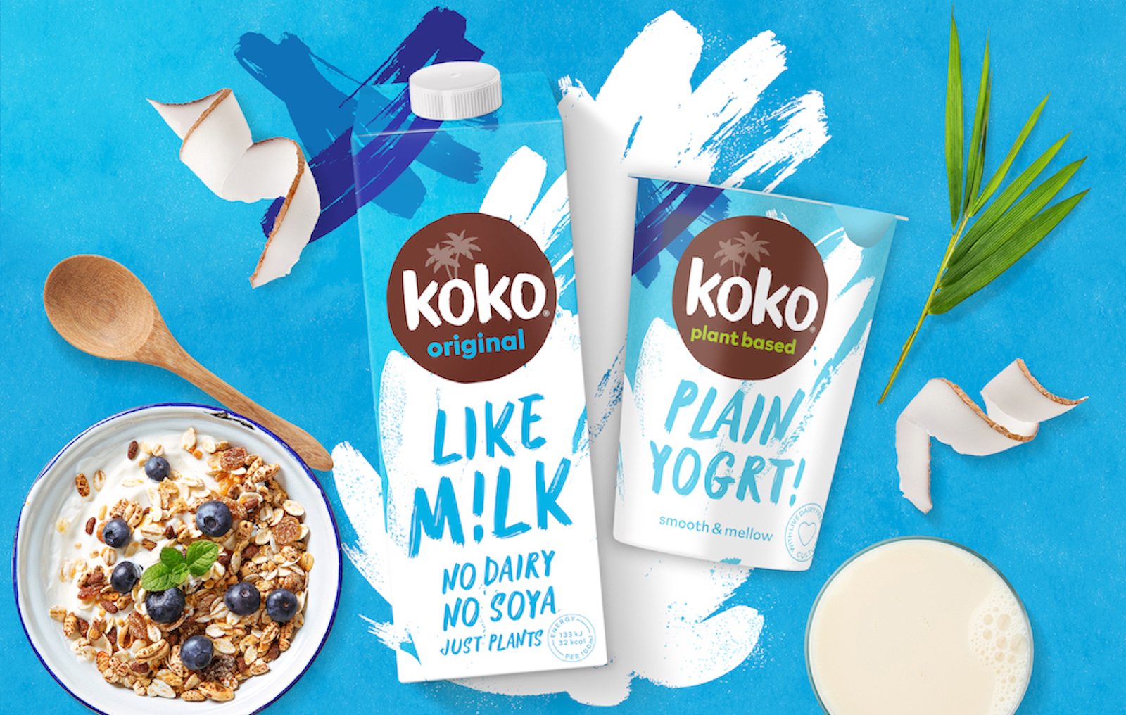
Episode Two’s starting point was to tone down the tropical vibe, eliminating any confusion among new consumers. These products are not merely coconut-flavored milks; instead, they incorporate all the goodness of coconut as a key ingredient. The packaging must convey that these are delicious dairy alternatives, not tropical beverages or cooking ingredients.
The new color schemes and graphic elements were intentionally chosen to mirror the product’s intended usage. The updated packaging now resembles a classic milk carton, and the bold design change imparts a youthful, modern feel that aligns more closely with the preferences of Koko’s core consumer demographic.
The playful and cheeky tone in the new names, “M!lk” and “Yogrt!,” reflects the brand’s friendly and fun personality. With the entire product range undergoing a relaunch, the revamped packaging also ensures consistent branding across all product lines, creating a much more distinct and recognizable brand presence on store shelves.
“With an ambitious brief, that needed to be turned around within a tight timeframe, we knew we needed a creative agency who could dive straight in – and that’s exactly what Episode Two did. They immediately understood what we were trying to do and have really captured the essence of what we want Koko to be. We absolutely love the new look and know our Koko Nuts will too!” Victoria Eadon, Marketing Manager


