The Crystal Rain Distillery, a family-owned venture from Illinois, USA, showcases a modern legacy in every sip of its exceptional spirits. The creation of their Kristone Craft Gin stands as a testament to their dedication to quality and innovation.
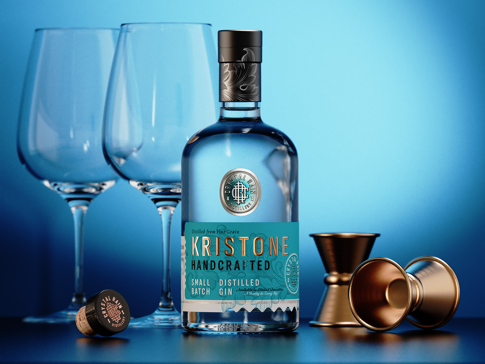
The gin’s identity is captured beautifully in its label, which was designed as a monogram integrating the letters C, R, and D, presenting the distillery’s new logo. This insignia sets the tone for the intriguing story of Kristone Craft Gin.
The gin bottle itself is a fusion of modern elegance and vintage charm. It’s a delicate balance between the contemporary and the classic, designed to reflect the spirit of the craft within.
The two-part label lends a luxurious feel to the gin. The base is made of solid paper stock with a smooth texture, while the top is a metal foil embellished with the distillery’s emblem and robust embossing. The tactile experience invites hands to explore the layers of craftsmanship.
The color palette uses a sophisticated turquoise backdrop paired with matte copper hot foil on the label. This combination provides a harmonious visual appeal and offers a sneak peek into the bottle’s refined character.
The sensory exploration continues with a deep debossed texture and custom roof embossing on the gin’s brand name, inviting one to discover the flavors within.
The minimalist ethos of the Kristone gin label design is complemented by a vintage twist. It’s a testament to tradition while capturing the essence of modernity, without losing touch with the timeless elegance associated with fine craft gin.
In the hands of Dagaprint.com, each label is crafted in a limited edition run, unveiling a story of precision, care, and small-scale craftsmanship.
The final touches are added with a black matte capsule adorned with an embossed logo and delicate floral elements in dark silver foil.
Kristone Craft Gin truly embodies the distillery’s commitment to quality and innovation. It’s more than just a gin label; it’s an exclusive testament to the art of craftsmanship.