Designed by: PepsiCo Design & Innovation
Country: United States

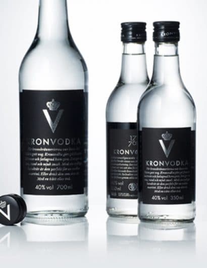
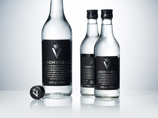
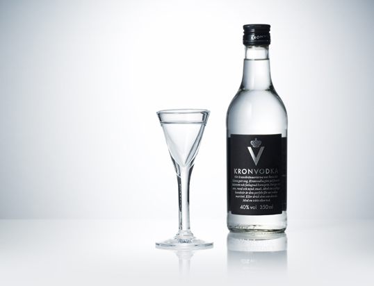
Kronvodka

kronvodka1

Designed by Neumeister | Country: Sweden | Font used: Futura

“Input: V&S, one of the world’s leading international spirits companies, wanted to regenerate Kronvodka, Swedish vodka brand with a royal heritage dating back to the 18th century.

Output: Kronvodka’s black and silver packaging with the new symbol was designed to attract a male audience between the age of 35-49.

Outcome: At the relaunch, Kronvodka immediately attracted attention in the media as well as in the shops. The sales forecast was quickly revised upwards.”
kronvodka2

kronvodka3

Get the latest packaging design inspiration in your inbox:

Popular designs

Dama Blanca: Packaging Design for Salt of Cádiz

Discover the artisanal salt packaging design for Dama Blanca, a family project from Salinas of Cádiz. The design reflects the brand’s 3000-year history, authenticity and love for the sea, using natural materials and a sea-inspired palette.

Rebranding Mayawell: A Blend of Mexican Heritage and Healthy Living

Discover Mayawell, a Mexican-owned beverage company that celebrates its heritage with natural, organic, and prebiotic drinks. The rebranding strikes a balance between traditional elements and contemporary design, offering a unique, healthy alternative to traditional sodas.

Art Meets Craftsmanship in BrewBeak Beer Series Packaging Design

“BrewBeak Beer Series Packaging Design artfully fuses craftsmanship and art, reflecting the brand’s philosophy and the beauty of nature. Through minimalist design and bird-themed illustrations, each package uniquely represents different beer varieties, creating a memorable and sophisticated brand identity.”

Designed by: PepsiCo Design & Innovation
Country: United States

Kronvodka

kronvodka1

kronvodka1

Designed by Neumeister | Country: Sweden | Font used: Futura

“Input: V&S, one of the world’s leading international spirits companies, wanted to regenerate Kronvodka, Swedish vodka brand with a royal heritage dating back to the 18th century.

Output: Kronvodka’s black and silver packaging with the new symbol was designed to attract a male audience between the age of 35-49.

Outcome: At the relaunch, Kronvodka immediately attracted attention in the media as well as in the shops. The sales forecast was quickly revised upwards.”

kronvodka2

kronvodka3

Previous slide
Next slide
Get the latest on packaging design in your inbox: