Designed by: PepsiCo Design & Innovation
Country: United States

Kvikne Flat Bread

Kvikne Flat Bread

Designed by Form til Fjells | Country: Norway

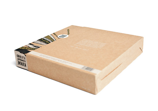
“Early this year we designed this packaging for a small, local client that produces a very traditionally kind of bread. This is a thin, crisp kind of bread that we norwegians use together with fish and meat dishes. The speciality for Kvikne is that its 100% homemade, and is of a much higher quality than the industrial breadtypes.

Most of the packing of these kind of products are, either very “homemade” stuffed in a Sponge cake box, a plain paper bag, or bombed with old traditional ornaments or a photo of “mom baking bread” and so forth.

So, we wanted to create something entirely different that would reflect all the values the client had, and bring them up to a new level. We wanted the box to feel exclusive, but to be rooted in its origin.

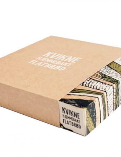
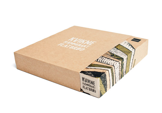
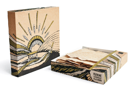
They also wanted the weight of the content to decrease from 500 grams to 400 grams, but still have the same price as before. We created a box-set containing to pieces, one box to put on the table, and one “outer” box to protect the product. We wanted the “tablebox” to look exiting, and we wanted to reveal a piece of the box before it is opened.

The box contains of a rough illustration on the backside, containing some of the tools they use, and hints of the product and landscape from where its made. The outside box is clean, with the logo, white print and embossed. (Embossing is a rear thing to use on packaging in Norway, so the tool for that was made in Britain.) The backside contains a “profile-text” that is signed by the owner of the company, Anne Gerd.

We feel that, even though the box looks like nothing else in Norway, it distinguish itself and reflects the client well. It looks great in the store shelves and differenciates against all the other producers of the same type of product.

Only after a few months in the stores, her sale has increased with 60%, so the client is very happy, and so are we.”

Kvikne Flat Bread

Kvikne Flat Bread

Get the latest packaging design inspiration in your inbox:

Popular designs

Far Out Bar

Description: Far Out Bar is a cutting-edge packaging design project created for High Life Farms’ macrodose THC chocolate bars. This project involved

Over the wave

This Kombucha originates in Lombok, Indonesia, where its paradise beaches attract hundreds of surfers eager to ride the waves. When you surf,

Designed by: PepsiCo Design & Innovation
Country: United States

Kvikne Flat Bread

kvikne1

Kvikne Flat Bread

Designed by Form til Fjells | Country: Norway

“Early this year we designed this packaging for a small, local client that produces a very traditionally kind of bread. This is a thin, crisp kind of bread that we norwegians use together with fish and meat dishes. The speciality for Kvikne is that its 100% homemade, and is of a much higher quality than the industrial breadtypes.

Most of the packing of these kind of products are, either very “homemade” stuffed in a Sponge cake box, a plain paper bag, or bombed with old traditional ornaments or a photo of “mom baking bread” and so forth.

So, we wanted to create something entirely different that would reflect all the values the client had, and bring them up to a new level. We wanted the box to feel exclusive, but to be rooted in its origin.

They also wanted the weight of the content to decrease from 500 grams to 400 grams, but still have the same price as before. We created a box-set containing to pieces, one box to put on the table, and one “outer” box to protect the product. We wanted the “tablebox” to look exiting, and we wanted to reveal a piece of the box before it is opened.

The box contains of a rough illustration on the backside, containing some of the tools they use, and hints of the product and landscape from where its made. The outside box is clean, with the logo, white print and embossed. (Embossing is a rear thing to use on packaging in Norway, so the tool for that was made in Britain.) The backside contains a “profile-text” that is signed by the owner of the company, Anne Gerd.

We feel that, even though the box looks like nothing else in Norway, it distinguish itself and reflects the client well. It looks great in the store shelves and differenciates against all the other producers of the same type of product.

Only after a few months in the stores, her sale has increased with 60%, so the client is very happy, and so are we.”
Kvikne Flat Bread

Kvikne Flat Bread

Previous slide
Next slide

Explore more great package design

Get the latest on packaging design in your inbox: