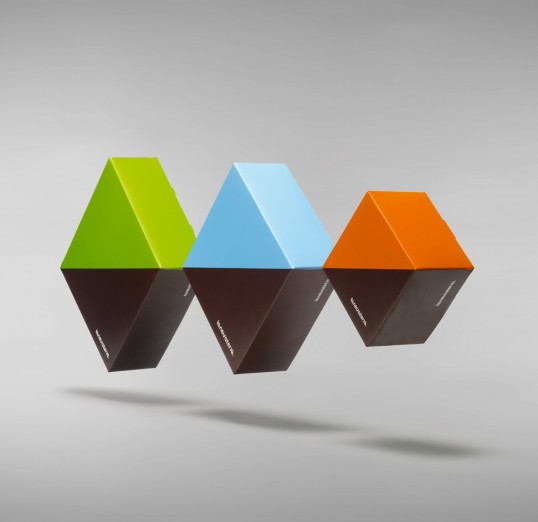
Designed by Bisgràfic | Country: Spain
“La Nevateria is a “sweets and coffe” shop which carries out both activities at 50%. Packaging is divided equally between brown (symbolizing the coffee) and different basic colors (symbolizing sweets).”
Designed by: PepsiCo Design & Innovation
Country: United States
Designed by Bisgràfic | Country: Spain
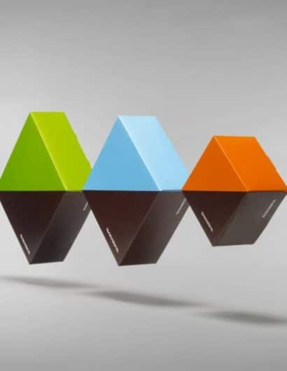
“La Nevateria is a “sweets and coffe” shop which carries out both activities at 50%. Packaging is divided equally between brown (symbolizing the coffee) and different basic colors (symbolizing sweets).”

Get the latest packaging design inspiration in your inbox:
Designed by: PepsiCo Design & Innovation
Country: United States

Designed by Bisgràfic | Country: Spain
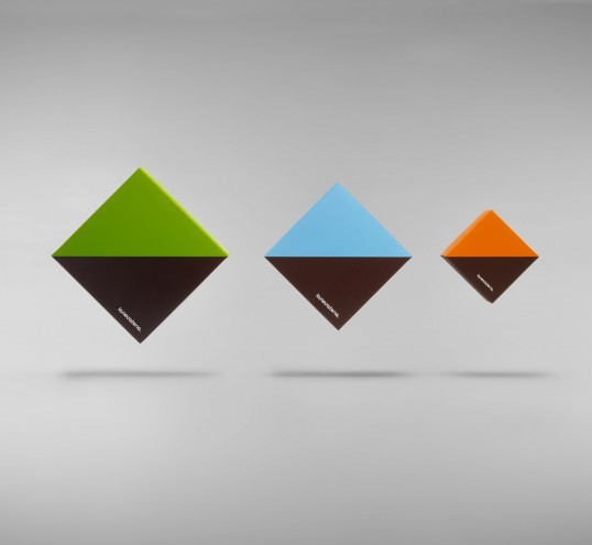
“La Nevateria is a “sweets and coffe” shop which carries out both activities at 50%. Packaging is divided equally between brown (symbolizing the coffee) and different basic colors (symbolizing sweets).”

