Designed by: PepsiCo Design & Innovation
Country: United States

Label Design And Rebranding Of The Gracious Gourmet

Designed by: Iskelet Design Works | Country: US

Connecticut-based award-winning artisan gourmet food producer, The Gracious Gourmet, approached Iskelet Design Works to create attractive packaging designs and effective rebranding strategies to take their brands to new heights.

The design agency mentions:

“The Gracious Gourmet came to us skeptic about changing their brand identity, which they have made when they first started out. We told them about how the process is and why a brand new visual identity can help them reach a wider audience, also keeps them updated with the current visual trends.

Label Design And Rebranding Of The Gracious Gourmet

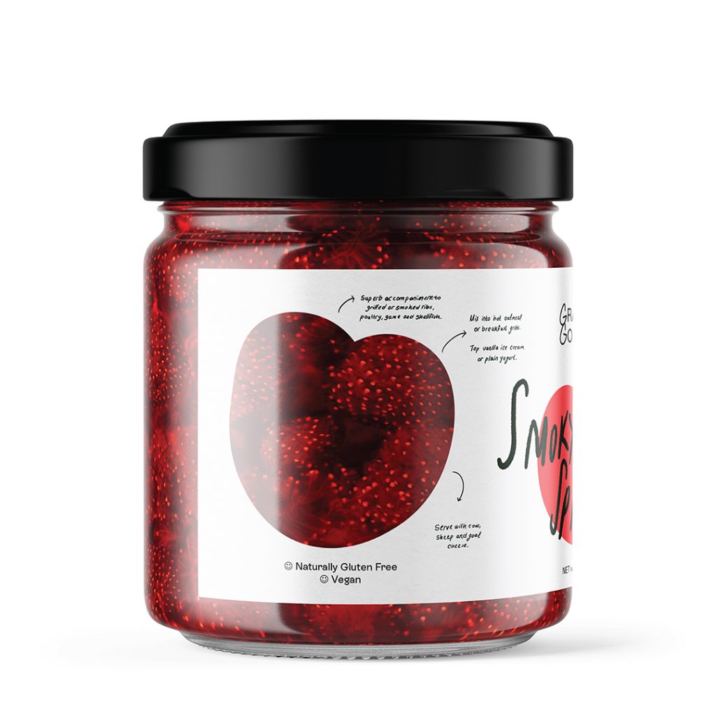
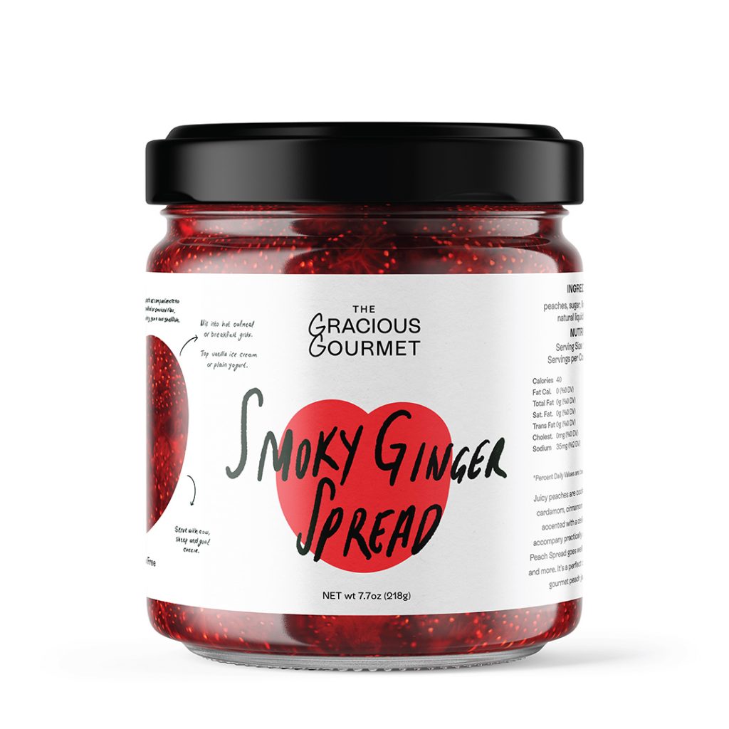
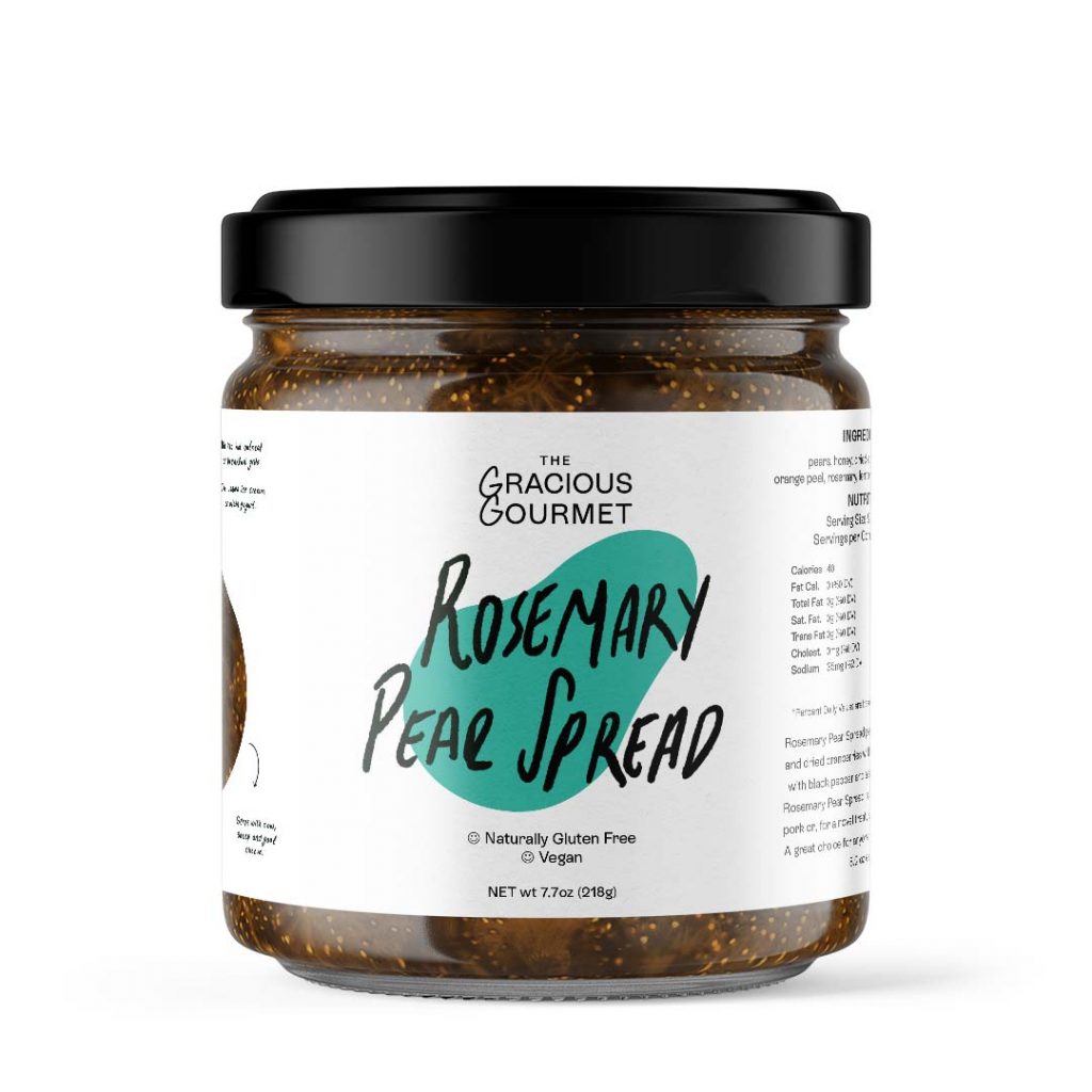
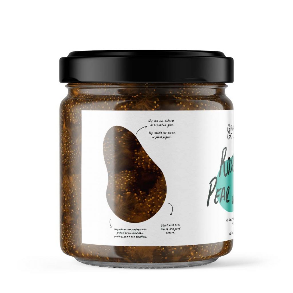
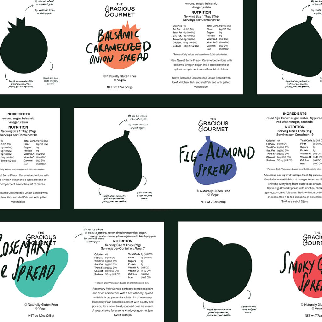
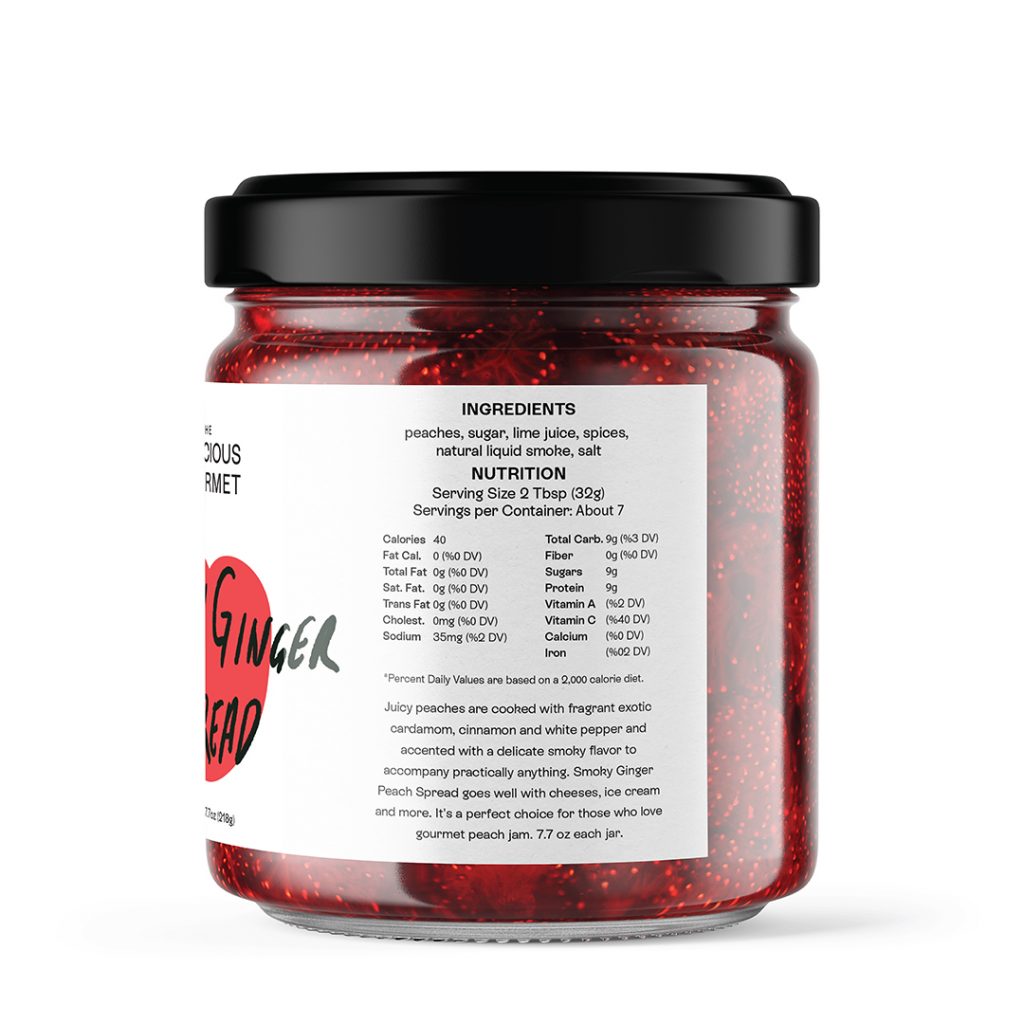
Inspired by handwritten recipes, Iskelet reimagined the branding and packaging in children story-like illustrations.

“The idea for the alternatives came from the root story of the brand, a personal story of a passion for good food being born. Handwritten recipes were a huge inspiration for this packaging as well as our focus on the products itself; the textures, colors, shapes and ingredients of each and every one of them. We provided this with couple of alternatives with cut-out product windows on labels, old children story-like supportive illustrations, and bold vibrant shapes.

Get the latest packaging design inspiration in your inbox:

Popular designs

Tropicana’s Branding & Packaging Redesign by Sunhouse

Tropicana rejuvenates its brand with Sunhouse, blending modern iconicity and heritage. The redesign emphasizes Tropicana’s legacy, highlighting its unique story and craftsmanship, making it stand out as the original, superior orange juice.

Creating a Strong Brand Identity: The Journey of Living Things Packaging Design

“Developing Living Things packaging involved multiple design stages, feedback, and refinement. With extensive market research, collaboration with brand strategist Jose Debate and design agency Studio Nari, we created a strong, recognizable brand identity appealing to health-conscious, trend-setting millennials and Gen Z.”

Studio La Regina Revamps Packaging Design for 7 Colli Amaro

Studio La Regina has transformed the packaging of 7 Colli, an artisan amaro with a loyal following, to support its distribution expansion. The new design features a sleek cylindrical bottle and a striking label with a deep black background, gold foil text, and a distinctive, multi-colored number 7.

Designed by: PepsiCo Design & Innovation
Country: United States

Label Design And Rebranding Of The Gracious Gourmet

4-filename-world-brand-design2 (1)

Designed by: Iskelet Design Works | Country: US

Connecticut-based award-winning artisan gourmet food producer, The Gracious Gourmet, approached Iskelet Design Works to create attractive packaging designs and effective rebranding strategies to take their brands to new heights.

The design agency mentions:

“The Gracious Gourmet came to us skeptic about changing their brand identity, which they have made when they first started out. We told them about how the process is and why a brand new visual identity can help them reach a wider audience, also keeps them updated with the current visual trends.

Label Design And Rebranding Of The Gracious Gourmet

Inspired by handwritten recipes, Iskelet reimagined the branding and packaging in children story-like illustrations.

“The idea for the alternatives came from the root story of the brand, a personal story of a passion for good food being born. Handwritten recipes were a huge inspiration for this packaging as well as our focus on the products itself; the textures, colors, shapes and ingredients of each and every one of them. We provided this with couple of alternatives with cut-out product windows on labels, old children story-like supportive illustrations, and bold vibrant shapes.

Previous slide
Next slide
Get the latest on packaging design in your inbox: