Designed by: PepsiCo Design & Innovation
Country: United States

Le Parcel

Le Parcel

Designed by Seven Fifty Five | Country: United States

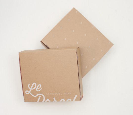
“The 2015 Le Parcel packaging system is the 3rd round of packaging systems Seven Fifty Five has created for Le Parcel. Each iteration serving a new purpose; a response to challenges faced by the company’s subscription business model.

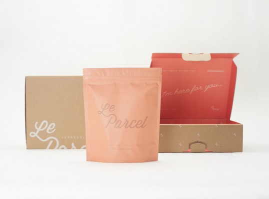
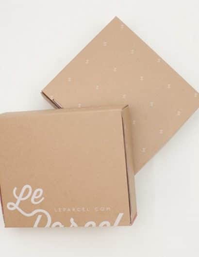
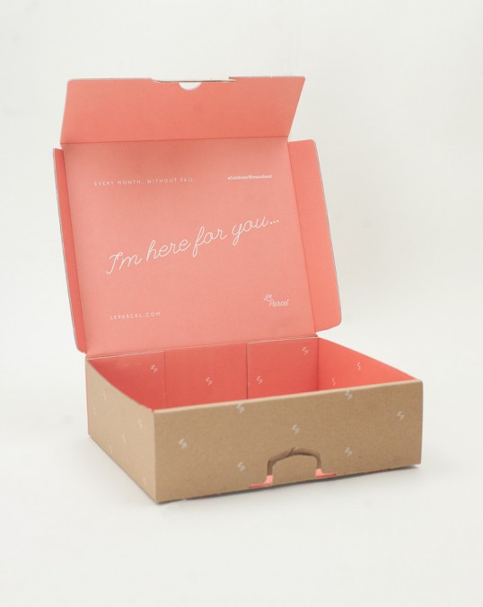
The challenges to address with this edition of Le Parcel’s packaging was first, weight. To accommodate this need the framework of the box had to be completely redesigned, including the use of a lighter-weight cardboard box. Graphics, including the bold pink interior, are silk screened rather than printed on a paper label – a typical graphic application.”

Le Parcel

Le Parcel

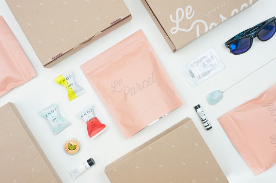
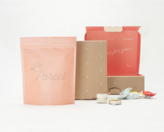
“The second issue to address in this round of packaging was organization within the box. The heat sealed bag brings both order to the box, but also an element of cleanliness. The bag is also easy to stash on the go, or under the counter, and has a resealable zipper lock.”

Le Parcel

“Le Parcel has always been adamant that their boxes should feel like opening a much-anticipated gift. The bright pink interior and bag as well as the messaging act as an instigator of celebration. The Le Parcel experience is to make periods more enjoyable, the box plays a part in that process reminding subscribers that as Le Parcel – “We are here for you”.

Le Parcel


Get the latest packaging design inspiration in your inbox:

Popular designs

The Bra Guru

Most women are wearing the wrong size bra and that is a fact. The Bra Guru® is the first and only professional

Over the wave

This Kombucha originates in Lombok, Indonesia, where its paradise beaches attract hundreds of surfers eager to ride the waves. When you surf,

The Port Vodka Lemon Water

Overview: In response to my client’s vision for a Cape Cod themed beverage brand, I embarked on the journey to create The Port

Burma Love Rebrand

Love at First BiteAs an extension of the Burma Superstar restaurant in San Francisco, Burma Love Foods gives diners an opportunity to

Far Out Bar

Description: Far Out Bar is a cutting-edge packaging design project created for High Life Farms’ macrodose THC chocolate bars. This project involved

Designed by: PepsiCo Design & Innovation
Country: United States

Le Parcel

lovely-package-le-parcel-1

Le Parcel

Designed by Seven Fifty Five | Country: United States

“The 2015 Le Parcel packaging system is the 3rd round of packaging systems Seven Fifty Five has created for Le Parcel. Each iteration serving a new purpose; a response to challenges faced by the company’s subscription business model.

The challenges to address with this edition of Le Parcel’s packaging was first, weight. To accommodate this need the framework of the box had to be completely redesigned, including the use of a lighter-weight cardboard box. Graphics, including the bold pink interior, are silk screened rather than printed on a paper label – a typical graphic application.”

Le Parcel

Le Parcel

“The second issue to address in this round of packaging was organization within the box. The heat sealed bag brings both order to the box, but also an element of cleanliness. The bag is also easy to stash on the go, or under the counter, and has a resealable zipper lock.”

Le Parcel

“Le Parcel has always been adamant that their boxes should feel like opening a much-anticipated gift. The bright pink interior and bag as well as the messaging act as an instigator of celebration. The Le Parcel experience is to make periods more enjoyable, the box plays a part in that process reminding subscribers that as Le Parcel – “We are here for you”.
Le Parcel


Previous slide
Next slide

Explore more great package design

Get the latest on packaging design in your inbox: