Designed by: PepsiCo Design & Innovation
Country: United States

Lintar Olive Oil

Updated on March 28th, 2010  |  
2 Minutes Read

lintar1

Designed by Tridvajedan | Country: Croatia

“Lintar olive oil is the product of years of investment of Cemex Croatia Company in sustainable development. On the southern slopes of Kozjak, local oil mill and the Cemex Company together made the project of regeneration by planting indigenous species of olive trees.

Collaboration is achieved at all stages, from strategy and market positioning, the name of the product to designing the identity and packaging design. Lintar name derives from the Greek word that means “funnel” and which is the old name for the Kastela Gulf, the geographical origin of the oil.

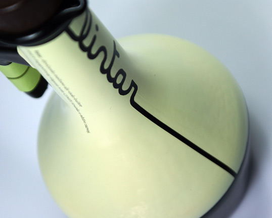
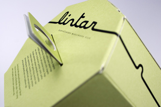
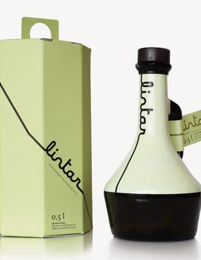
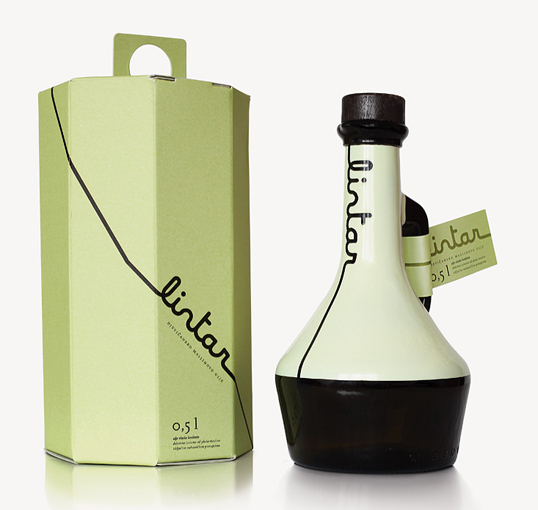
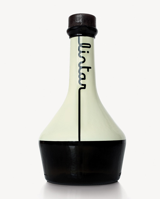
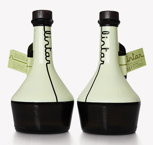
Brand and packaging design is inspired by the shape of the funnel and pouring. So brand is made in typography Maline, interpreting the oil line pouring on the surface and creating the name. The bottle is funnel shape. The visual identity of this product is juncture of traditional and contemporary, which is particularly evident in the specific combination of colors and shapes.

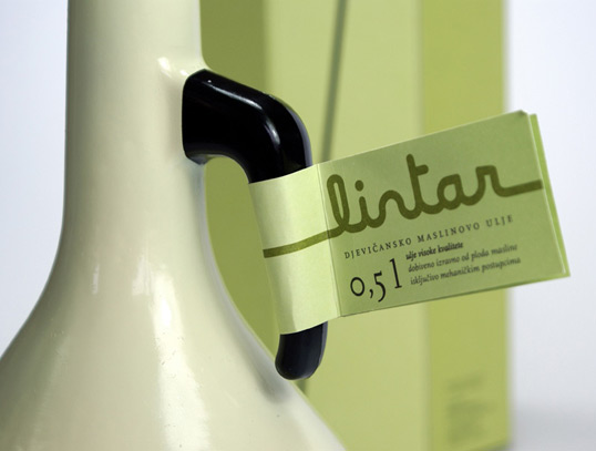
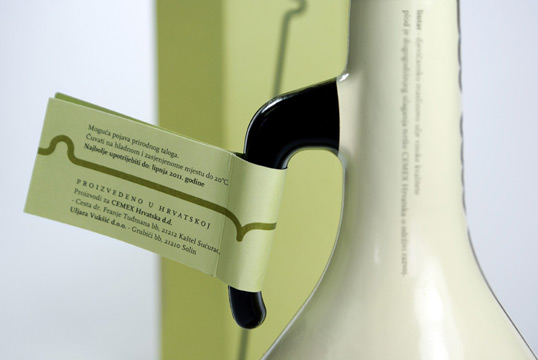
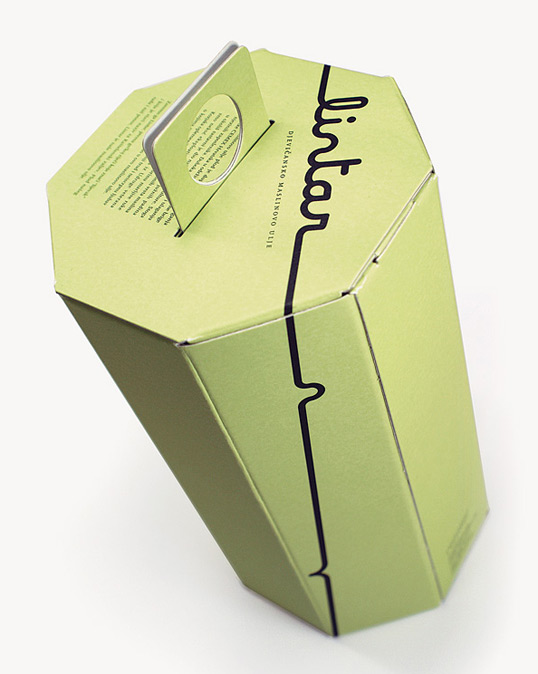
Dark brown glass bottle is hand painted in very light yellow-green tone and text elements are printed on the surface. Label, with basic information about the product, is attached to bottle handle, and other information is printed on cardboard box with a fingers handle.”
lintar2

lintar3

lintar4

lintar5

lintar6

lintar7

lintar8

lintar9

Popular designs

Absolut Vodka Rock Edition

Designed by Natalia Brilli | Country: France “Absolut worked with designer Natalia Brilli, who is known for wrapping things in leather. This

64 by Rio Coffee

Designed by Voice | Country: Australia “Rio Coffee has been hand roasting Australia’s favourite Coffees since 1964, with 14 varieties already in

Designed by: PepsiCo Design & Innovation
Country: United States

Lintar Olive Oil

2 Minutes Read
lintar1

lintar1

Designed by Tridvajedan | Country: Croatia

“Lintar olive oil is the product of years of investment of Cemex Croatia Company in sustainable development. On the southern slopes of Kozjak, local oil mill and the Cemex Company together made the project of regeneration by planting indigenous species of olive trees.

Collaboration is achieved at all stages, from strategy and market positioning, the name of the product to designing the identity and packaging design. Lintar name derives from the Greek word that means “funnel” and which is the old name for the Kastela Gulf, the geographical origin of the oil.

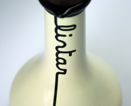
Brand and packaging design is inspired by the shape of the funnel and pouring. So brand is made in typography Maline, interpreting the oil line pouring on the surface and creating the name. The bottle is funnel shape. The visual identity of this product is juncture of traditional and contemporary, which is particularly evident in the specific combination of colors and shapes.

Dark brown glass bottle is hand painted in very light yellow-green tone and text elements are printed on the surface. Label, with basic information about the product, is attached to bottle handle, and other information is printed on cardboard box with a fingers handle.”
lintar2

lintar3

lintar4

lintar5

lintar6

lintar7

lintar8

lintar9

Previous slide
Next slide