Designed by: PepsiCo Design & Innovation
Country: United States

Little Bird

Little Bird

Designed by Pearlfisher | Country: United Kingdom

“Pearlfisher has created the tone of voice and brand identity for Little Bird, the fresh new brand for babies and children up to 5 years old from Jools Oliver in partnership with Mothercare.

Mothercare’s values of timeless and enduring care and quality, combined with Jools Oliver’s loving, modern and unique approach to motherhood have combined to create the perfect partnership. Little Bird is the unique and fresh expression of this collaboration.

The brand is strongly rooted in heritage and nostalgia mixed with a modern quirky twist. Jools was a Mothercare baby herself and the shared history and her love of vintage inspiration is a cornerstone to the brand.

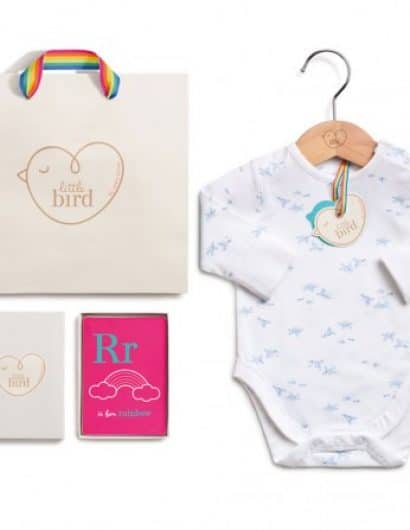
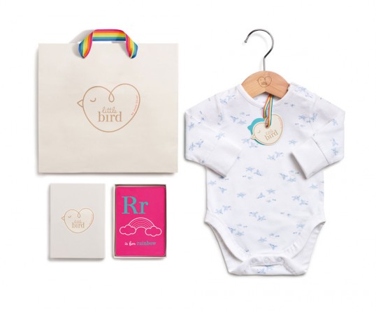
The brand identity is an iconic symbol for motherhood and the design brings to life the brand name through a little bird icon. The brand mark works as a double visual identity, with the heart icon becoming apparent after that of the bird – celebrating the best of childhood and growing up, by representing freedom, curiosity and connection, core values of the brand. The rainbow is a nod to vintage, looking back to the 70’s whilst the neon in the name is a link to the modern quirky feel of the brand. And all of these design cues in combination sum up the essence of the brand.

The identity will be brought to life across the Little Bird brand range of clothes, packaging and brand collateral.”

Get the latest packaging design inspiration in your inbox:

Popular designs

D’eyras – Medrono & Olive Oil

What connects D´EYRAS, Medronho, and Olive Oil? They all hail from the same country: Portugal. These trees are indigenous to the region, serving as a testament to the bountiful and diverse Mediterranean flora.

Designed by: PepsiCo Design & Innovation
Country: United States

Little Bird

lovely-package-little-bird

Little Bird

Designed by Pearlfisher | Country: United Kingdom

“Pearlfisher has created the tone of voice and brand identity for Little Bird, the fresh new brand for babies and children up to 5 years old from Jools Oliver in partnership with Mothercare.

Mothercare’s values of timeless and enduring care and quality, combined with Jools Oliver’s loving, modern and unique approach to motherhood have combined to create the perfect partnership. Little Bird is the unique and fresh expression of this collaboration.

The brand is strongly rooted in heritage and nostalgia mixed with a modern quirky twist. Jools was a Mothercare baby herself and the shared history and her love of vintage inspiration is a cornerstone to the brand.

The brand identity is an iconic symbol for motherhood and the design brings to life the brand name through a little bird icon. The brand mark works as a double visual identity, with the heart icon becoming apparent after that of the bird – celebrating the best of childhood and growing up, by representing freedom, curiosity and connection, core values of the brand. The rainbow is a nod to vintage, looking back to the 70’s whilst the neon in the name is a link to the modern quirky feel of the brand. And all of these design cues in combination sum up the essence of the brand.

The identity will be brought to life across the Little Bird brand range of clothes, packaging and brand collateral.”
Previous slide
Next slide
Get the latest on packaging design in your inbox: