

The renowned Belgian cookie brand Lotus Biscoff has unveiled a new global brand identity and packaging design, masterfully crafted by BrandMe. This initiative is a strategic step towards modernizing the brand and establishing Biscoff as a global icon.
Lotus Biscoff has a rich history dating back to 1932, with a unique Belgian recipe that has captivated cookie enthusiasts worldwide. Recognizing the opportunity to strengthen its global recognition, the brand teamed up with the London-based brand and design agency, BrandMe. The objective was to create a more relevant brand expression and broaden its appeal to consumers.
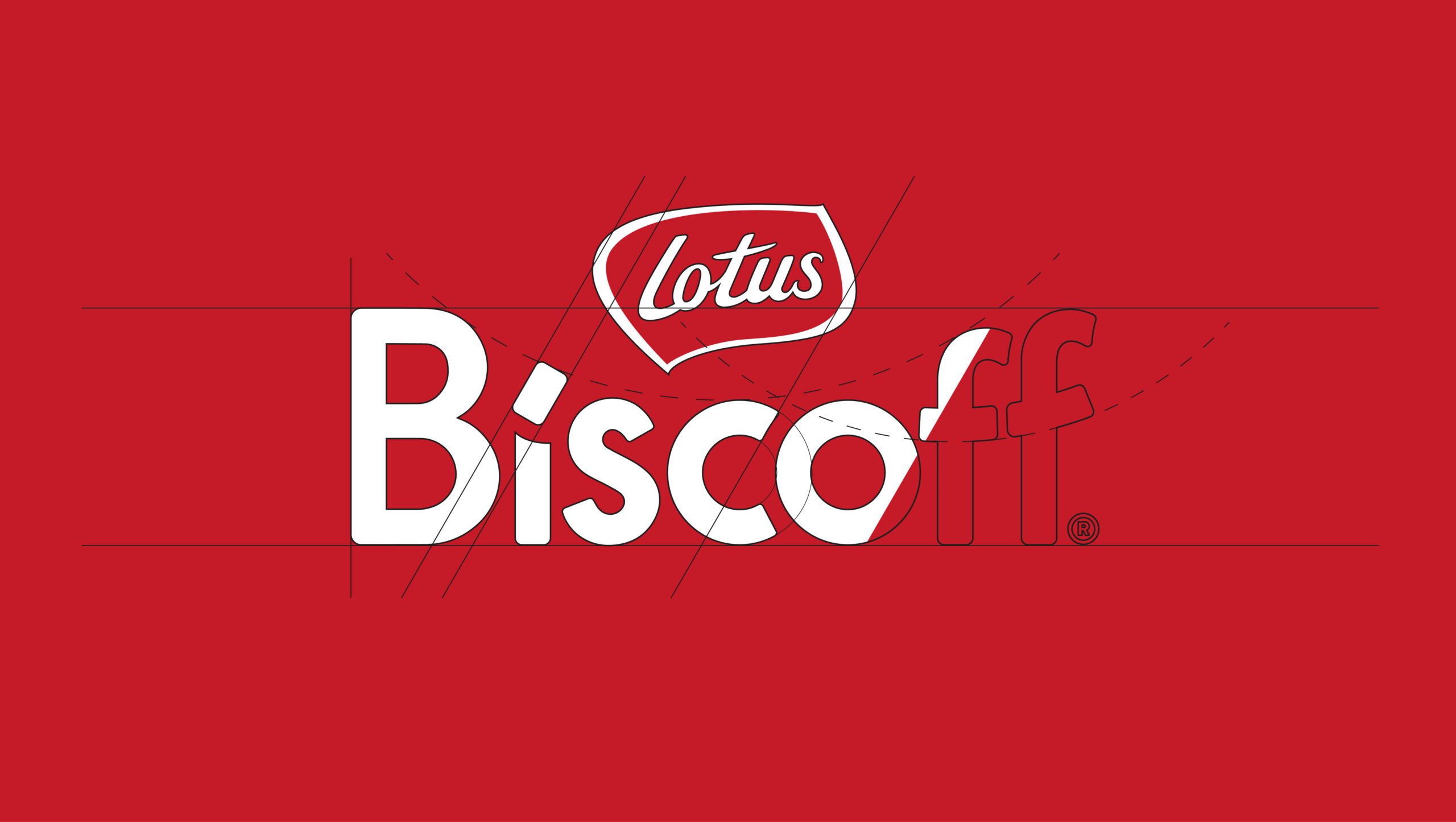
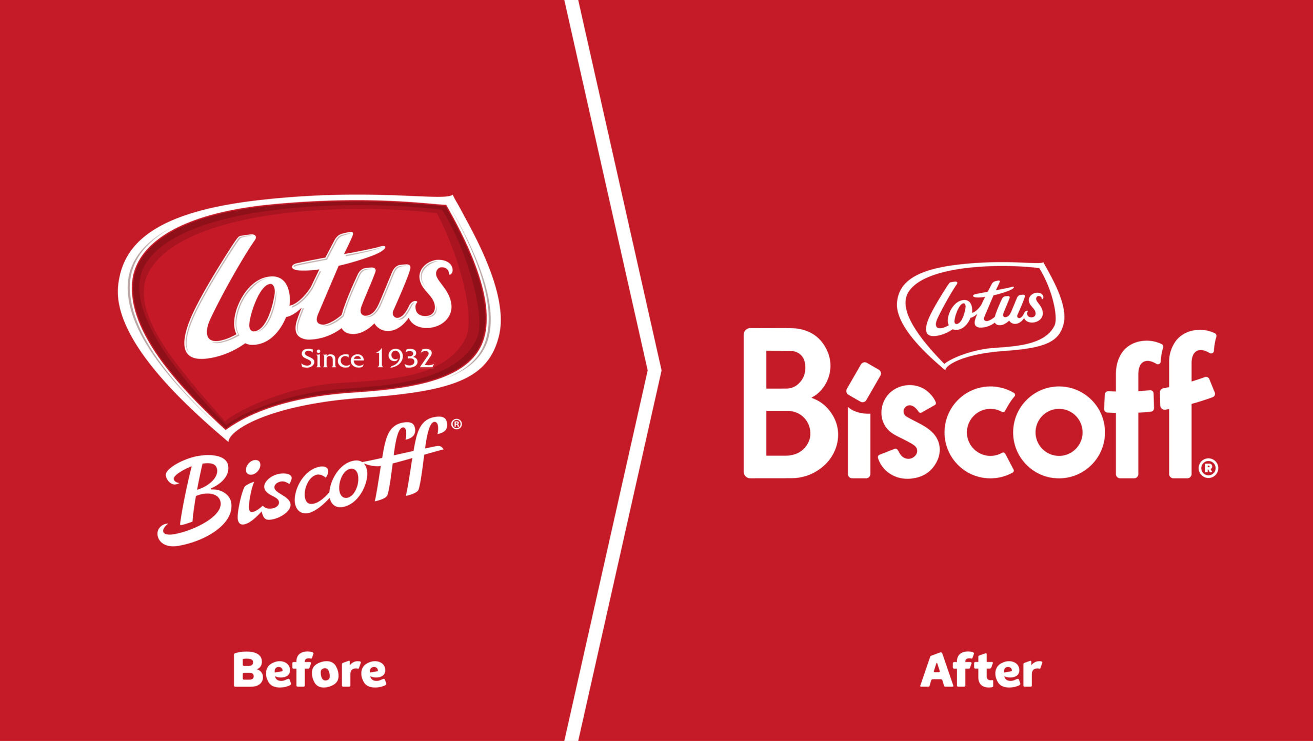
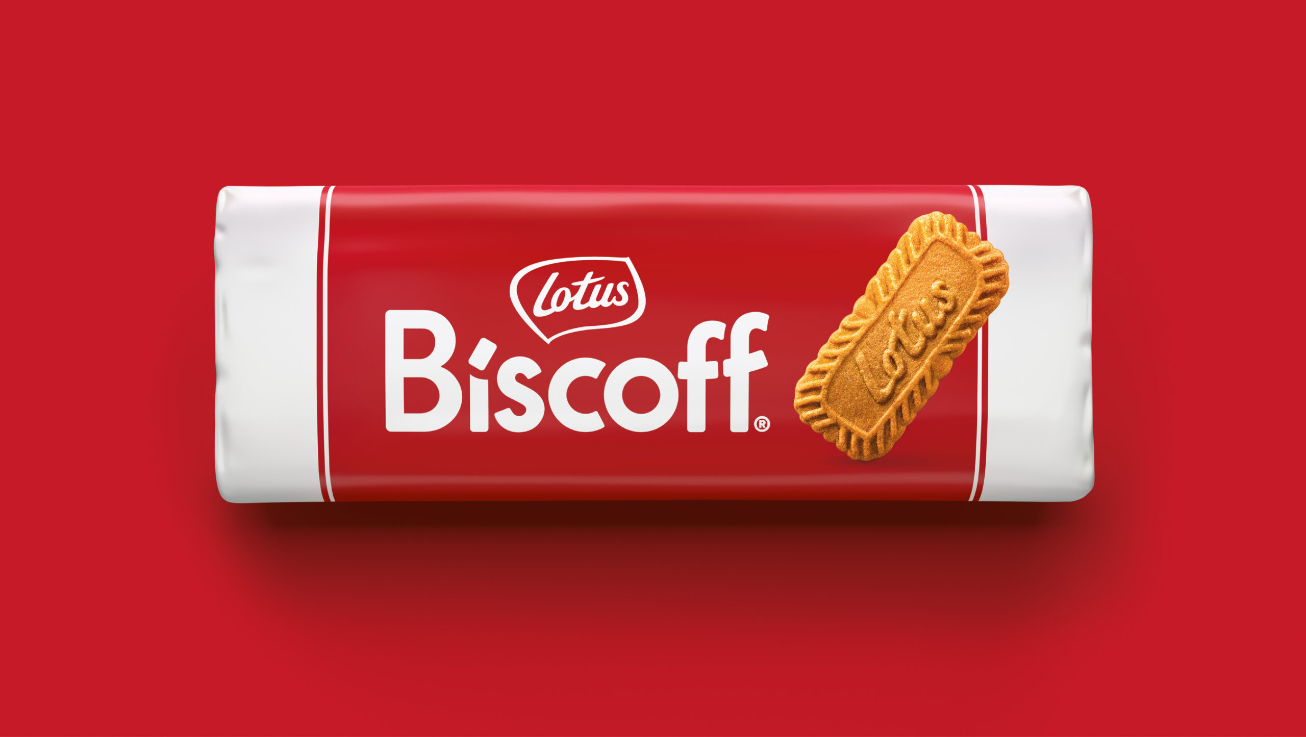
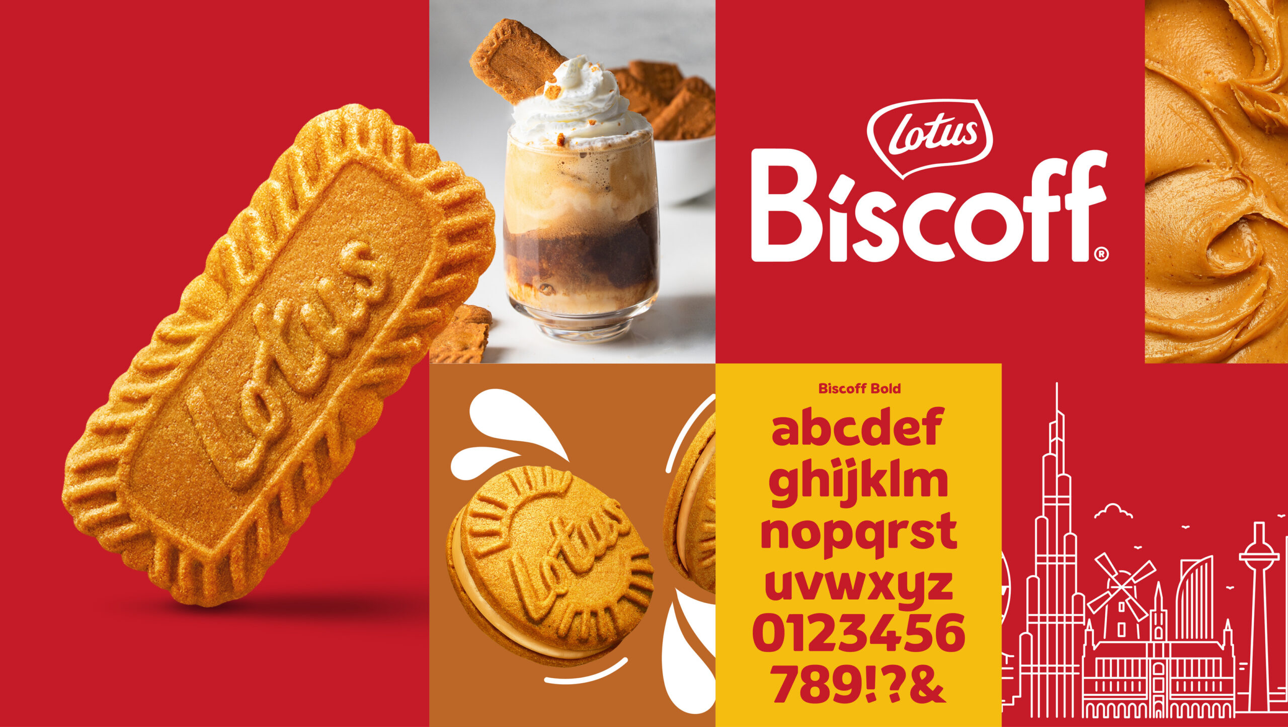
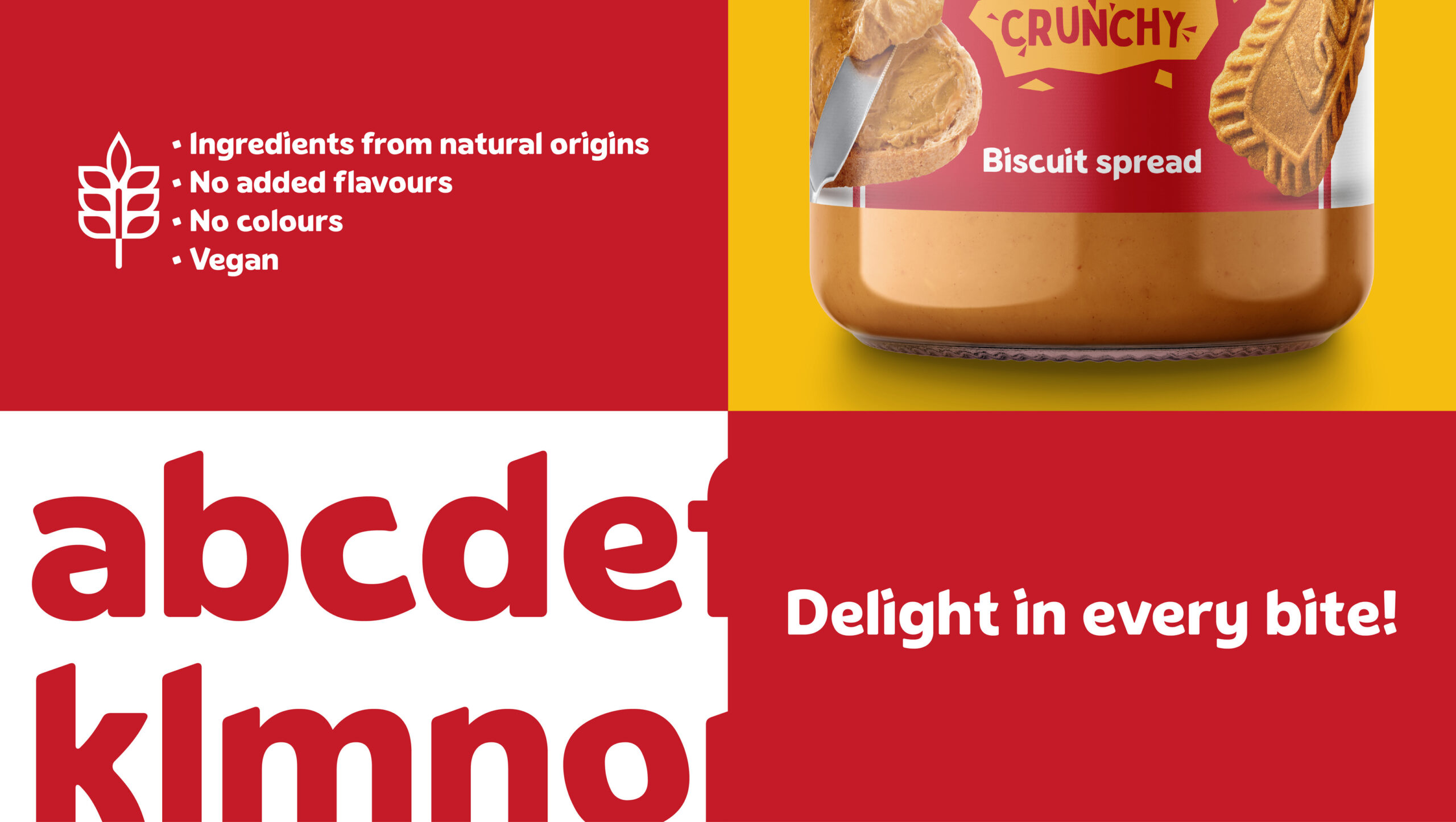
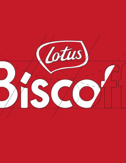
The rebranding strategy was two-pronged. The first step was to elevate Biscoff as the primary, most visible brand, with the Lotus brand acting as a supportive element to leverage its longstanding reputation of quality and trust. The second step was to rejuvenate the brand’s appearance while maintaining its essence and the bright, confident Biscoff personality. As part of the rebranding, BrandMe developed a new global identity, which included the creation of a bespoke typeface for the brand. The process also included refreshing the full portfolio’s packaging, developing seasonal limited editions, and creating a new travel retail range.
BrandMe’s Creative Director, Charlotte Elder, explained, “The new identity brings to life Biscoff’s bold, joyful personality in a contemporary way and continues to communicate the brand’s delicious taste experience. There is a sense of warmth and inclusivity in this confident new brand mark. Crafted to include moments of discovery throughout the letter forms, such as our iconic cookie, creating a hidden smile. Positive, friendly, and always approachable.”
Alexandra De Smet, the global brand manager at Biscoff, further added, “The new Biscoff branding is a significant step forward in our journey to become the number three cookie brand worldwide. Our new visual identity perfectly reflects the confident & friendly nature of our delicious Biscoff brand, with our iconic cookie smartly becoming part of our brand mark. It is simple, yet very impactful, and creates major stand-out in shelves.”
The new branding will be rolled out across all packaging in the product portfolio and across all markets over the coming months.
