Designed by: PepsiCo Design & Innovation
Country: United States

L&P

L&P

Designed by Dow Design | Country: New Zealand

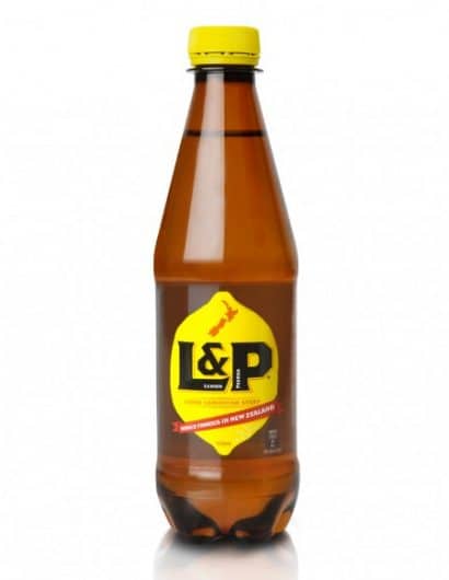
“Iconic soft drink, Lemon & Paeroa (L&P), has been revitalised at the hands of brand design specialists, Dow Design. The ‘World Famous in New Zealand’ brand’s fresh, contemporary makeover aims to make the lemony drink a more compelling choice.

While L&P remains an enduring and much loved favourite with Kiwis – its Facebook page has over 184,000 likes and a recent Reader’s Digest survey lists L&P the seventh most trusted brand in New Zealand – nostalgia for the brand was beginning to outstrip its appeal as a thirst quencher.

To update the brand’s image, Dow Design was asked to put the verve back into L&P’s packaging design with the aim of giving it a more current look and feel that especially connects with today’s younger generation.

Dow’s brief was to leave the brand clearly recognisable to its consumers as the L&P ‘they know and love’.  As a result, the rebranding holds on to the brand’s iconic elements, while creating a stronger focus on L&P’s unique taste and refreshment promise.”

Get the latest packaging design inspiration in your inbox:

Popular designs

The Bra Guru

Most women are wearing the wrong size bra and that is a fact. The Bra Guru® is the first and only professional

Burma Love Rebrand

Love at First BiteAs an extension of the Burma Superstar restaurant in San Francisco, Burma Love Foods gives diners an opportunity to

Far Out Bar

Description: Far Out Bar is a cutting-edge packaging design project created for High Life Farms’ macrodose THC chocolate bars. This project involved

Designed by: PepsiCo Design & Innovation
Country: United States

L&P

lovely-package-l-and-p

L&P

Designed by Dow Design | Country: New Zealand

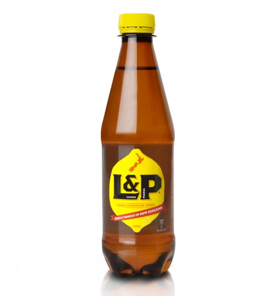
“Iconic soft drink, Lemon & Paeroa (L&P), has been revitalised at the hands of brand design specialists, Dow Design. The ‘World Famous in New Zealand’ brand’s fresh, contemporary makeover aims to make the lemony drink a more compelling choice.

While L&P remains an enduring and much loved favourite with Kiwis – its Facebook page has over 184,000 likes and a recent Reader’s Digest survey lists L&P the seventh most trusted brand in New Zealand – nostalgia for the brand was beginning to outstrip its appeal as a thirst quencher.

To update the brand’s image, Dow Design was asked to put the verve back into L&P’s packaging design with the aim of giving it a more current look and feel that especially connects with today’s younger generation.

Dow’s brief was to leave the brand clearly recognisable to its consumers as the L&P ‘they know and love’.  As a result, the rebranding holds on to the brand’s iconic elements, while creating a stronger focus on L&P’s unique taste and refreshment promise.”

Previous slide
Next slide

Explore more great package design

Get the latest on packaging design in your inbox: