Designed by: PepsiCo Design & Innovation
Country: United States

Lucia

lucia1

Designed by Pure Living | Country: Canada

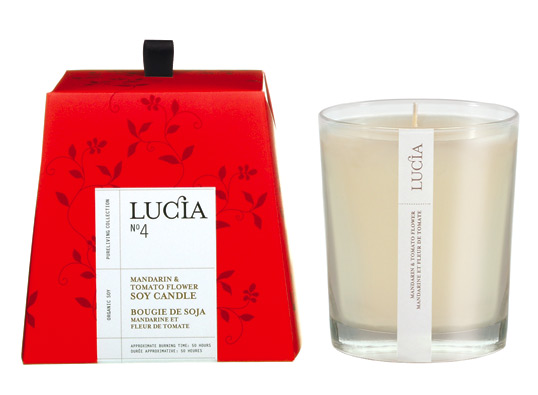
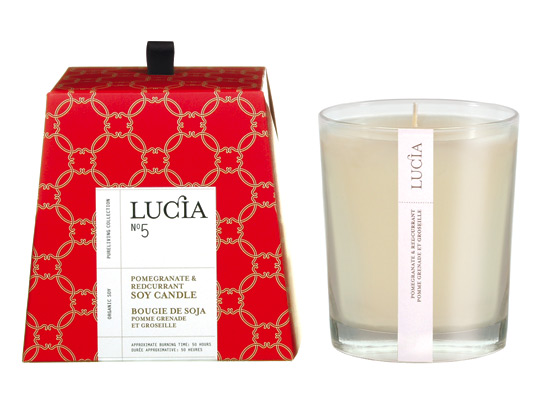
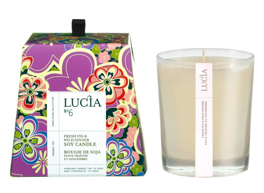
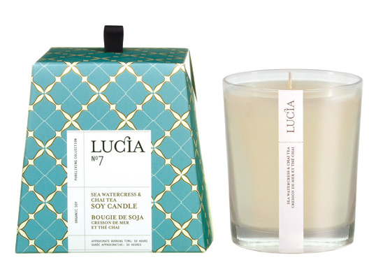
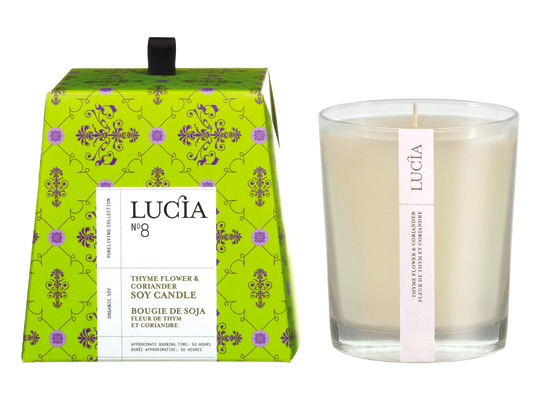
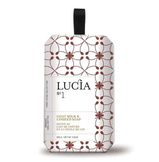
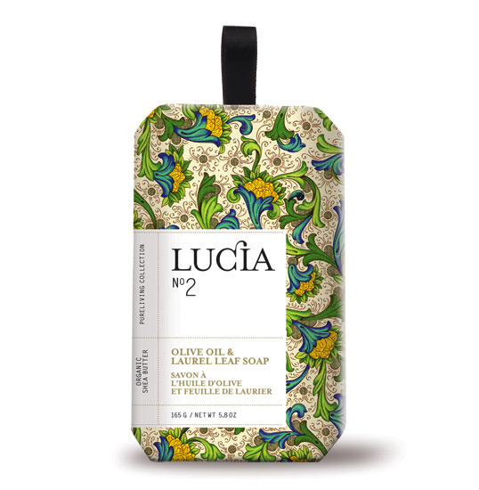
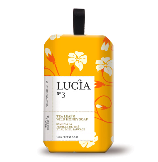
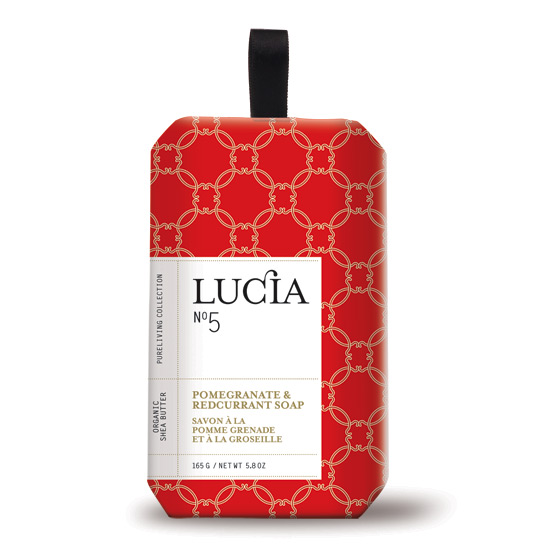
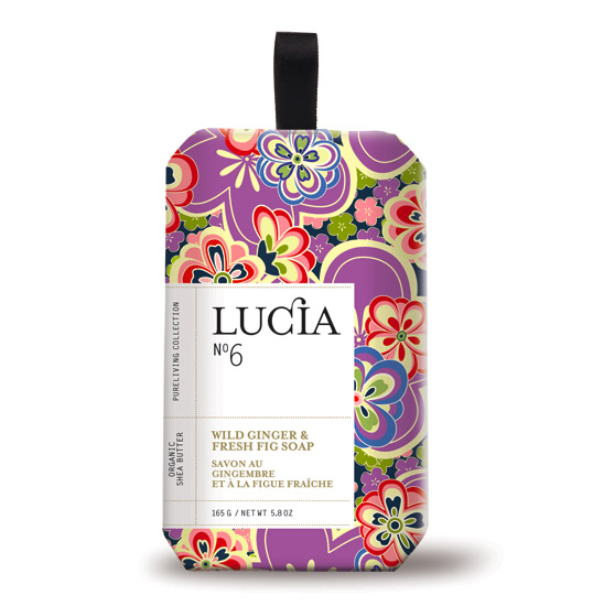
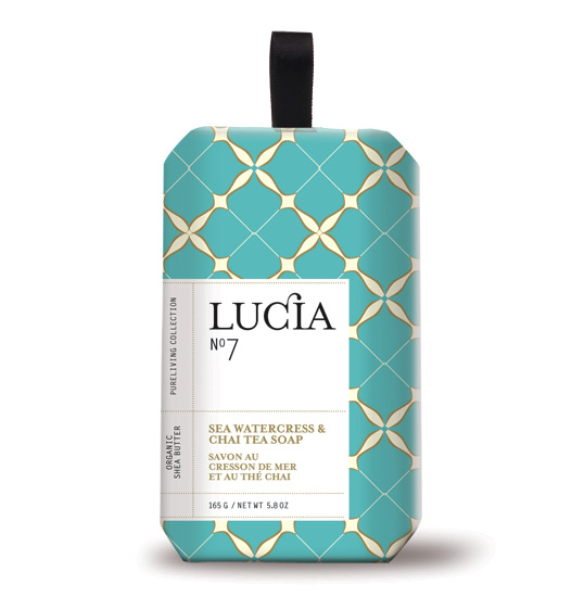
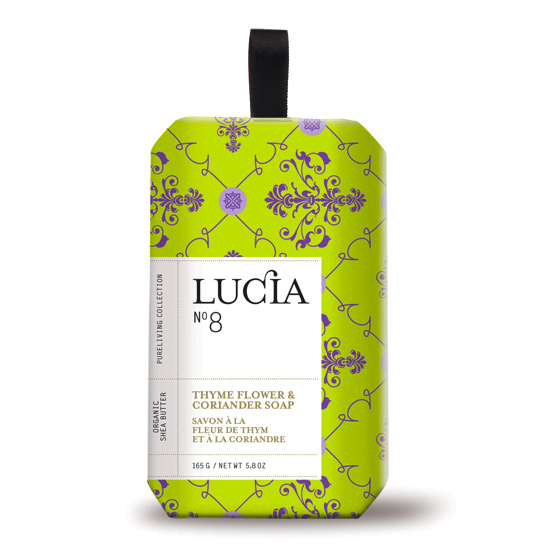
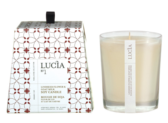
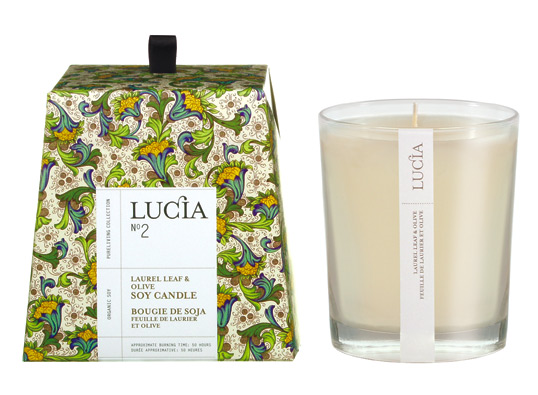
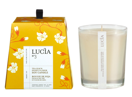
“LUCIA was inspired by Lucie Bernier (president) of Pure living products. Her many travels to Europe, Asia, etc has led her to bring back through the years an assortment of Renaissance designs on fabrics from Florence, ceramic work from Portugal, Spain and  Italy, etc. She wanted to create a line of specialty soaps (now candles also)  that reflected these rich  textured designs. Each design reflects old world charm with a modern touch. The logo LUCIA in black & white reflected the ‘cleanness’ of a soap product and at the same time counter-act the rich and ‘busy’ textures of the old world designs. Also, this was a product that was designed in our contemporary times so the logo had to refect this. The box construction of the soaps was inspired from old, pre-war soap designs from Spain & Portugal. The candle box contruction was inspired  by the ‘Pannetone’ cake found in Italy.”
lucia2

lucia3

lucia4

lucia5

lucia6

lucia7

lucia8

lucia9

lucia10

lucia11

lucia12

lucia13

lucia16

lucia17

lucia18

Get the latest packaging design inspiration in your inbox:

Popular designs

Far Out Bar

Description: Far Out Bar is a cutting-edge packaging design project created for High Life Farms’ macrodose THC chocolate bars. This project involved

Burma Love Rebrand

Love at First BiteAs an extension of the Burma Superstar restaurant in San Francisco, Burma Love Foods gives diners an opportunity to

Over the wave

This Kombucha originates in Lombok, Indonesia, where its paradise beaches attract hundreds of surfers eager to ride the waves. When you surf,

Designed by: PepsiCo Design & Innovation
Country: United States

Lucia

lucia1

lucia1

Designed by Pure Living | Country: Canada

“LUCIA was inspired by Lucie Bernier (president) of Pure living products. Her many travels to Europe, Asia, etc has led her to bring back through the years an assortment of Renaissance designs on fabrics from Florence, ceramic work from Portugal, Spain and  Italy, etc. She wanted to create a line of specialty soaps (now candles also)  that reflected these rich  textured designs. Each design reflects old world charm with a modern touch. The logo LUCIA in black & white reflected the ‘cleanness’ of a soap product and at the same time counter-act the rich and ‘busy’ textures of the old world designs. Also, this was a product that was designed in our contemporary times so the logo had to refect this. The box construction of the soaps was inspired from old, pre-war soap designs from Spain & Portugal. The candle box contruction was inspired  by the ‘Pannetone’ cake found in Italy.”
lucia2

lucia3

lucia4

lucia5

lucia6

lucia7

lucia8

lucia9

lucia10

lucia11

lucia12

lucia13

lucia16

lucia17

lucia18

Previous slide
Next slide

Explore more great package design

Get the latest on packaging design in your inbox: