Designed by: PepsiCo Design & Innovation
Country: United States

Lyle’s Golden Syrup Logo Redesign: A Shift from Traditional to Modern Branding

6

In an unexpected turn, one might question the wisdom of using a logo featuring a long-deceased lion engulfed by bees when launching a brand. Such a decision might not be considered the most sensible choice in modern times. However, this is not the year 1885, and the product in question is not a syrupy concoction that resembles honey.

The fascinating tale behind this peculiar choice of logo belongs to Lyle’s Golden Syrup, a popular baking ingredient in the UK. This brand holds the Guinness World Record for the oldest unaltered logo and packaging design, or at least it used to.

af0a6f2cd9f684647bc0ff19ccea1a34.jpeg
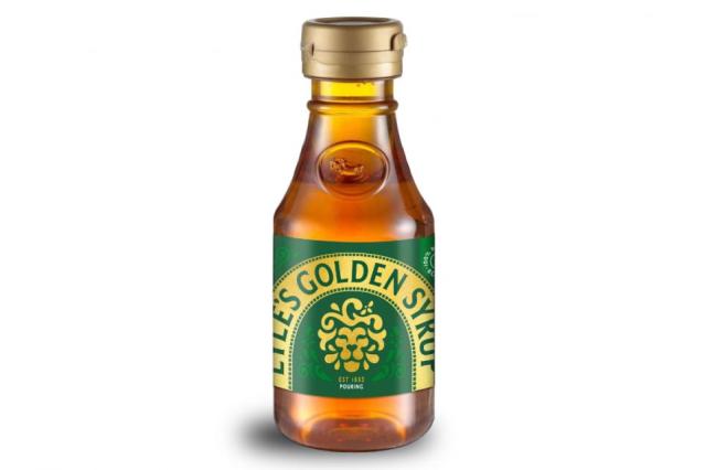
New packaging.


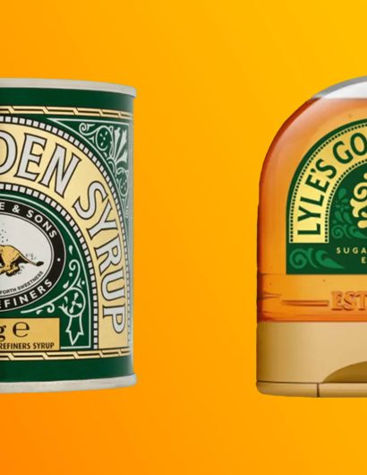
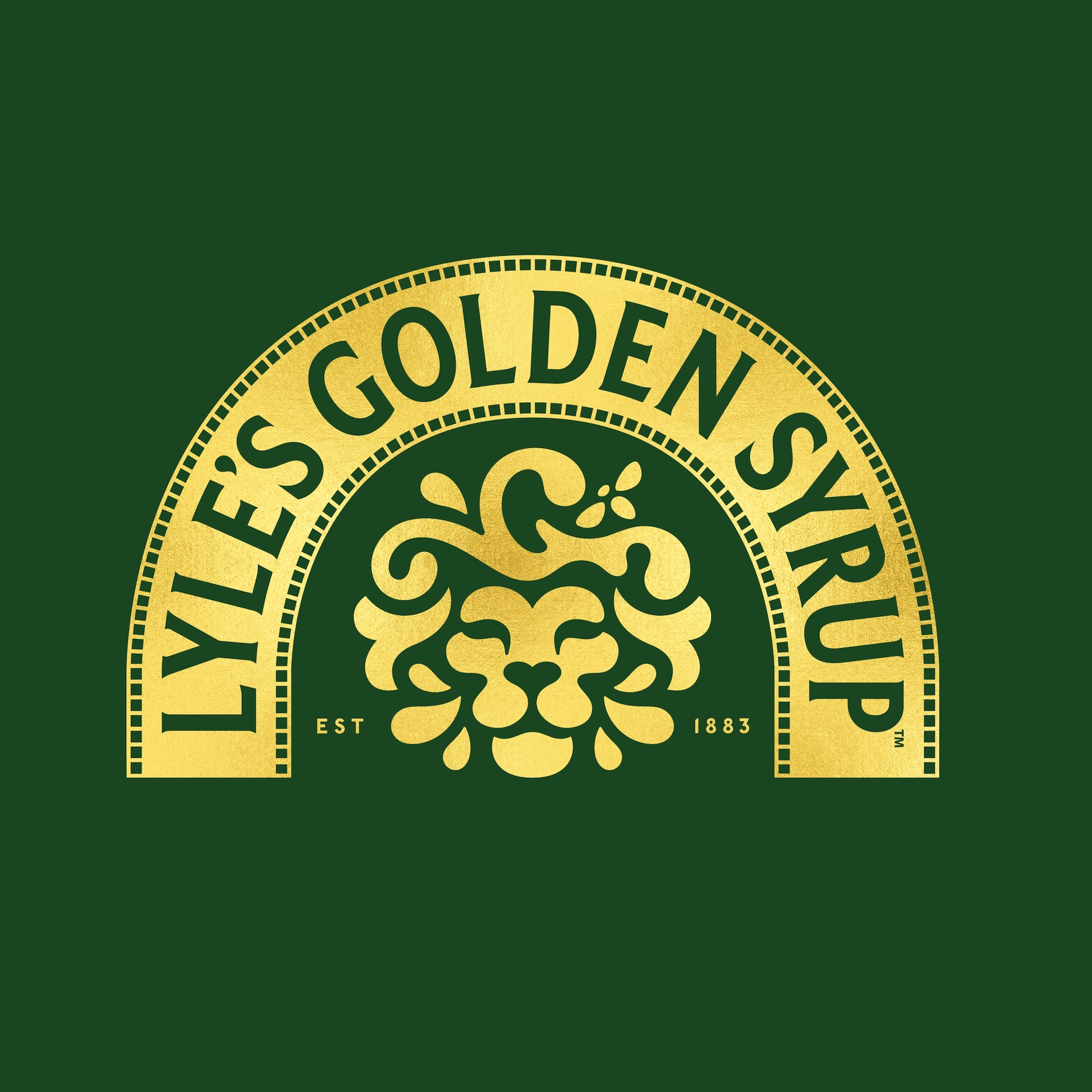
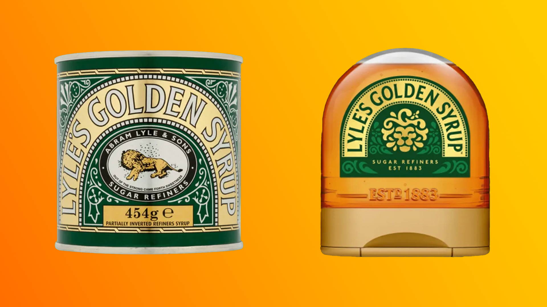
In a recent attempt to attract younger consumers, Lyles announced a redesign of some of their packaging. The updated design replaces the deceased lion and bees with a tastefully designed lion’s head featuring a single, inconspicuous bee merging into the lion’s mane. This fresh design will adorn the brand’s plastic syrup and dessert bottles, but not the classic Lyle’s tin, thus preserving the brand’s Guinness record.

427952722_885687606899495_7280574994028063521_n.jpg


The original logo came about due to the religious beliefs of Lyle’s owner, Abram Lyle. He took inspiration from a quote from the Book of Judges: “Out of the eater came forth meat, and out of the strong came forth sweetness.” This quote originates from the story of Samson, who discovered a honeycomb inside the decomposing body of a lion he had previously killed. Lyle used the quote as a tagline underneath an illustration of the deceased lion.

425289903_887549080046681_8416428033581256004_n.jpg
Redesigned logo.


However, the redesign did not go without controversy, with the Daily Express labeling it as “woke” for reasons which are not entirely clear. Despite not all the product line undergoing a change, the brand is still sacrificing well-established recognition and equity on the shelf.

Who can predict how this will play out? This tale might baffle anyone who wouldn’t consider featuring a perished lion on a jar of non-honey product, even in the 19th century.

Featured image for Hey, Maybe You Should Get Rid Of That Dead Lion Logo: Lyle's Golden Syrup Redesigns After Nearly 140 Years

6

Get the latest packaging design inspiration in your inbox:

Popular designs

Inverey: A Unique Barrel-Aged Scottish Gin Packaging Design

Inverey stands out with its image that captures the essence of the rugged Highland countryside. Breaking away from the norm, the label design does not feature the traditional tartan. Instead, it presents an organised structure of intertwining circles, rhombuses, four-pointed stars and dots born out of their intersection.

Designed by: PepsiCo Design & Innovation
Country: United States

Lyle’s Golden Syrup Logo Redesign: A Shift from Traditional to Modern Branding

6
Lyle's Golden Syrup Logo Redesign: A Shift from Traditional to

In an unexpected turn, one might question the wisdom of using a logo featuring a long-deceased lion engulfed by bees when launching a brand. Such a decision might not be considered the most sensible choice in modern times. However, this is not the year 1885, and the product in question is not a syrupy concoction that resembles honey.

The fascinating tale behind this peculiar choice of logo belongs to Lyle’s Golden Syrup, a popular baking ingredient in the UK. This brand holds the Guinness World Record for the oldest unaltered logo and packaging design, or at least it used to.

af0a6f2cd9f684647bc0ff19ccea1a34.jpeg
New packaging.


In a recent attempt to attract younger consumers, Lyles announced a redesign of some of their packaging. The updated design replaces the deceased lion and bees with a tastefully designed lion’s head featuring a single, inconspicuous bee merging into the lion’s mane. This fresh design will adorn the brand’s plastic syrup and dessert bottles, but not the classic Lyle’s tin, thus preserving the brand’s Guinness record.

427952722_885687606899495_7280574994028063521_n.jpg


The original logo came about due to the religious beliefs of Lyle’s owner, Abram Lyle. He took inspiration from a quote from the Book of Judges: “Out of the eater came forth meat, and out of the strong came forth sweetness.” This quote originates from the story of Samson, who discovered a honeycomb inside the decomposing body of a lion he had previously killed. Lyle used the quote as a tagline underneath an illustration of the deceased lion.

425289903_887549080046681_8416428033581256004_n.jpg
Redesigned logo.


However, the redesign did not go without controversy, with the Daily Express labeling it as “woke” for reasons which are not entirely clear. Despite not all the product line undergoing a change, the brand is still sacrificing well-established recognition and equity on the shelf.

Who can predict how this will play out? This tale might baffle anyone who wouldn’t consider featuring a perished lion on a jar of non-honey product, even in the 19th century.

Featured image for Hey, Maybe You Should Get Rid Of That Dead Lion Logo: Lyle's Golden Syrup Redesigns After Nearly 140 Years

6
Previous slide
Next slide
Get the latest on packaging design in your inbox: