


Designed by: 43 OZ Design Studio | Country: Moldova
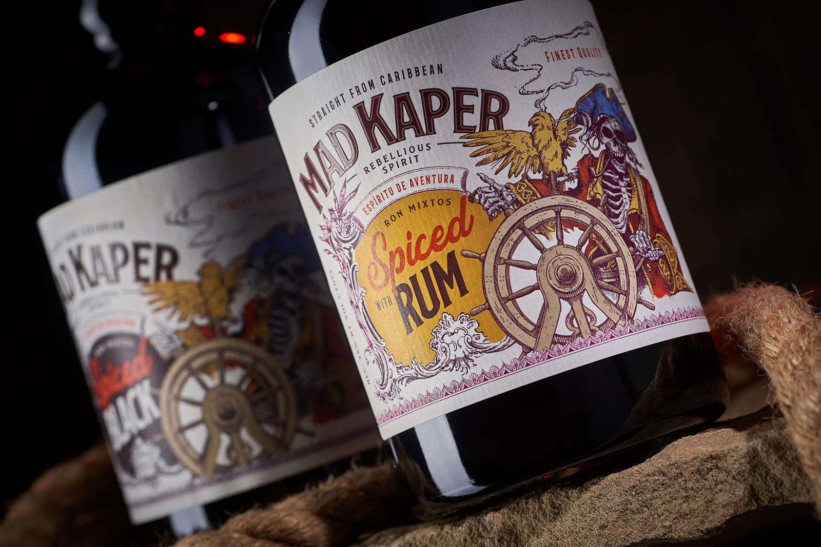
Millennials and Gen Z have grown up watching Captain Jack Sparrow and his amusing eccentricities. Apart from his compass, slurred speech, and unpredictability, his love for rum is legendary. Rum is the favorite drink of pirates, and what could look better on a packaging label than an illustration of a skeletal pirate with bony hands on the helm?
Created by 43 OZ Design Studio, the packaging design for Sodiko’s new line of rums, Mad Kaper, features an undead pirate, a bird, and a helm.


The design studio mentions:
“The visual style for the label design of Mad Kaper rums is designed in the style of pirate posters and adventure novels. Of course, the stylized illustration of an undead pirate plays the main role in the design, which embodies the name of the product and sets the whole label in light and slightly frivolous tone. Information elements support the overall style and are enclosed in graphic blocks that continue the theme of vintage posters and book illustrations. Thus, even upon a quick glance at the bottle, the consumer gets the impression of “that exact rum” that is sung about in pirate songs and adventure books.”


