Designed by Base Design | Country: Belgium
“With values rooted in the past but a business plan oriented toward the future, Dandoy asked Base Design in 2011 to modernize and rethink its visual identity, packaging range and website. The main questions to solve were “How do you transform a small-scale, local family business into a global family brand, without losing the image of local craftsmanship and true tradition?” and “How to reach a broader audience?”.
To tackle these questions, Base Design started with interviews in the field to gauge the context. This was followed by an analysis of Dandoy’s assets, opportunities and brand experience, a benchmark study, ideas for improvement and a workshop with the client. All this resulted in about ten design-strategy recommendations followed by a graphic design phase.”

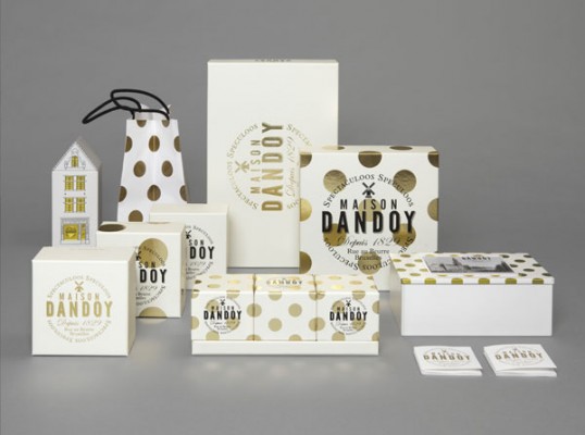
“The resulting visual identity has been reduced to its essence. The new Maison Dandoy brand is built on a graphic toolbox that consists of a logo, typography, illustrations, the colour palette black-gold-white, and simple packaging to reduce waste.
The visual part is enriched with brisk copywriting, from a new brand manifesto and a new baseline – Maison Dandoy, Spectaculoos Speculoos – to several taglines, craftsmen’s portraits, speculoos figurine dialogues, and other stories written in a no-nonsense, humorous tone of voice. From now on, Maison Dandoy is a brand with a consistent, recognizable voice.”

“The new tone of voice also reflects Maison Dandoy’s joyful, warm, generous and human character. Maison Dandoy is all about pleasure! The copywriting talks to everybody and ties together the unique family history, the high-quality products, and the new visual identity.
Through the new baseline, Maison Dandoy’s new identity is built around the star product Speculoos, a delicacy they are known for since ages. From now on, Maison Dandoy means ‘Speculoos’ just like La Durée means ‘Macaron’ and Maille means ‘Moutarde’.”

“A last notable change is the return of Dandoy’s original company name ‘Maison Dandoy’. This refers to Dandoy’s charismatic motherhouse in the heart of Brussels, where it all started. Yes, Maison Dandoy is a typical Brussels brand. Its Brussels roots are felt everywhere, through the logo, the illustrations and the slightly surrealist tone of voice. Do you want to know how good life tastes? Do you want to get to know Brussels? Meet Maison Dandoy!”