Designed by: PepsiCo Design & Innovation
Country: United States

Mas de Santa Creu

Mas de Santa Creu

Designed by Ambar Partners | Country: Spain

Project: The object of the project was to design an ecological olive oil produced by “Mas de Santa Creu”  in the area of Siurana, Catalunya. The family produced an extremely high quality olive oil for their own consumption and decided it was time to commercialize it in very small quantities per year.  The olive oil is produced using only ecological methods. It is extracted from olives collected only from the tree, discarding all the fruits that fall to the ground. It is a premium oil and it is sold unfiltered to preserve all its flavors and richness.

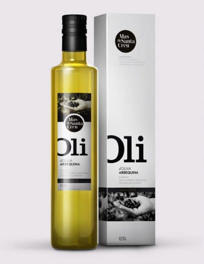
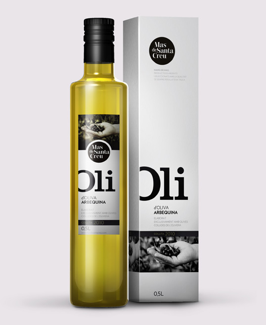
Solution: We wanted the label to communicate the strong emotional bond between the family and the land without losing the simple and honest feel of the product. To achieve this we associated the brand to a vintage looking photography that explained the intimate relation of the producer and the family estate  in a simple, classical way. At the same time, the typography used in the name (“Oli”)remains clear and simple, thus adding a stylish touch to a very traditional product. The roughness and the homemade character of the unfiltered oil combined with the clean modern looks of the label produces an interesting contrast achieving strong visual presence  remaining true to the nature of the product.”

Get the latest packaging design inspiration in your inbox:

Popular designs

Innovative Design and Packaging of Teeling Whiskey Crystal Malt

Explore the innovative packaging design of Teeling Whiskey Crystal Malt. A dark screen printed bottle with a Marque™ aluminum label, textural dimension, and a seamless diamond pattern, embodies the brand’s commitment to unconventional expressions.

Designed by: PepsiCo Design & Innovation
Country: United States

Mas de Santa Creu

oli

Mas de Santa Creu

Designed by Ambar Partners | Country: Spain

Project: The object of the project was to design an ecological olive oil produced by “Mas de Santa Creu”  in the area of Siurana, Catalunya. The family produced an extremely high quality olive oil for their own consumption and decided it was time to commercialize it in very small quantities per year.  The olive oil is produced using only ecological methods. It is extracted from olives collected only from the tree, discarding all the fruits that fall to the ground. It is a premium oil and it is sold unfiltered to preserve all its flavors and richness.

Solution: We wanted the label to communicate the strong emotional bond between the family and the land without losing the simple and honest feel of the product. To achieve this we associated the brand to a vintage looking photography that explained the intimate relation of the producer and the family estate  in a simple, classical way. At the same time, the typography used in the name (“Oli”)remains clear and simple, thus adding a stylish touch to a very traditional product. The roughness and the homemade character of the unfiltered oil combined with the clean modern looks of the label produces an interesting contrast achieving strong visual presence  remaining true to the nature of the product.”
Previous slide
Next slide
Get the latest on packaging design in your inbox: