


Designed by: Antonia Skaraki | Country: Greece
Do you know what parapharmaceutical is? Food supplements derived from plants are known as parapharmaceuticals. Popular parapharmaceutical products include fish oil, Biloba, ginkgo, vitamin C and multivitamins. The Greek company Mastihashop Therapy is known for creating products “based on the precious and unique mastiha resin.”
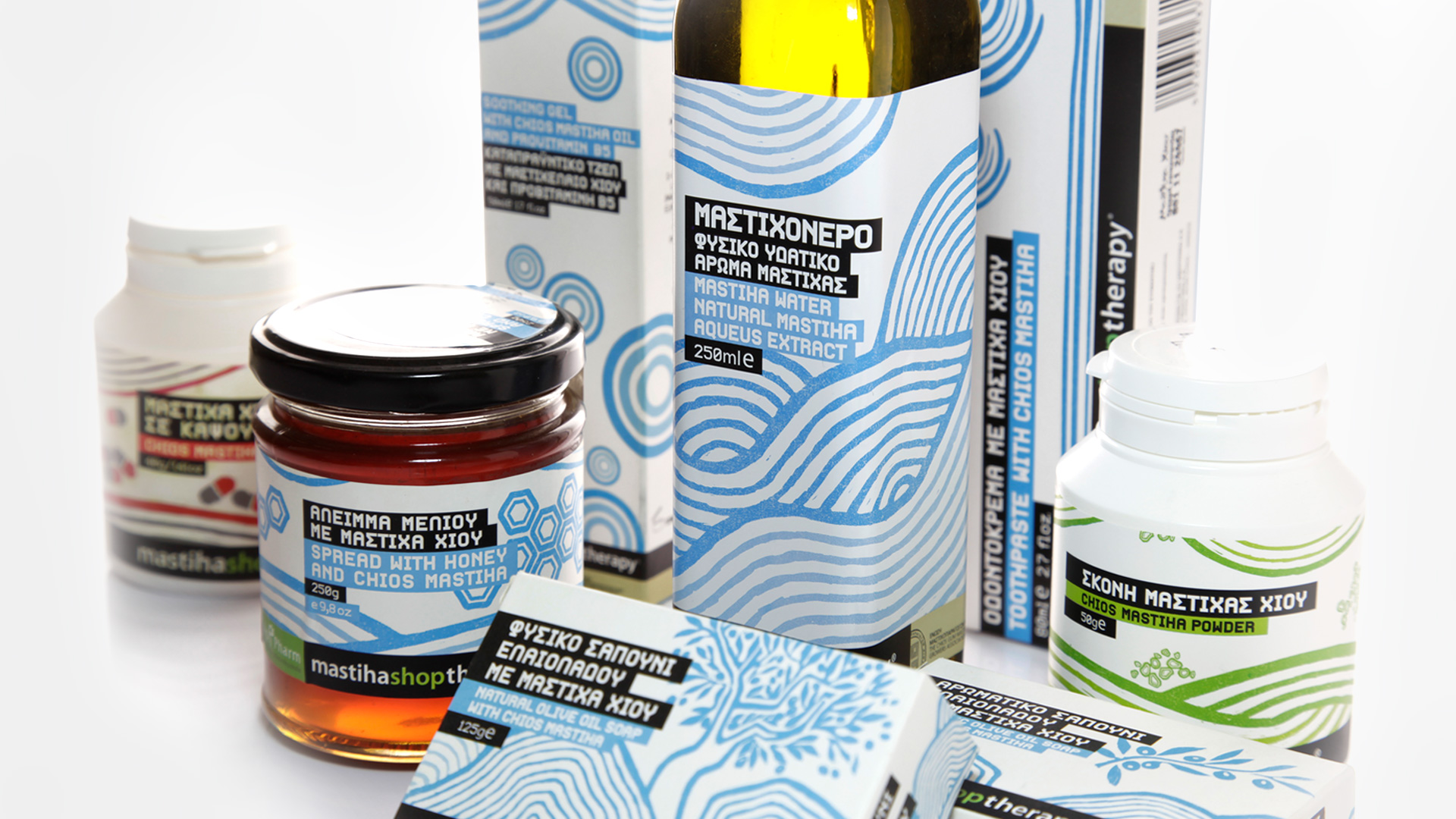
The parapharmaceutical company approached Antonia Skaraki, an Athens-based design agency, to create the brand identity and packaging design of various products the company manufactured.
“The brand identity and packaging should communicate the natural origin of those beauty products and their roots to the tradition of Chios through their active ingredient; Mastic resin.”
The prime idea behind the project was to highlight the origins and the health benefits of the parapharmaceutical products Mastihashop manufactures.
“We needed to approach this project conceptually in a manner that brings its origin and health benefits to the forefront in the entire product range. To achieve this we drew inspiration from nature, the terrain of Chios and agriculture as a means to extract the product. As a protagonist to our concept we decided to pick the mastic tree; the tree that produces the mastic resin.”


The illustrations on the product package are hand-drawn and symbolize their organic origins. In addition to the mastic tree, the illustrations “depict images from the Greek countryside and agriculture.”
The design studio mentions:
“…To reinforce the concept of purity we chose white as a background color. The blue color of the illustrations combines with the white background, not only, to form the distinctly Greek color palette, but also synthesize an image that communicates the purity and natural origin of the


