Designed by TSMGO | Country: Spain
“The task provided by the Project Management Team (TSMGO) to the Design Team (Estudio Moruba) was to create a visual poem that would give personality to each of the creations of Mateo & Bernabé with a graphical design both recognisable and full of meaning.
Each of the varieties of beer would have the personality of a saint (without the liturgy or religious components) to make them more personable. The characteristics of each variety would be seen more clearly and would tell the story of each Saint associated with the place of which he is patron, to invite the commemoration of the saint’s day.”


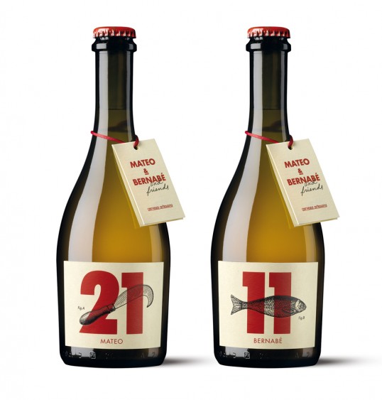
Graphically the use of numbers sets the product apart from the rest of Artisan beers and successfully transmits the sensation of an artisan product made with care and attention to detail. This is then reflected in its well-crafted production and the product cards.


There are three principal elements:
The name of the saint that defines the beer’s personality.
The number that defines the date of their commemoration and creates a collection of beer bottles.
The engraving that reinforces and underpins the story behind the beer.
The tone of the communication is always playful with its message: “Bendita cerveza” (Blessed beer) which has a double meaning as it wants to mineralize its religious component whilst also acknowledging it. ”