Designed by: PepsiCo Design & Innovation
Country: United States

Meadows Honey Gets A Makeover

Designed by: StormBrands | Country: UK

London-based branding agency StormBrands has created the visual identity and packaging range for Meadows Honey, “a honey brand that really does help give back to our planet.”

In addition to creating high-quality honey, Meadows Honey works on protecting the ecological balance by marinating the well-being of the bees.

Meadows Honey mentions the following:

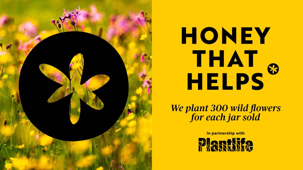
Passionate about bees, meadows and creating high quality honey that showcases nature’s beautiful flowers, the Meadows Honey business was born from a desire to protect the environment and landscape where bees thrive… Our wildflower meadows are therefore perfectly suited for bees and are important for our pollinators and our ecosystem at large, both for sustenance, as well as to provide a place to shelter and breed.

Meadows Honey Gets A Makeover

The packaging

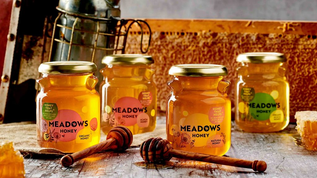
StormBrands were briefed to create the packaging design that communicated the brand story to the consumers. The design agency worked closely with the team at Meadows Honey to create a winning brand identity and packaging design.

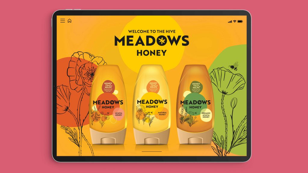
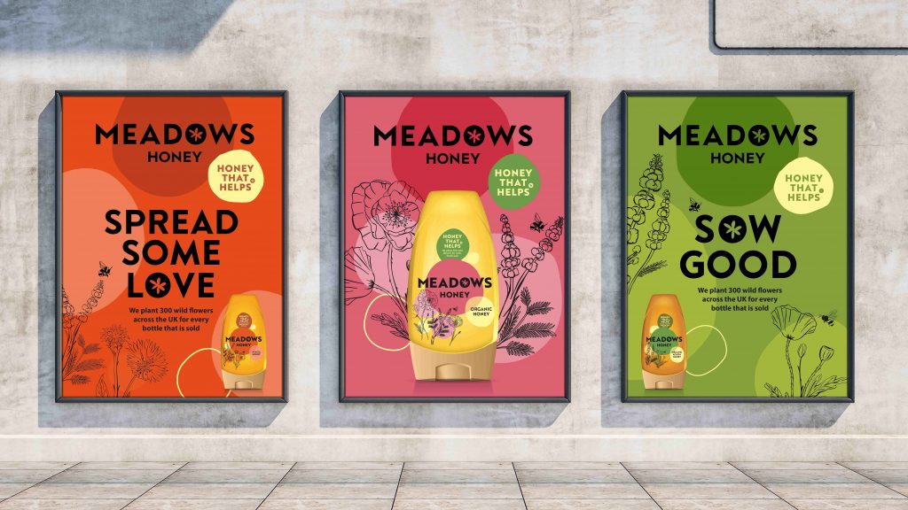
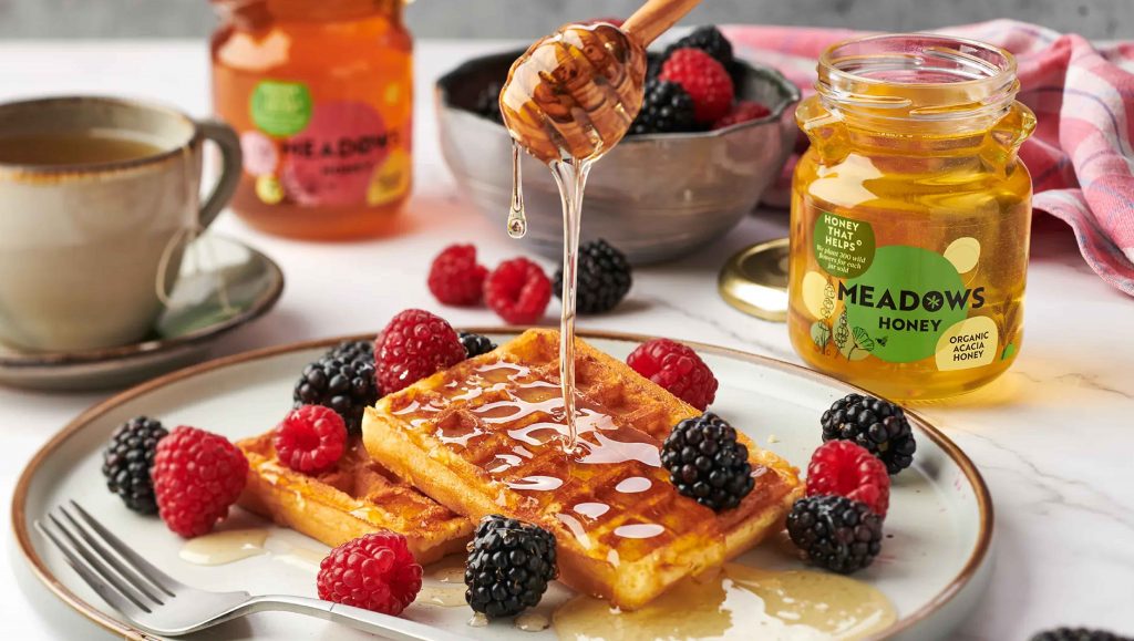
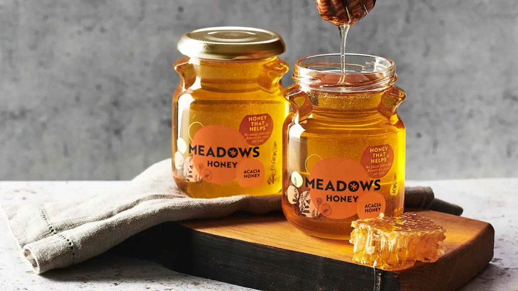
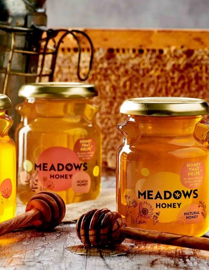
Inspired by wildflower meadows and the bees that call it their home, StormBrands created a fresh and modern look.

Zoe Phillipson, Creative Director at StormBrands, mentioned:

“Our new, fresh, and contemporary visual identity for Meadows Honey communicates the brand’s story through whimsical native wildflower illustrations imbued with summer’s warm rays. The bold, modern wordmark adds character and clarity to the identity, creating a sense of design harmony, while each variant retains its own unique color coding and accompanying organic form, signifying both the honey type and the distinct flowers used to make it.”

Get the latest packaging design inspiration in your inbox:

Popular designs

Over the wave

This Kombucha originates in Lombok, Indonesia, where its paradise beaches attract hundreds of surfers eager to ride the waves. When you surf,

Pure Persian Honey

When we look closely at honey packaging, they are almost all in the usual format, and the ultimate in creativity is that

The Port Vodka Lemon Water

Overview: In response to my client’s vision for a Cape Cod themed beverage brand, I embarked on the journey to create The Port

Designed by: PepsiCo Design & Innovation
Country: United States

Meadows Honey Gets A Makeover

23044_StormBrands_Meadows_Honey_world-brand-design-01

Designed by: StormBrands | Country: UK

London-based branding agency StormBrands has created the visual identity and packaging range for Meadows Honey, “a honey brand that really does help give back to our planet.”

In addition to creating high-quality honey, Meadows Honey works on protecting the ecological balance by marinating the well-being of the bees.

Meadows Honey mentions the following:

Passionate about bees, meadows and creating high quality honey that showcases nature’s beautiful flowers, the Meadows Honey business was born from a desire to protect the environment and landscape where bees thrive… Our wildflower meadows are therefore perfectly suited for bees and are important for our pollinators and our ecosystem at large, both for sustenance, as well as to provide a place to shelter and breed.

Meadows Honey Gets A Makeover

The packaging

StormBrands were briefed to create the packaging design that communicated the brand story to the consumers. The design agency worked closely with the team at Meadows Honey to create a winning brand identity and packaging design.

Inspired by wildflower meadows and the bees that call it their home, StormBrands created a fresh and modern look.

Zoe Phillipson, Creative Director at StormBrands, mentioned:

“Our new, fresh, and contemporary visual identity for Meadows Honey communicates the brand’s story through whimsical native wildflower illustrations imbued with summer’s warm rays. The bold, modern wordmark adds character and clarity to the identity, creating a sense of design harmony, while each variant retains its own unique color coding and accompanying organic form, signifying both the honey type and the distinct flowers used to make it.”

Previous slide
Next slide

Explore more great package design

Get the latest on packaging design in your inbox: