Designed by Cipmann | Country: Croatia
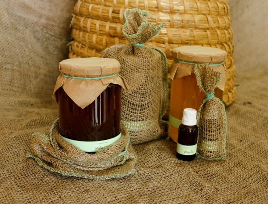
“Cipmann was asked to create visual identity and packaging for the homemade honey and honey-based products that would emphasize their local origin and high quality. We came up with the brand name Mediterra (‘med’ is Croatian word for honey, and ‘terra’ is Latin for land, earth) and the identity that evokes natural balance and puts the bee in the primary focus.
The package design is inspired by traditional jars of homemade food which were extremely simple and had just a name sticker on them. The label on the jar is as simple as it can get. If we would to remove just one more element, it wouldn’t function any more. The color of the honey is actually the primary differentiator between the products, as it was in the old days. We think that the unobtrusive label lets the rich color of the honey speak for itself. And it speaks volumes.
The jar also contains a coaster doubling as a business card, situated under the jar’s ‘cap’ so the jar doesn’t stick to the surface.”