Designed by: PepsiCo Design & Innovation
Country: United States

Melbourne Moonshine

lovely-package-melbourne-moonshine-1

Designed by Sense | Country: Australia

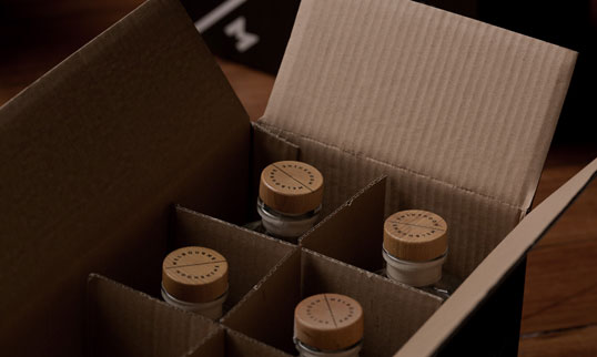
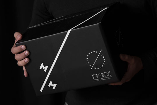
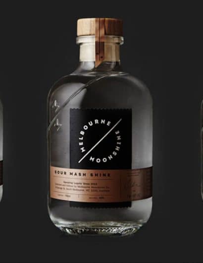
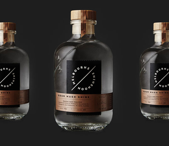
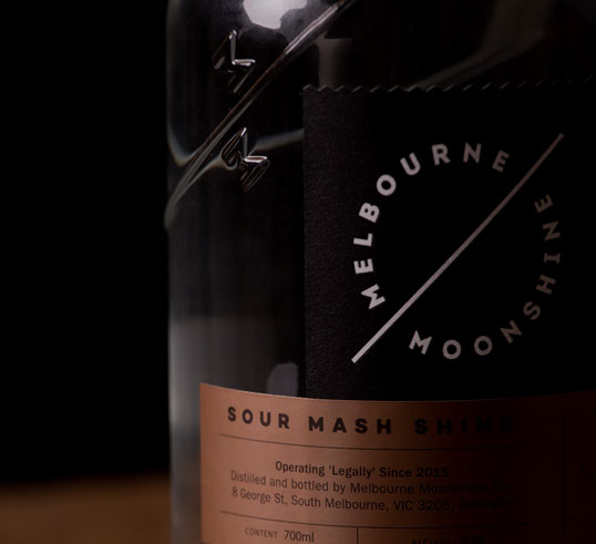
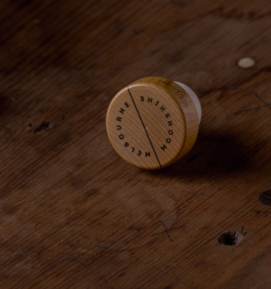
“Melbourne Moonshine is a brand new alcohol firm based out of South Melbourne. For its branding, packaging and website, we drew influences from the bootleg history of moonshine itself, as well as the shape of the celestial moon and the copper of the alembic stills used to create this unique liquor.

Melbourne Moonshine was also the opportunity for Sense to design our first spirit bottle, which made us proud as punch (Moonshine punch, of course).

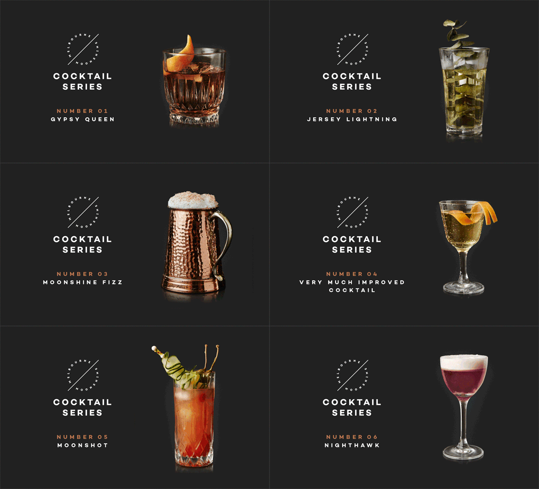
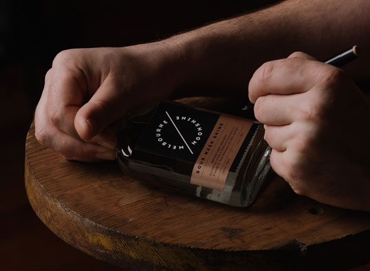
The pillars of this fine drop’s brand identity include photography referencing film noir aesthetics and a tone of voice full of Appalachian jargon and down-home attitude and we can tell you, we had as much fun as a moonshiner sampling from the still working on this job.”
lovely-package-melbourne-moonshine-6 lovely-package-melbourne-moonshine-3 lovely-package-melbourne-moonshine-5 lovely-package-melbourne-moonshine-2 lovely-package-melbourne-moonshine-4 lovely-package-melbourne-moonshine-8

Get the latest packaging design inspiration in your inbox:

Popular designs

Pure Persian Honey

When we look closely at honey packaging, they are almost all in the usual format, and the ultimate in creativity is that

The Bra Guru

Most women are wearing the wrong size bra and that is a fact. The Bra Guru® is the first and only professional

Far Out Bar

Description: Far Out Bar is a cutting-edge packaging design project created for High Life Farms’ macrodose THC chocolate bars. This project involved

Designed by: PepsiCo Design & Innovation
Country: United States

Melbourne Moonshine

lovely-package-melbourne-moonshine-1

lovely-package-melbourne-moonshine-1

Designed by Sense | Country: Australia

“Melbourne Moonshine is a brand new alcohol firm based out of South Melbourne. For its branding, packaging and website, we drew influences from the bootleg history of moonshine itself, as well as the shape of the celestial moon and the copper of the alembic stills used to create this unique liquor.

Melbourne Moonshine was also the opportunity for Sense to design our first spirit bottle, which made us proud as punch (Moonshine punch, of course).

The pillars of this fine drop’s brand identity include photography referencing film noir aesthetics and a tone of voice full of Appalachian jargon and down-home attitude and we can tell you, we had as much fun as a moonshiner sampling from the still working on this job.”
lovely-package-melbourne-moonshine-6 lovely-package-melbourne-moonshine-3 lovely-package-melbourne-moonshine-5 lovely-package-melbourne-moonshine-2 lovely-package-melbourne-moonshine-4 lovely-package-melbourne-moonshine-8

Previous slide
Next slide

Explore more great package design

Get the latest on packaging design in your inbox: