Designed by: PepsiCo Design & Innovation
Country: United States

MidNight

MidNight

Designed by Mucho | Country: United States

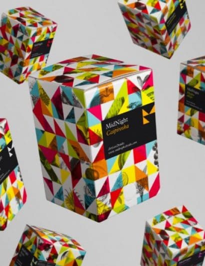
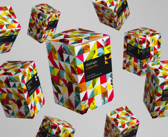
“MidNight drinks is proposing a unique idea for cocktail consumption. Using a simple system involving a backing box with cocktail mixes and a box shaker, their intention is to revolutionize the way people create cocktails both in bars and at home. The cocktail mixes maintain the essence of classic cocktails but this new method results in surprisingly excellent quality cocktails.

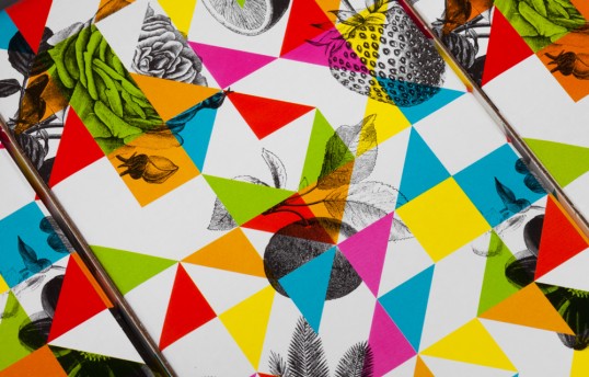
We were invited to generate a new brand identity that could retain the tradition and elegance of cocktail making, whilst reflecting this revolutionary new method. Based on the geometric reinterpretation of the ‘M’ and the ‘N’ in Mid Night we created a system of triangles that when mixed with classic engravings of fruits generate a kaleidoscopic visual language. It really captures this new and fun way of creating cocktails.”

MidNight

MidNight

Get the latest packaging design inspiration in your inbox:

Popular designs

The Bra Guru

Most women are wearing the wrong size bra and that is a fact. The Bra Guru® is the first and only professional

Pure Persian Honey

When we look closely at honey packaging, they are almost all in the usual format, and the ultimate in creativity is that

Burma Love Rebrand

Love at First BiteAs an extension of the Burma Superstar restaurant in San Francisco, Burma Love Foods gives diners an opportunity to

Designed by: PepsiCo Design & Innovation
Country: United States

MidNight

lovely-package-midnight-1

MidNight

Designed by Mucho | Country: United States

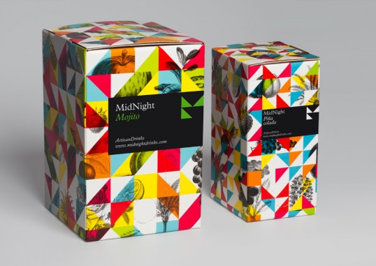
“MidNight drinks is proposing a unique idea for cocktail consumption. Using a simple system involving a backing box with cocktail mixes and a box shaker, their intention is to revolutionize the way people create cocktails both in bars and at home. The cocktail mixes maintain the essence of classic cocktails but this new method results in surprisingly excellent quality cocktails.

We were invited to generate a new brand identity that could retain the tradition and elegance of cocktail making, whilst reflecting this revolutionary new method. Based on the geometric reinterpretation of the ‘M’ and the ‘N’ in Mid Night we created a system of triangles that when mixed with classic engravings of fruits generate a kaleidoscopic visual language. It really captures this new and fun way of creating cocktails.”
MidNight

MidNight

Previous slide
Next slide

Explore more great package design

Get the latest on packaging design in your inbox: