Designed by: PepsiCo Design & Innovation
Country: United States

Mighty Rice

Mighty Rice

Designed by mousegraphics | Country: Greece

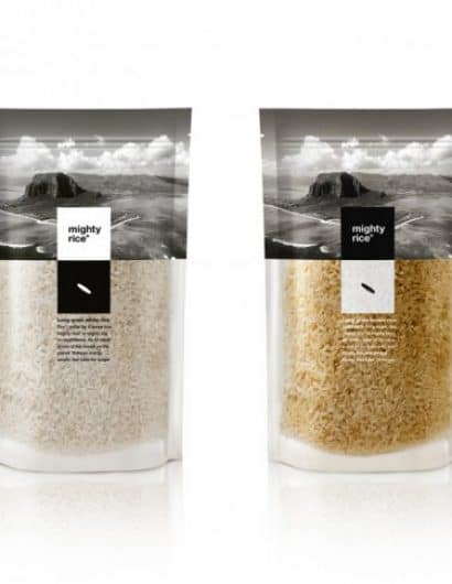
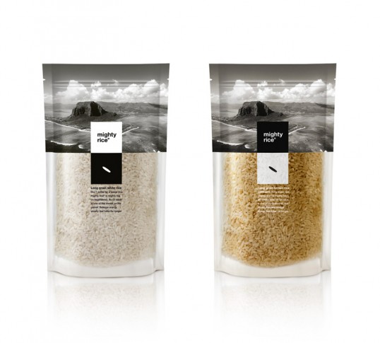
“The briefing (in brief): We want a packaging design that will communicate the difference in quality, the refined character and the exceptional origin of our product. The target audience: An eclectic but low-key clientele. The design: To meet the expectations of an overseas based client was a challenge we accepted with enthusiasm. Our design approach developed through a series of emails and skype calls between Athens and the exotic Mauritius, whilst we gradually absorbed the information that described this food product as ethically cultivated and dynamically positioned in the contemporary market. This experience was incorporated into the design framework. Thus, a mighty combination between the stated, the symbolic and the imaginary emerged. The essence of the island and the grain -the basic unit of every rice production- are rendered visible through clear, dynamic albeit elegant, transparent, duo-chromatic (b&w), non-folkloric design choices.”

Mighty Rice

Get the latest packaging design inspiration in your inbox:

Popular designs

The Bra Guru

Most women are wearing the wrong size bra and that is a fact. The Bra Guru® is the first and only professional

Burma Love Rebrand

Love at First BiteAs an extension of the Burma Superstar restaurant in San Francisco, Burma Love Foods gives diners an opportunity to

Over the wave

This Kombucha originates in Lombok, Indonesia, where its paradise beaches attract hundreds of surfers eager to ride the waves. When you surf,

Designed by: PepsiCo Design & Innovation
Country: United States

Mighty Rice

lovely-package-mighty-rice-1

Mighty Rice

Designed by mousegraphics | Country: Greece

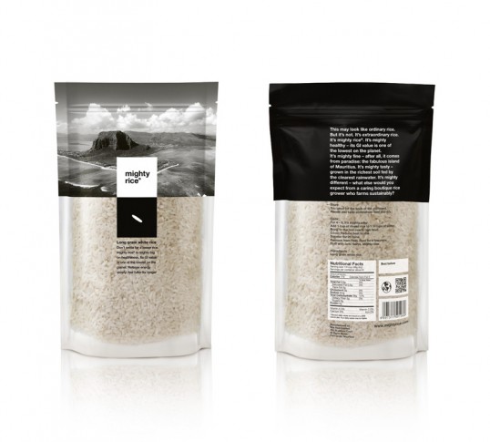
“The briefing (in brief): We want a packaging design that will communicate the difference in quality, the refined character and the exceptional origin of our product. The target audience: An eclectic but low-key clientele. The design: To meet the expectations of an overseas based client was a challenge we accepted with enthusiasm. Our design approach developed through a series of emails and skype calls between Athens and the exotic Mauritius, whilst we gradually absorbed the information that described this food product as ethically cultivated and dynamically positioned in the contemporary market. This experience was incorporated into the design framework. Thus, a mighty combination between the stated, the symbolic and the imaginary emerged. The essence of the island and the grain -the basic unit of every rice production- are rendered visible through clear, dynamic albeit elegant, transparent, duo-chromatic (b&w), non-folkloric design choices.”
Mighty Rice

Previous slide
Next slide

Explore more great package design

Get the latest on packaging design in your inbox: