Designed by Insite Design | Country: Canada
Believe it or not, Canadians share an indelible spirit and commonality — we are hard working, nose to the grindstone underdogs that stop at nothing to get the job done. Despite our modest stature, conservative stiff lips and ever apologetic disposition, we rise to the top when the game bell rings.
Mike Weir embodies this spirit and among his Canadian sport icon peers, stands out as the true Underdog. In sport as in wine, Canadians continue to stand up to the challenges, capitalize on timing and execute on hard work as did Mike Weir leading up to his win of the 2003 PGA Masters.
Mike Weir’s Underdog Wine Co. celebrates all of our achievements as Canadians — you, me, wine, design, sport, innovation — Canada is right there leading the way. Congrats to Mike Weir, Ontario wine and all Canadians.

The Underdog Wine is an extension to Mike Weir’s established and very successful wines of which Insite assisted in the brand creation and package back in 2004. We are particularly excited to have been invited to assist once again to produce the package for Mike Weir Wines.
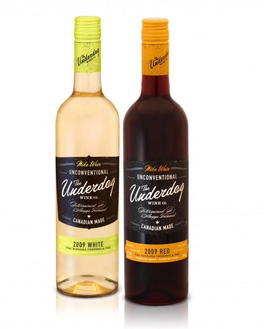
The goal of the new Underdog Wine Co. wine and package is to express the passion, drive and spirit of the Canadian golf icon Mike Weir in a less modest communication than his current ultra premium wine — to tell a different side of the Weir story inclusive of the drive and determination we can all relate to.
Insite worked with the Weir team from the naming stage through print. We believed strongly that there was current equity both in the established branding of Mike Weir Wine but also in the branding of the figure himself including the iconic black attire Weir is known for wearing on the big day of PGA tournaments.
Stylistically we focused heavily on classic type usage to assist in asserting personality while telling the Underdog story on the label. Textural elements as well as embossing reflect the tactile quality of materials that celebrate sport history such as trophies, patches and awards. The result is what we hope to be a sparky and somewhat sporty option for appreciators of Canadian wine.