Designed by: PepsiCo Design & Innovation
Country: United States

Moma

Moma

Designed by Pearlfisher | Country: United Kingdom

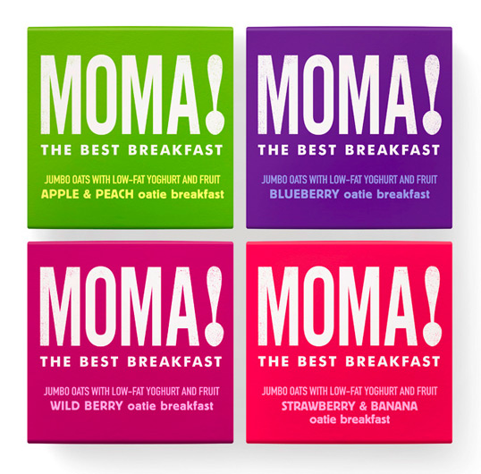
“Launched in 2006, Moma challenged the ‘coffee and croissant’ breakfast by producing healthy, energising and delicious take-away breakfast options based on a version of the ‘bircher muesli’. From one initial stall at Waterloo station, Moma now has eight custom built stalls in Central London railway stations and also supplies many other outlets, offices and business including Virgin Atlantic, the BBC and Selfridges.

Pearlfisher Creative Director Natalie Chung, said, “The brand has done phenomenally well in a relatively short space of time but needed to create greater stand out and impact. We took the power of the language and robustness of political campaigns as our ‘muse’ and essentially created a ‘ call to action’ element within the packaging and identity. The new colour palette is natural and foody but the design and typography is deliberately bold, direct and motivational to reflect the single-minded nature of the food offer.”

Moma

Get the latest packaging design inspiration in your inbox:

Popular designs

Designed by: PepsiCo Design & Innovation
Country: United States

Moma

moma1

Moma

Designed by Pearlfisher | Country: United Kingdom

“Launched in 2006, Moma challenged the ‘coffee and croissant’ breakfast by producing healthy, energising and delicious take-away breakfast options based on a version of the ‘bircher muesli’. From one initial stall at Waterloo station, Moma now has eight custom built stalls in Central London railway stations and also supplies many other outlets, offices and business including Virgin Atlantic, the BBC and Selfridges.

Pearlfisher Creative Director Natalie Chung, said, “The brand has done phenomenally well in a relatively short space of time but needed to create greater stand out and impact. We took the power of the language and robustness of political campaigns as our ‘muse’ and essentially created a ‘ call to action’ element within the packaging and identity. The new colour palette is natural and foody but the design and typography is deliberately bold, direct and motivational to reflect the single-minded nature of the food offer.”

Moma

Explore more great package design

Get the latest on packaging design in your inbox: