Designed by: PepsiCo Design & Innovation
Country: United States

Monga Design Creates The Brand Identity For Pray Coffee Bar

Designed by: Monga Design | Country: South Korea

While jazz is similar to other genres of music in terms of rhythm, melody, and harmony, the element of improvisation sets it apart from other forms. Give a jazz musician some space, and he will improvise on the spot. Pray Coffee Bar, a South Korean jazz-themed bar, reflects the creator’s love and passion for the music.

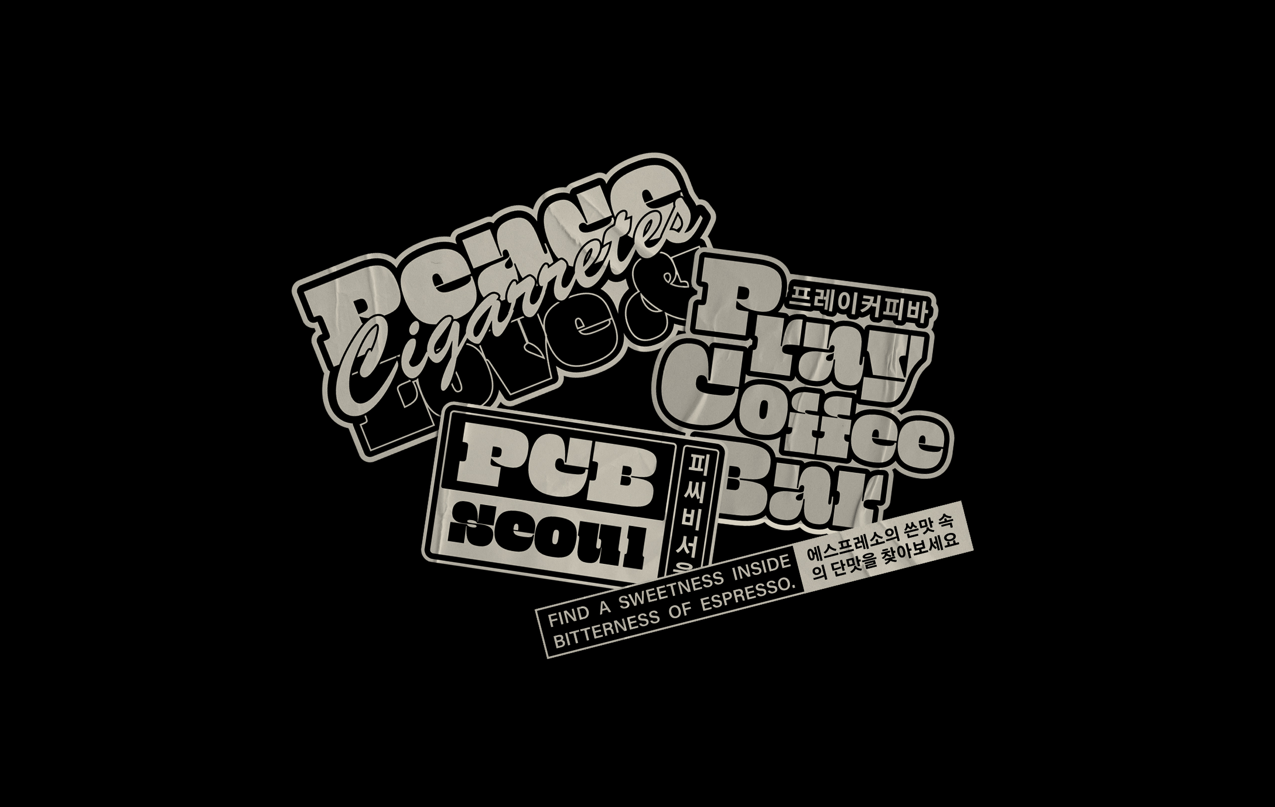
“…The entire environment of the place was thought to reflect the passion of its creator for jazz from the 50s to the 70s, with many records of the musical style and equipment that reproduces the atmosphere of the time, such as the “radio valve” McIntosh 240, the C22 and an Altec A5 that was used in theaters during the 60s. The name Pray Coffee Bar was inspired by the feelings that this musical style evokes, referring to a time, not so distant, when people “prayed” for values such as freedom and human rights…”
Monga Design Creates The Brand Identity For Pray Coffee Bar

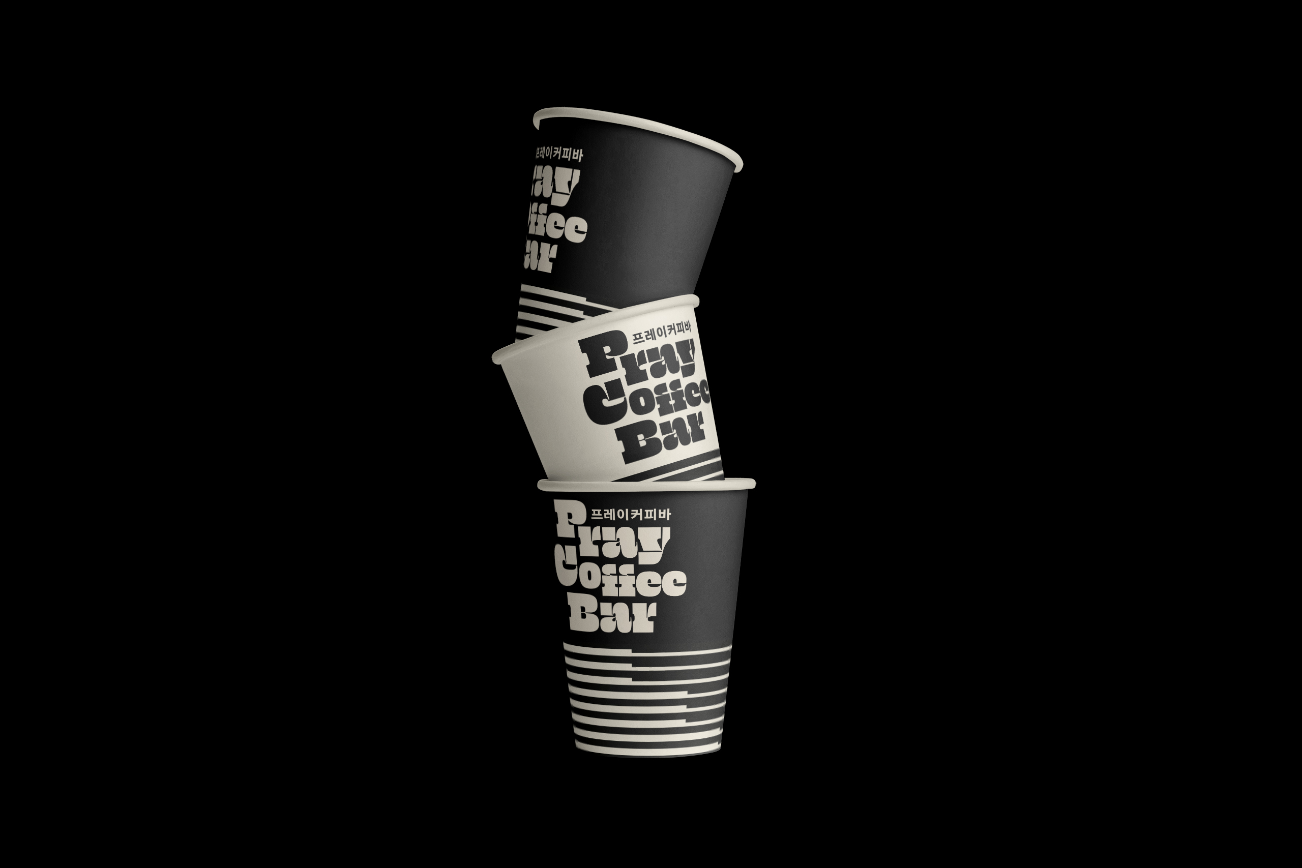
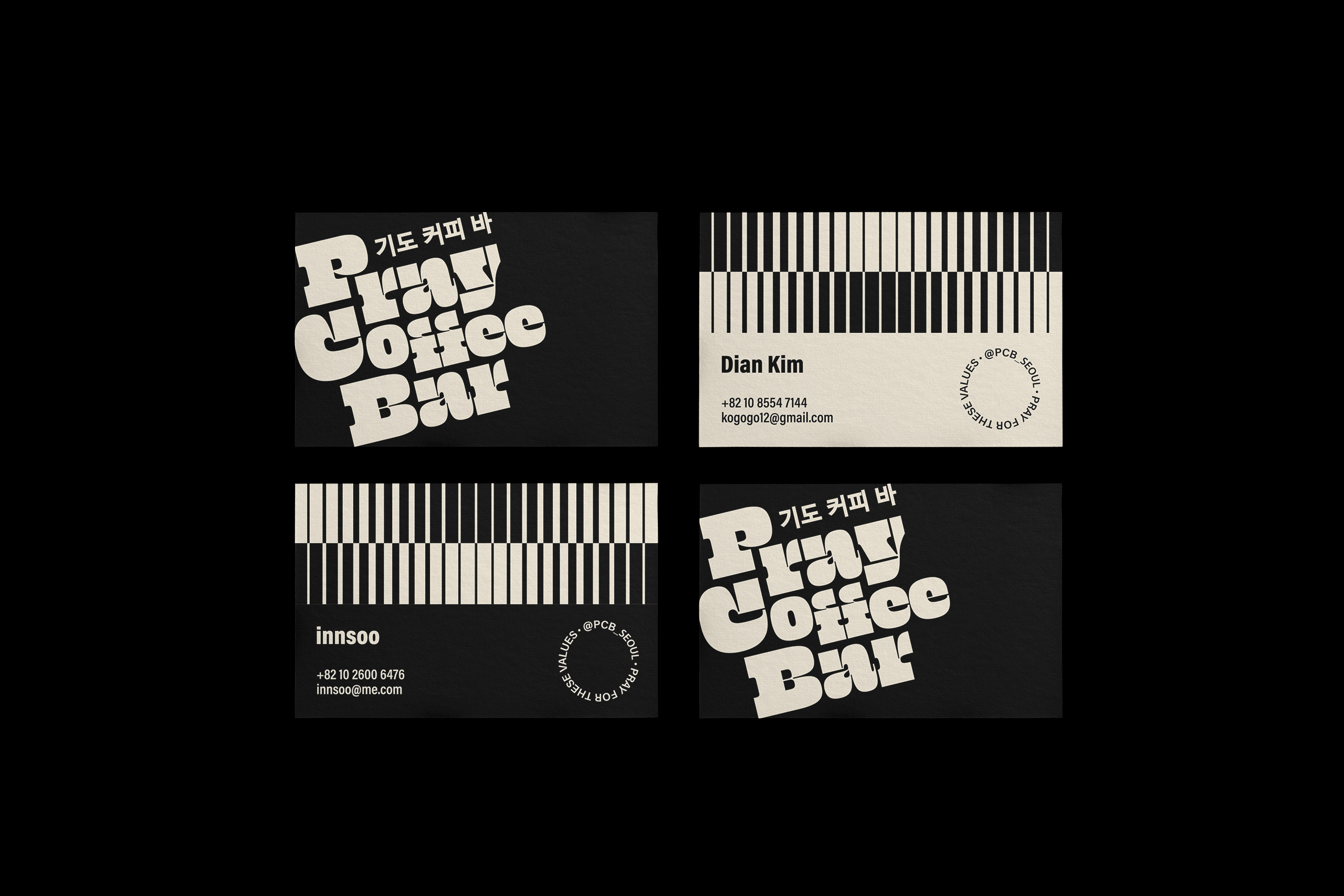
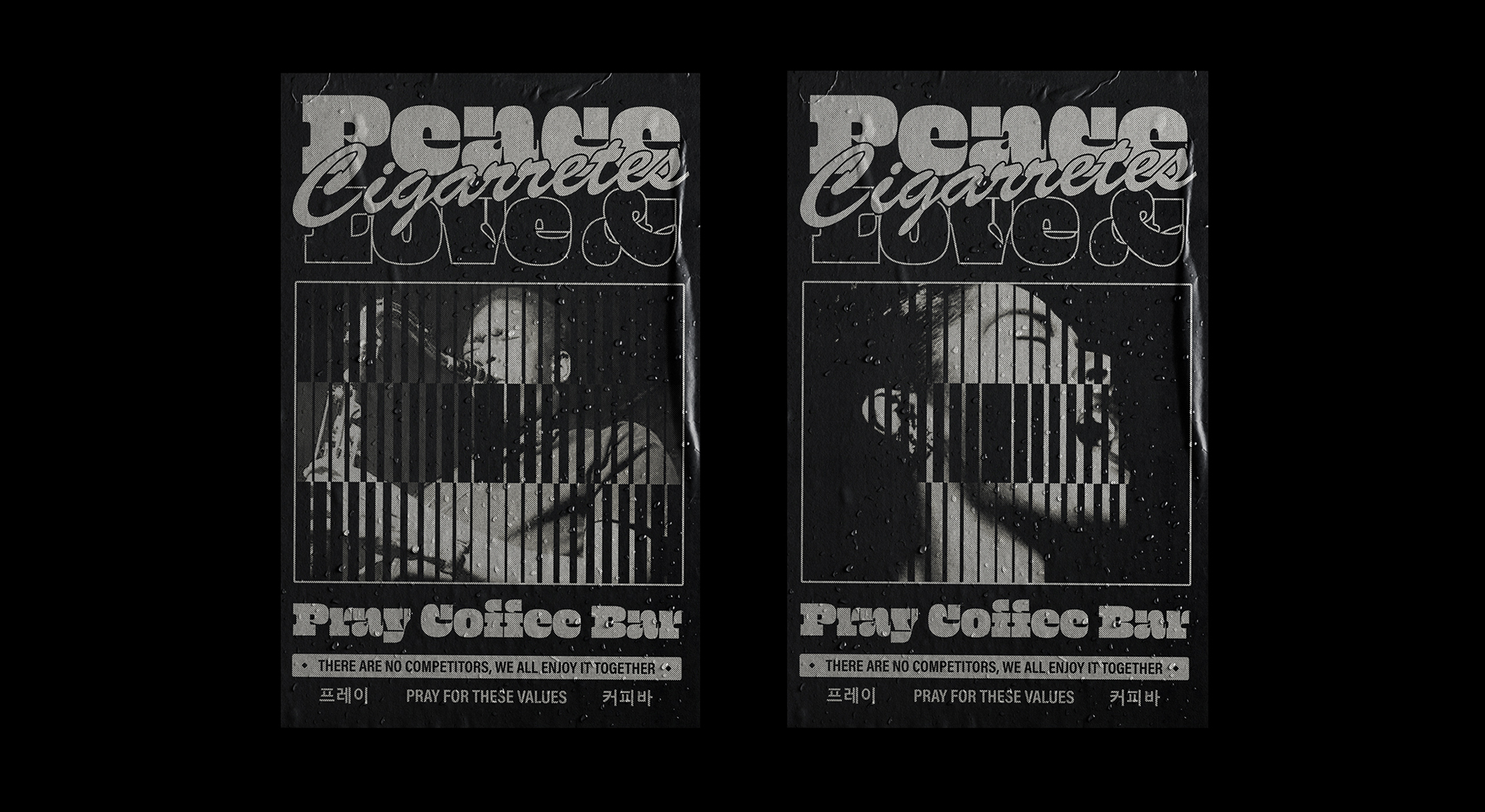
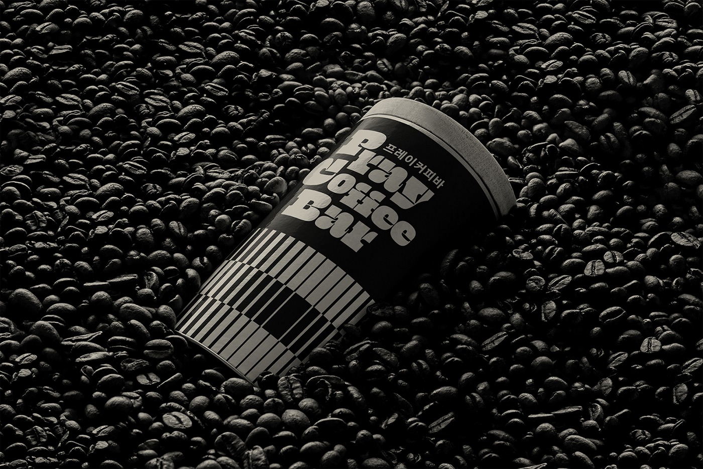
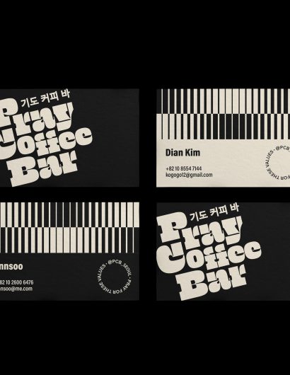
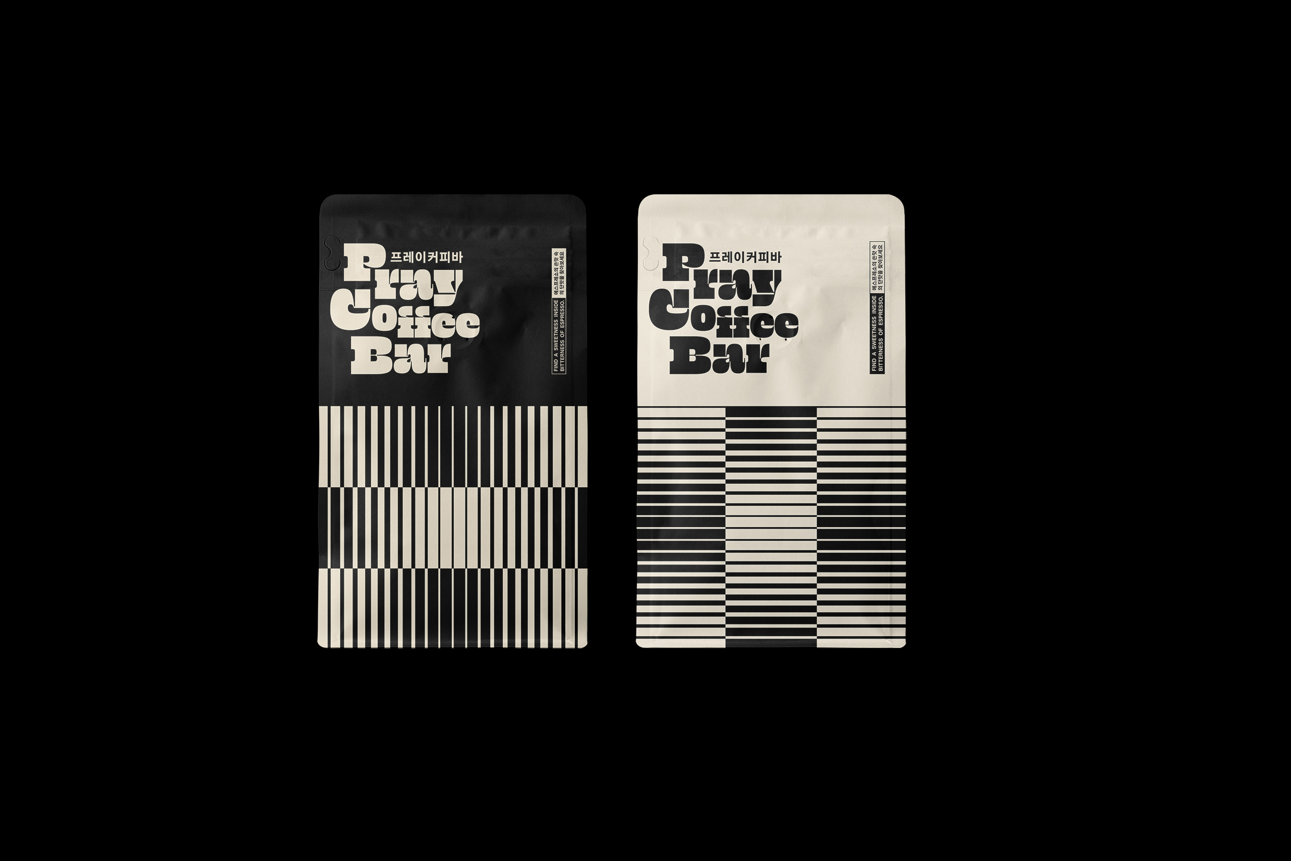
From the packaging design to the theme, Pray Coffee Bar screams jazz. The horizontal and vertical lines in black and white symbolize the main musical instruments used in this genre of music, such as piano and bass. The black-and-white color palette creates the ambiance of a bygone era when jazz was at its peak.

“To select 1950’s-1980’s jazz with the artistic audio equipment of the period.

So, to pursue our new image, inspired jazz music label.

Freedom, Human rights, Peace. In hindsight, it seems so obvious, but it took some robust will to make it happen in 1950’s-1970’s

Somewhere, some era, some people “Pray” those values.”

Get the latest packaging design inspiration in your inbox:

Popular designs

Far Out Bar

Description: Far Out Bar is a cutting-edge packaging design project created for High Life Farms’ macrodose THC chocolate bars. This project involved

Pure Persian Honey

When we look closely at honey packaging, they are almost all in the usual format, and the ultimate in creativity is that

Designed by: PepsiCo Design & Innovation
Country: United States

Monga Design Creates The Brand Identity For Pray Coffee Bar

62

Designed by: Monga Design | Country: South Korea

While jazz is similar to other genres of music in terms of rhythm, melody, and harmony, the element of improvisation sets it apart from other forms. Give a jazz musician some space, and he will improvise on the spot. Pray Coffee Bar, a South Korean jazz-themed bar, reflects the creator’s love and passion for the music.

“…The entire environment of the place was thought to reflect the passion of its creator for jazz from the 50s to the 70s, with many records of the musical style and equipment that reproduces the atmosphere of the time, such as the “radio valve” McIntosh 240, the C22 and an Altec A5 that was used in theaters during the 60s. The name Pray Coffee Bar was inspired by the feelings that this musical style evokes, referring to a time, not so distant, when people “prayed” for values such as freedom and human rights…”
Monga Design Creates The Brand Identity For Pray Coffee Bar

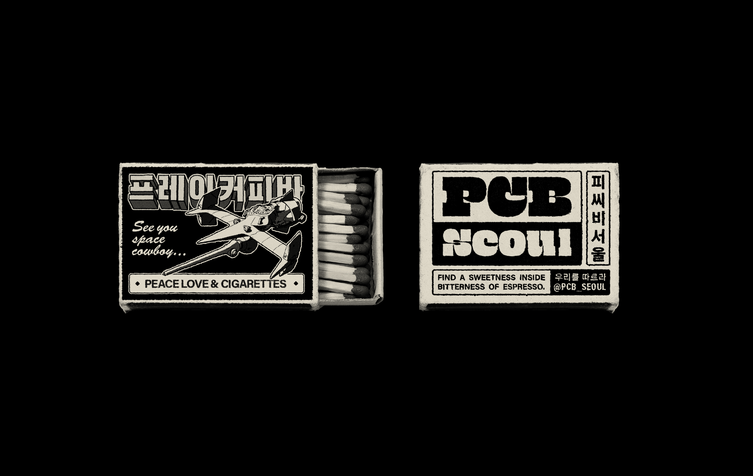
From the packaging design to the theme, Pray Coffee Bar screams jazz. The horizontal and vertical lines in black and white symbolize the main musical instruments used in this genre of music, such as piano and bass. The black-and-white color palette creates the ambiance of a bygone era when jazz was at its peak.

“To select 1950’s-1980’s jazz with the artistic audio equipment of the period.

So, to pursue our new image, inspired jazz music label.

Freedom, Human rights, Peace. In hindsight, it seems so obvious, but it took some robust will to make it happen in 1950’s-1970’s

Somewhere, some era, some people “Pray” those values.”

https://www.youtube.com/watch?v=iksaUu0E4gI

Previous slide
Next slide

Explore more great package design

Get the latest on packaging design in your inbox: