Designed by Stocks Taylor Benson | Country: United Kingdom
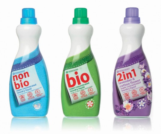
“Brief: laundry care is a complex segment. With a huge array of product types and product formats, the key to solving the brief was to clarify and simplify on pack messaging and create shelf standout for consumers.
The various product types (e.g. Bio, Non Bio, 2 in 1s and Colours) and their benefits are the key messages. Then within each type a variety of different formats are available (tablets, capsules, powders, liquids and gels and super concentrates).
Creative Solution: steering away from the rather dated category norm imagery of flowers, butterflies, mothers hugging children and scientific whooshes, the revamped range focuses on a simple, strong design concept that mimics fabric care labels found on clothing. This ties the complete range together and still allows for the important differences between product type and format to be clearly identified.
This ‘label’ design concept cleverly allows further key messages to be conveyed. The background fabric changes for product type. For example, a soft fleece fabric is used for Non Bio. Secondary messages, such as number of washes and washing temperatures, are displayed as icons done in the style of washing instructions found on clothing labels.
In a world populated all too often with copycat design when it comes to own label packaging, the goal was to break convention and create category busting designs that will clean up against the competition.”