Designed by: PepsiCo Design & Innovation
Country: United States

MYSTERIUM

MYSTERIUM

Designed by Spotlight | Country: Romania

“Jidvei’s owner, one of the most competitive wine producers in Romania, decided to develop a new limited wine series designed to address a market segment well known for its general distrust towards the wine products: the night clubs/lounge bars arena. Our client needed a packaging concept that will standout among the much shinier presence of beer, liqueurs and other spirits.

The concept of the MYSTERIUM wines has originated in the secret of their making. Blended from up to three hand-picked grape varieties, the making of each MYSTERIUM bottle is a well kept oenological secret so that the final product shall be a mystery in itself, ready to be tasted and discovered.”

MYSTERIUM

MYSTERIUM

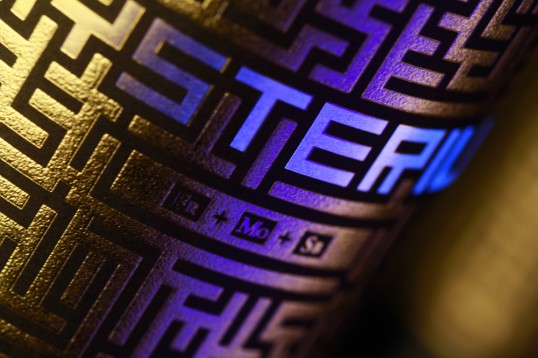
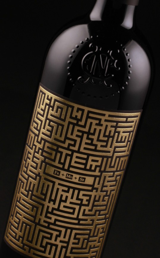
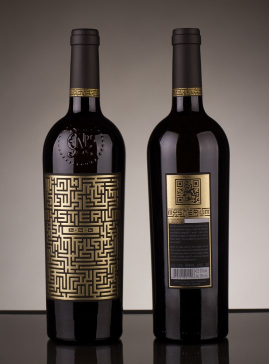
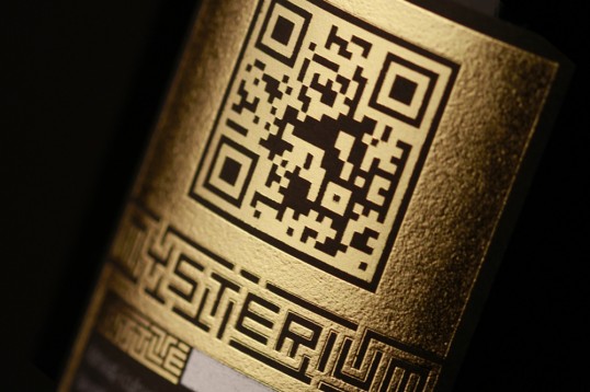
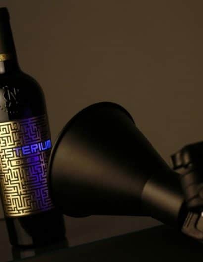
“We translated the story into labels by choosing to reveal the wine’s mystery only in a special light. We decided that a labyrinth themed pattern would be the perfect place to hide a secret and choosing gold foil would give the label a great texture in low-key illuminated places. Furthermore, we crafted a typeface that would blend seamlessly into the label’s labyrinth and silk screened with ultraviolet ink the wine’s name. As for les connaiseurs, if one is intrigued by the taste, one will be pleased to discover that the grape varieties used in the wine blend are coded in an intuitive manner in the central part of the label. For the rest of us clubbers, there is a QR foiled in gold on the back.”

MYSTERIUM

MYSTERIUM

Get the latest packaging design inspiration in your inbox:

Popular designs

Designed by: PepsiCo Design & Innovation
Country: United States

MYSTERIUM

lovely-package-mysterium1

MYSTERIUM

Designed by Spotlight | Country: Romania

“Jidvei’s owner, one of the most competitive wine producers in Romania, decided to develop a new limited wine series designed to address a market segment well known for its general distrust towards the wine products: the night clubs/lounge bars arena. Our client needed a packaging concept that will standout among the much shinier presence of beer, liqueurs and other spirits.

The concept of the MYSTERIUM wines has originated in the secret of their making. Blended from up to three hand-picked grape varieties, the making of each MYSTERIUM bottle is a well kept oenological secret so that the final product shall be a mystery in itself, ready to be tasted and discovered.”

MYSTERIUM

MYSTERIUM

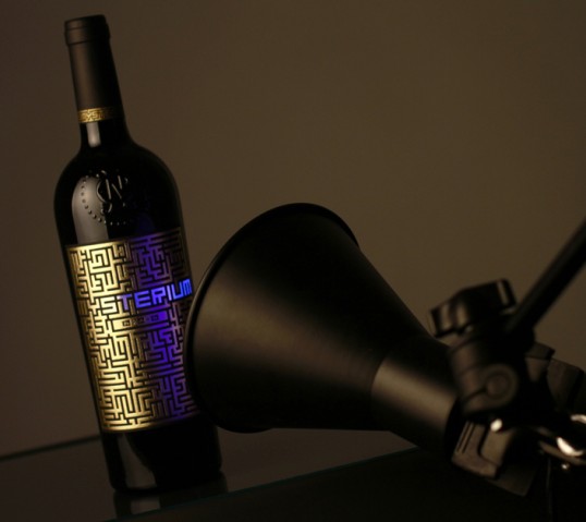
“We translated the story into labels by choosing to reveal the wine’s mystery only in a special light. We decided that a labyrinth themed pattern would be the perfect place to hide a secret and choosing gold foil would give the label a great texture in low-key illuminated places. Furthermore, we crafted a typeface that would blend seamlessly into the label’s labyrinth and silk screened with ultraviolet ink the wine’s name. As for les connaiseurs, if one is intrigued by the taste, one will be pleased to discover that the grape varieties used in the wine blend are coded in an intuitive manner in the central part of the label. For the rest of us clubbers, there is a QR foiled in gold on the back.”
MYSTERIUM

MYSTERIUM

Explore more great package design

Get the latest on packaging design in your inbox: