Designed by Bleublancrouge | Country: Canada | Fonts used: Estilo
The Du Minot Cider Mill has asked Bleublancrouge to update the brand image of their Mystique Cider. Robert Demoy, owner of the Du Minot Cider Mill,
chose to place more emphasis on the quality of their product by giving up the carbonation process to produce cider fermented in vats, resulting in a natural effervescence. What the cider gains in refinement and sophistication, however, is the result of a more costly production method. Due to an overall increase in price and quality, it was time to reposition the product on the market.
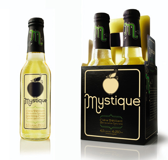
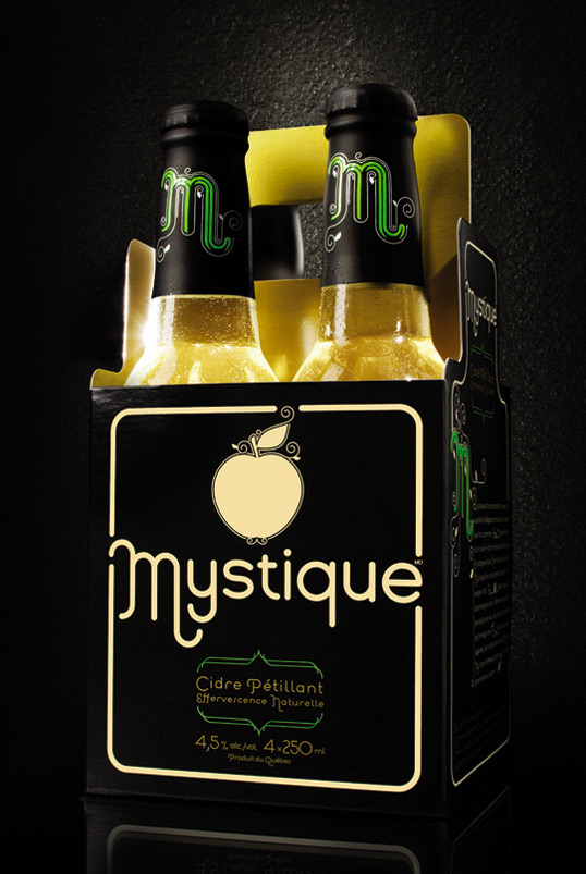
The overall objective is for their sparkling cider to stand out from the rest, to better define their target clientele and to update and refresh their brand image. The old packaging, a six-pack case of 341ml bottles, pretty much identical to beer packaging in most respects, is being replaced by a more refined 250 ml bottle in an open-top four-pack. “The clientele is undoubtedly more feminine,” explains Robert Demoy, “and since people don’t drink cider as fast as beer, I thought that perhaps the 250 ml bottle was a more appropriate format.”
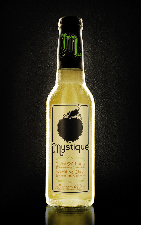
Taking the theme of the Garden of Eden and the apple of temptation, Creative Director, Marie-Hélène Trottier, and Graphic Designer, Joe Lapalme, mixed it
up a bit with a dash of Art Nouveau. “We wanted to emphasize the natural element by showcasing the bubbly, playful aspect of the product. Drawing
inspiration from nature, the Art Nouveau movement was the best way to communicate Mystique Cider’s characteristics. The flourishes heighten the overall experience and visual image of the entire theme.”
The colours are elegant, refined and sparkling, representative of the natural qualities and characteristics of the product. Although women are the main target market, the dark, sober packaging and use of the colour black will likely entice the male market as well. The lime green letter ‘M’ on the matte black foil that tops off the cap brings out both the freshness and tartness of the apples.
The elegant black box contrasted with the clear bottle gives an interesting variation without interfering with brand recognition. “We wanted to emphasize the golden colour of the cider, so the solution was to open up the four-pack, put a metallic gold finish on the inside of the box, making the colour of the product stand out nicely against the matte black finish.”
The refinement and sophistication of this cider is similar to wine, at the same time, it also has the familiar friendly quality of beer. We had to develop a unique visual language in order to effectively describe and convey the natural characteristics of the product as well as the specifications of the offer.
Client: Du Minot Cider Mill
Creative Director: Marie-Hélène Trottier
Art Direction and Design: Joe Lapalme
Copywriting: Guillaume Blanchet
Computer Graphic Design: Normand Terrault
Account Services: Caroline Desvaux
Package Photos: David de Stefano


