


Designed by: Luminous Design Group | Country: Greece
Greece-based creative agency Luminous Design Group has created the packaging for Mythos, a popular Greek beer company. Luminous based its packaging idea on the beer brand’s motto, “There’s a myth everywhere.”
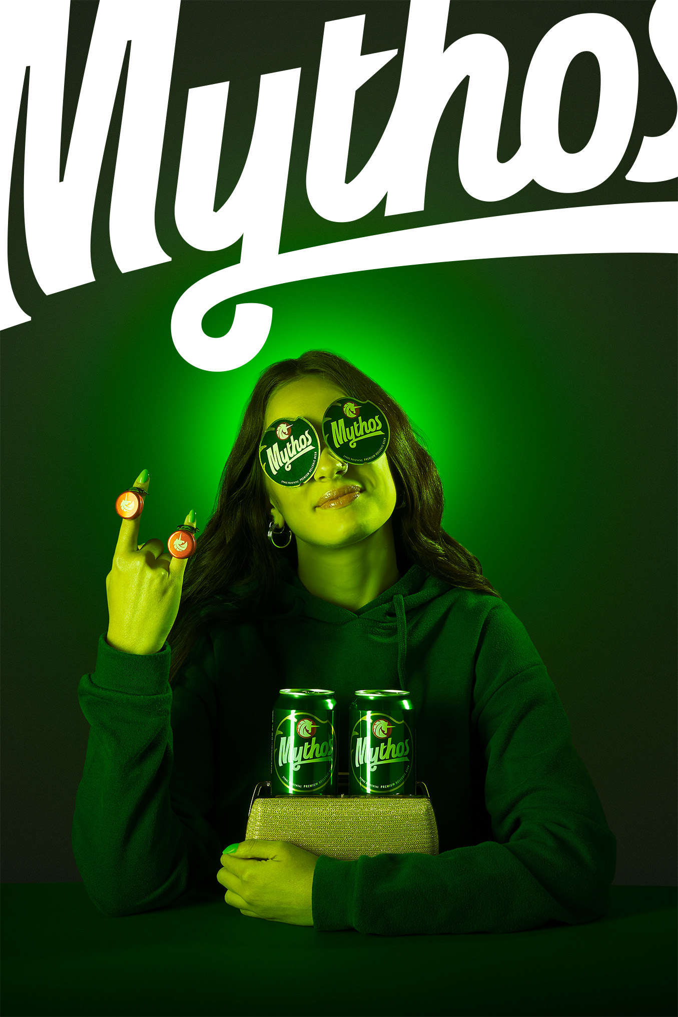
“…Our goal was to redesign the unicorn symbol in a way that conveys the brand values. The new design consists of clean lines and shapes, achieving a braver, more confident approach. In a closer look, its mane resembles sun rays, while the design on its top resembles sea waves as reference to the liquid element and Greek spirit found in the tagline “Hellenic Premium Beer”.


The centerpiece of the packaging design is the unicorn and the italic typography. The typography provides a sense of motion, letting the consumers know that a unicorn cannot be caught.
“The creation of a unique label die-cut which can also be applied to the cans as a graphic element, was deemed necessary. The uniqueness of the identity was enhanced, while unnecessary information and talkative design elements were dropped, achieving a refreshed image, supporting the brand’s storytelling.”


