Designed by: PepsiCo Design & Innovation
Country: United States

Naughty But Rice

lovely-package-naughty-but-rice-8

Designed by Robot Food | Country: United Kingdom

“Rice pudding is rising in popularity, and to coincide with the trend, The Hain Daniels Group has launched Naughty But Rice, a vibrant new brand with a bit of a twist. The clue’s in the name. Naughty But Rice brings pud lovers all the heart and soul of traditional rice pudding with a deliciously contemporary edge.

Leeds-based brand and design agency, Robot Food, are well-known for their daring challenger approach, and were asked to help create the brand look, feel and packaging. Leaving behind the tired, whimsical category cues of old, the team came up with the strap-line, ‘Rice pudding. But not as you know it’, and got to work on a strikingly indulgent aesthetic that deliberately disregards the category’s moody, rather serious look and feel.”

lovely-package-naughty-but-rice-1 lovely-package-naughty-but-rice-2 lovely-package-naughty-but-rice-6 lovely-package-naughty-but-rice-3 lovely-package-naughty-but-rice-7 lovely-package-naughty-but-rice-4

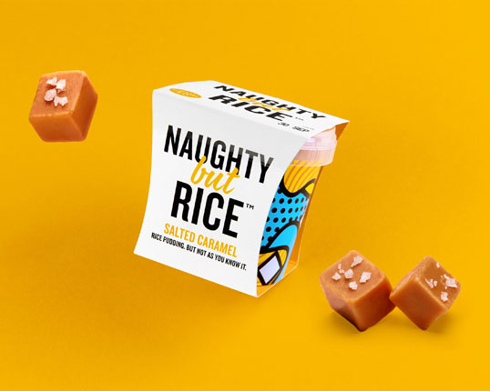
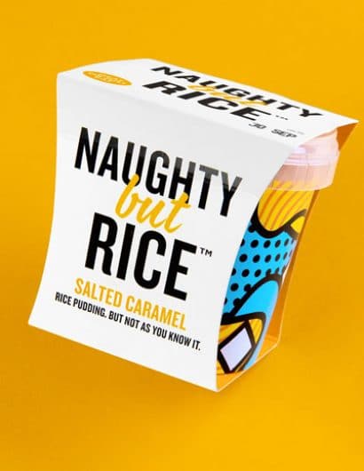
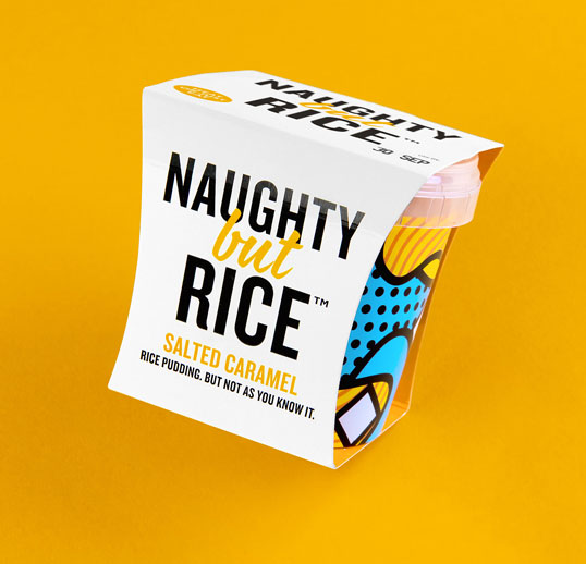
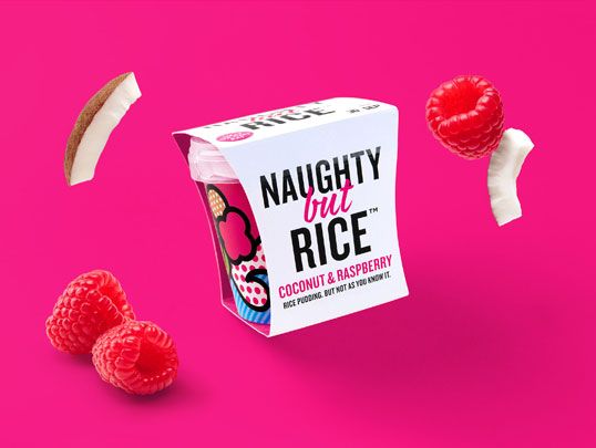
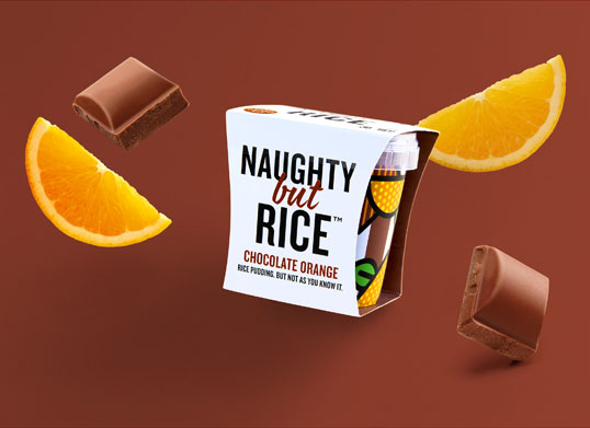
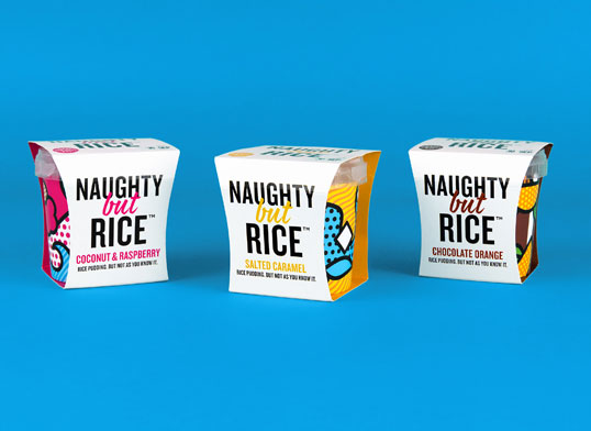
“At first glance, the pack design is fresh and clean with plenty of pure white space to suggest dairy cues. The other side of the card uses bold contrasting colours to reveal each variant’s ‘naughty’ side and encapsulate the brand’s personality – cerise for Coconut & Raspberry, orange for Salted Caramel, and rich brown for Chocolate Orange.”

The pots themselves are the piece de résistance, the goal to be impactful. True to the brand personality, the pot designs defy convention with vivd, brightly coloured illustrations (with no branding) to represent the dynamic flavours. 

Jeremy Hudson, CEO, The Hain Daniels Group said, “We are delighted with Robot Food’s contribution to the project, the packaging is very different to anything already on shelf. Naughty But Rice is now our most successful new brand launch to date with listings in Asda, Morrisons, Sainsbury’s and Booths.”

Simon Forster, Creative Director at Robot Food, said, “We distilled the brief down to ‘rice pudding, reinvented’. With such indulgent flavours, we had to push the boat out to tickle contemporary taste buds but rein it in enough to attract the more old-school rice pudding fans too. We think the results strike a pretty tasty balance.”

lovely-package-naughty-but-rice-5

Get the latest packaging design inspiration in your inbox:

Popular designs

Dama Blanca: Packaging Design for Salt of Cádiz

Discover the artisanal salt packaging design for Dama Blanca, a family project from Salinas of Cádiz. The design reflects the brand’s 3000-year history, authenticity and love for the sea, using natural materials and a sea-inspired palette.

Designed by: PepsiCo Design & Innovation
Country: United States

Naughty But Rice

lovely-package-naughty-but-rice-8

lovely-package-naughty-but-rice-8

Designed by Robot Food | Country: United Kingdom

“Rice pudding is rising in popularity, and to coincide with the trend, The Hain Daniels Group has launched Naughty But Rice, a vibrant new brand with a bit of a twist. The clue’s in the name. Naughty But Rice brings pud lovers all the heart and soul of traditional rice pudding with a deliciously contemporary edge.

Leeds-based brand and design agency, Robot Food, are well-known for their daring challenger approach, and were asked to help create the brand look, feel and packaging. Leaving behind the tired, whimsical category cues of old, the team came up with the strap-line, ‘Rice pudding. But not as you know it’, and got to work on a strikingly indulgent aesthetic that deliberately disregards the category’s moody, rather serious look and feel.”
lovely-package-naughty-but-rice-1 lovely-package-naughty-but-rice-2 lovely-package-naughty-but-rice-6 lovely-package-naughty-but-rice-3 lovely-package-naughty-but-rice-7 lovely-package-naughty-but-rice-4

“At first glance, the pack design is fresh and clean with plenty of pure white space to suggest dairy cues. The other side of the card uses bold contrasting colours to reveal each variant’s ‘naughty’ side and encapsulate the brand’s personality – cerise for Coconut & Raspberry, orange for Salted Caramel, and rich brown for Chocolate Orange.”

The pots themselves are the piece de résistance, the goal to be impactful. True to the brand personality, the pot designs defy convention with vivd, brightly coloured illustrations (with no branding) to represent the dynamic flavours. 

Jeremy Hudson, CEO, The Hain Daniels Group said, “We are delighted with Robot Food’s contribution to the project, the packaging is very different to anything already on shelf. Naughty But Rice is now our most successful new brand launch to date with listings in Asda, Morrisons, Sainsbury’s and Booths.”

Simon Forster, Creative Director at Robot Food, said, “We distilled the brief down to ‘rice pudding, reinvented’. With such indulgent flavours, we had to push the boat out to tickle contemporary taste buds but rein it in enough to attract the more old-school rice pudding fans too. We think the results strike a pretty tasty balance.”
lovely-package-naughty-but-rice-5

Previous slide
Next slide
Get the latest on packaging design in your inbox: