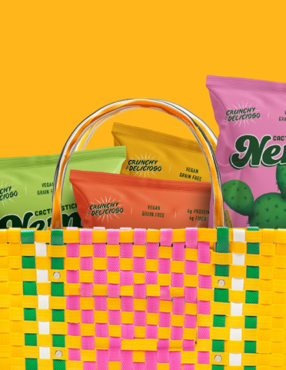
Designed by: Mamba Studio | Country: Mexico
Nemi Snacks come packed with traditional Mexican flavors. The packaging designs represent Mexico in a meaningful and respectful way. Apart from the packaging, the design studio worked on the branding of Nemi.
“The new logo was designed inspired by traditional Mexican iconography that can be found on the streets of most Mexican cities but adding a contemporary look that merges tradition with modernity to denote a dynamic and up-to-date product. The bold colors, round edges on the typography and the lively energy of the logo itself was achieved summarizing the features of the product.”
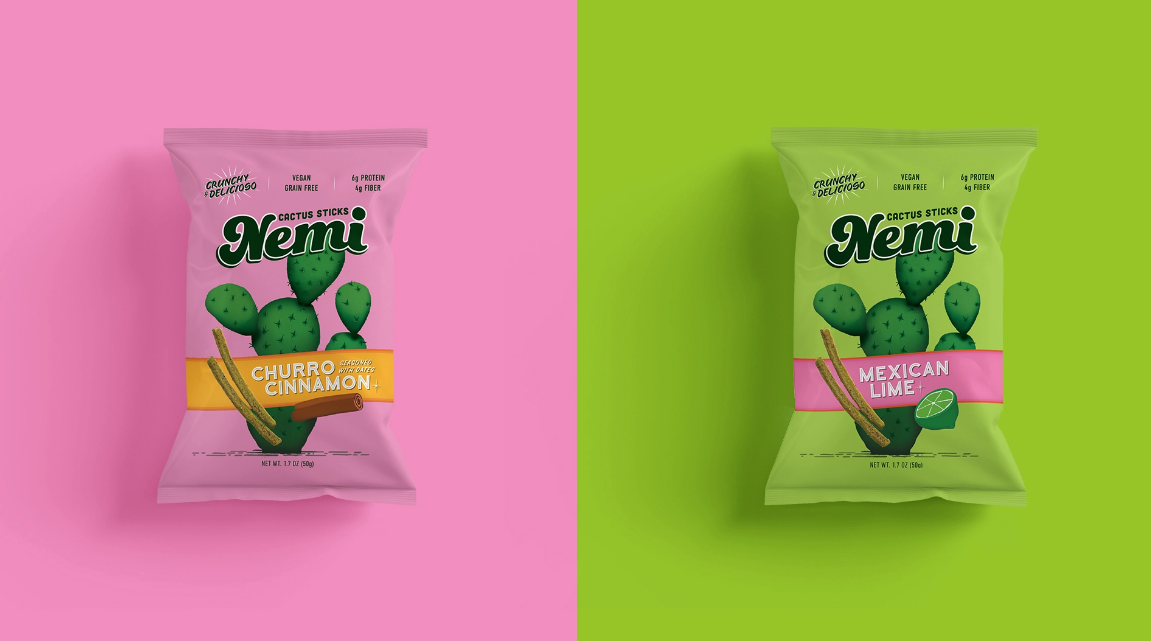
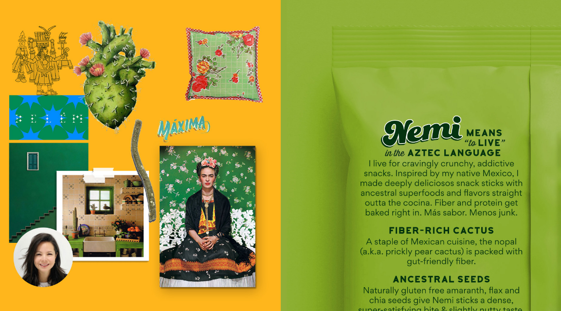
The packaging
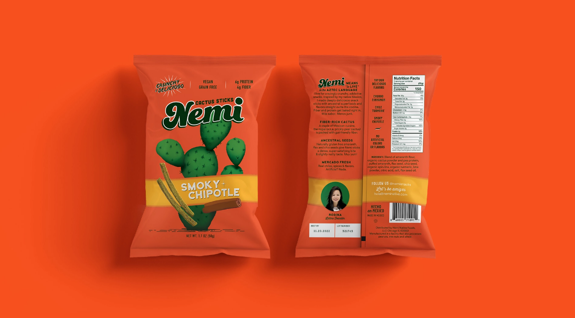
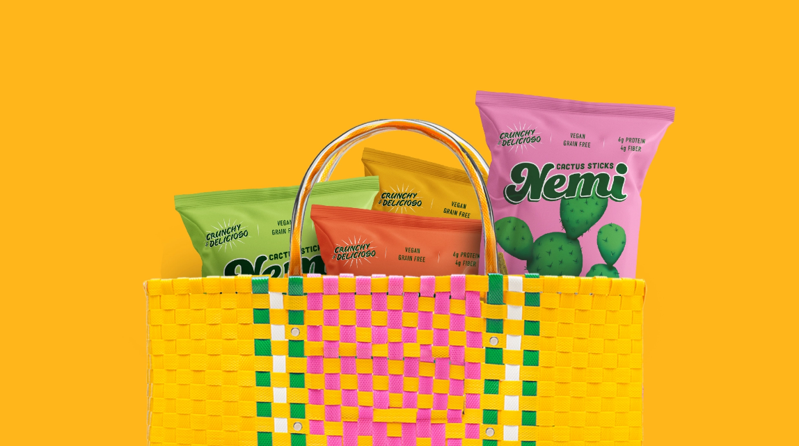
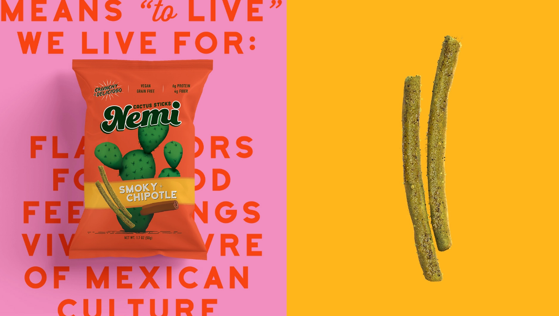
Nemi Snacks teamed up with Mamba Studio, a Mexico-based branding agency, to create packaging designs that highlight Mexican traditions with a touch of modernity. The design studio uses an array of colors to highlight “the personality of the product and its origins.” Furthermore, the illustration of the prickly pear cactus on the label was used as a symbol of a healthy lifestyle.
“The nopal (prickly pear cactus) was conceived as the main character of the whole re design and so it became the central piece of the package. The vibrant green of the cactus was used as a symbol of a vegan and healthy product with numerous assets that contribute to achieve a healthy lifestyle.
Every color and detail in the package and the logo was chosen to emphasize the personality of the product and its origin. The flavor of every package is highlighted by a colorful stripe that reminds the image of a traditional Mexican rebozo (shawl), embracing the ingredients and accentuating the visual connection with the flavor.”


