Designed by: PepsiCo Design & Innovation
Country: United States

1920

1920

Designed by Estudio Pedro González | Country: Spain

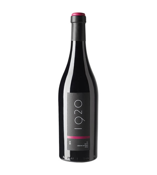
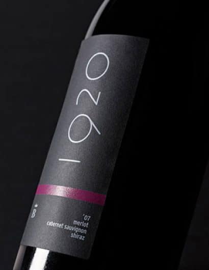
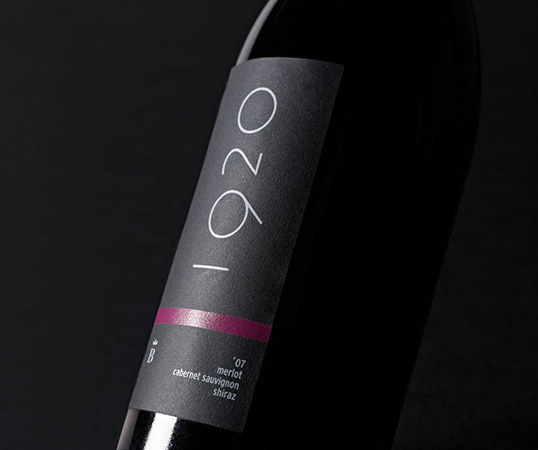
The Barony of Turis Coop. V. needed to create a benchmark in the restoration wine sector. This could reposition themselves and change the perception that to date there was, both the brand and its products. We used the year of foundation as a starting point, and after following the artistic avant-garde work of this time (beginning of the century), the option chosen was the one that formally was cleaner. It was printed in flat, with digital white on black self-adhesive paper (Black Pepper).

1920

Get the latest packaging design inspiration in your inbox:

Popular designs

Pure Persian Honey

When we look closely at honey packaging, they are almost all in the usual format, and the ultimate in creativity is that

Over the wave

This Kombucha originates in Lombok, Indonesia, where its paradise beaches attract hundreds of surfers eager to ride the waves. When you surf,

Burma Love Rebrand

Love at First BiteAs an extension of the Burma Superstar restaurant in San Francisco, Burma Love Foods gives diners an opportunity to

Designed by: PepsiCo Design & Innovation
Country: United States

1920

lovely-package-1920-1

1920

Designed by Estudio Pedro González | Country: Spain

The Barony of Turis Coop. V. needed to create a benchmark in the restoration wine sector. This could reposition themselves and change the perception that to date there was, both the brand and its products. We used the year of foundation as a starting point, and after following the artistic avant-garde work of this time (beginning of the century), the option chosen was the one that formally was cleaner. It was printed in flat, with digital white on black self-adhesive paper (Black Pepper).
1920

Previous slide
Next slide

Explore more great package design

Get the latest on packaging design in your inbox: