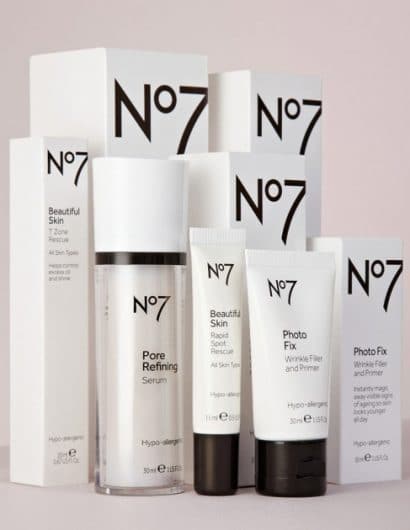
Designed by Two Create | Country: United Kingdom
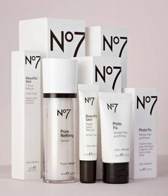
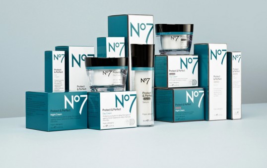
“Two Create were challenged to modernise the No7 aesthetic to appeal to their existing loyal followers whilst opening the doors to new. They were also asked to consider global appeal, as No7 is now sold in nineteen International markets worldwide. In addition, the designers were asked to add more coherence across sub-categories, to improve navigation at the point of sale, and in use, functionality and practicality where necessary.”
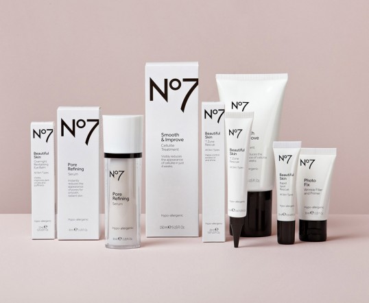
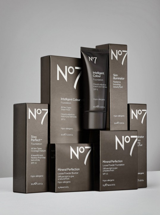
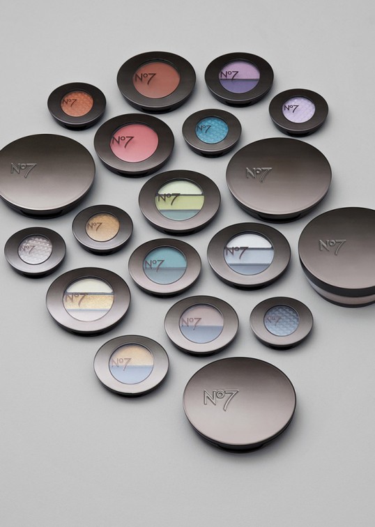
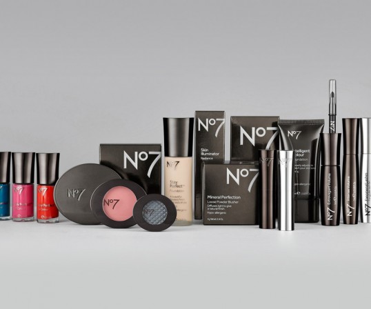
“Two Creates vision was to create a more youthful and confident No7 for 2012 and onwards. Following extensive market research, Two Create designed a new signature form for No7 with cleaner curves and sharper edges, and a series of brand principles. Each of the 70 pack formats were then re-designed in line with the new form and rules.”
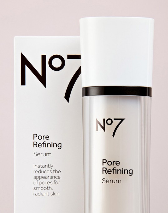
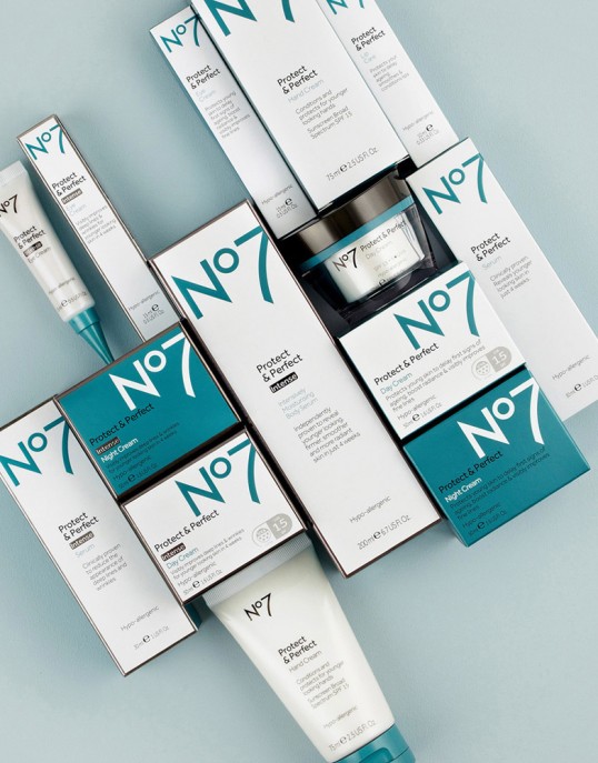
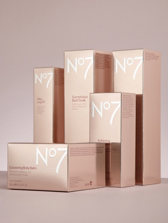
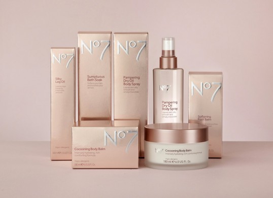
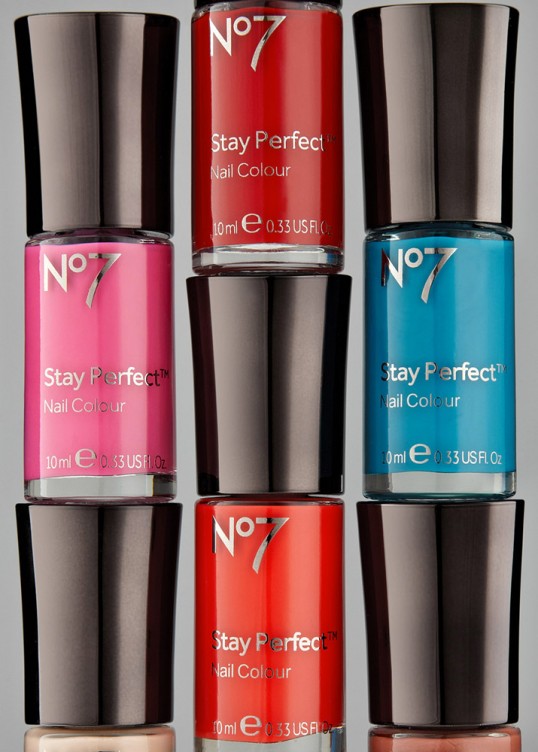
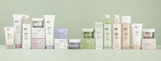
“Pewter replaced the current gold on pack and a colour system was introduced to aid navigation between skintypes and product category. The No7 logo was scaled up and cropped on cartons, reflecting the new bolder and more confident voice of the brand. A new typeface was chosen for pack copy, and the logo and copy then left-aligned to look more modern.”
“In addition to the core skincare and cosmetic lines, Two Create re-designed No7’s washing & bathing range to be more luxurious and sensual, whilst No7 Men’s has become cleaner, more professional and more masculine. In contrast to the Women’s lines, No7 Men features stronger, energizing colours and uppercase characters.”

