Designed by: PepsiCo Design & Innovation
Country: United States

Nomad Kombucha Packaging Design

Designed by: Fin Studio | Vietnam

Kombucha is a fermented beverage prepared with tea, sugar, and yeast. From detoxification to boosting energy to reducing belly fat, Kombucha tea comes packed with various health benefits. Drinking the beverage on a regular basis balances the body and the mind.

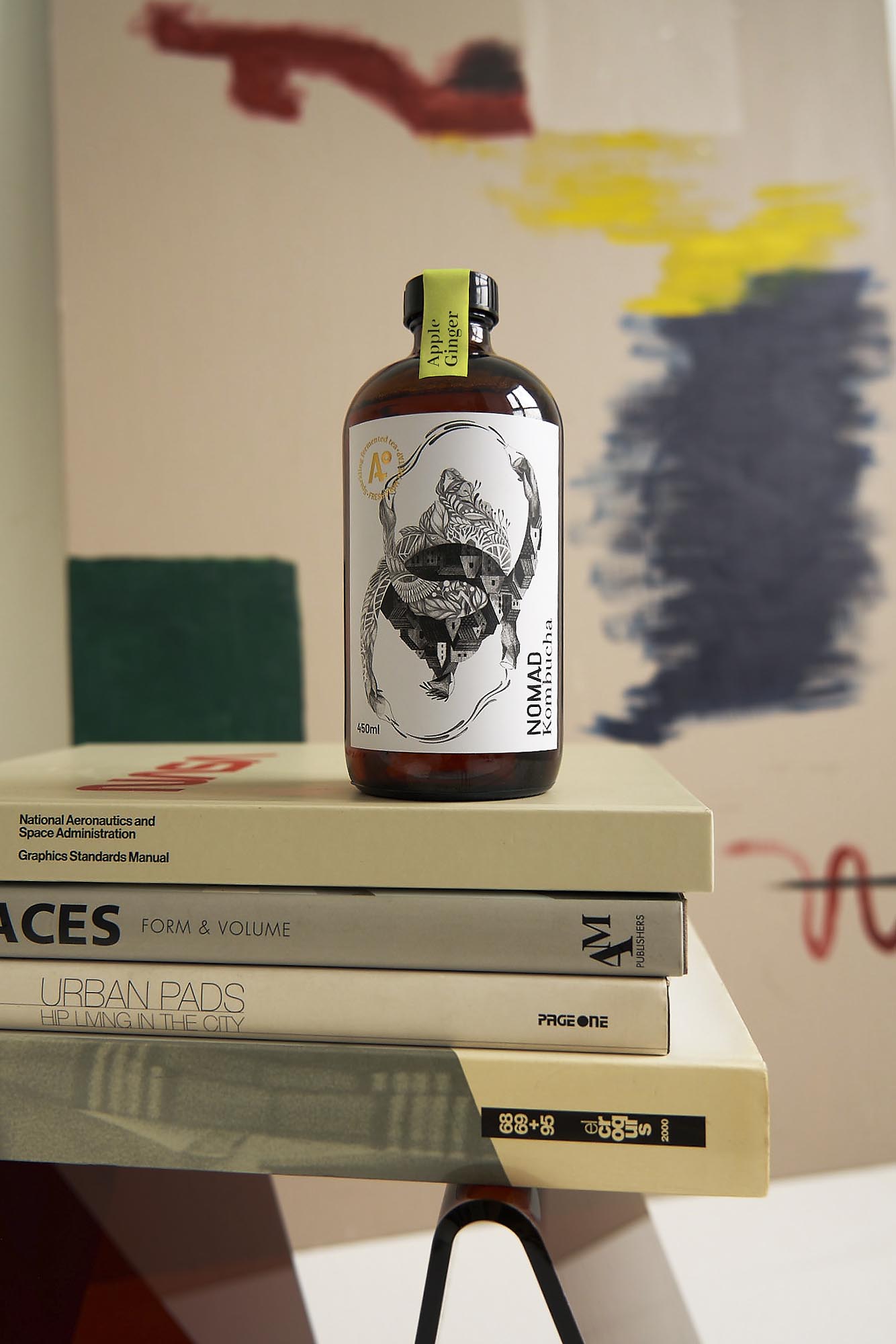
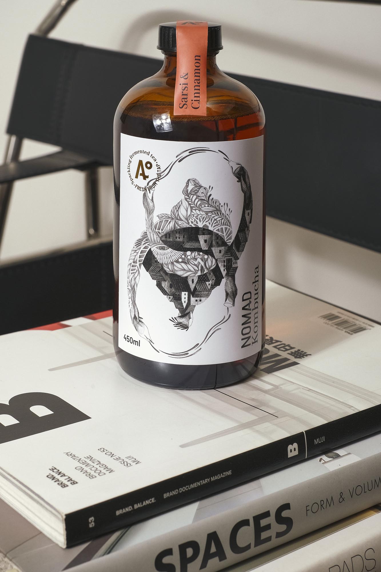
The packaging concept is built around the idea of Yin and Yang since it is the perfect representation of balance and harmony.

“We built the visual concept; the “Balance”, around the idea of Yin and Yang which went along nicely with the kombucha tea. The “Balance” (like Yin and Yang) is visualized by two contrary images that are complemented, interdependent, and interconnected: big city and natural forest, male and female, up and down, light and dark; the two opposite forces that are pulling each other and keeping things in balance because they are bound together as parts of a mutual whole.

Nomad Kombucha Packaging Design

The packaging

Nomad Kombucha partnered with Fin Studio, a Ho Chi Minh City-based design agency, to create packaging designs that would perfectly summarize the physical and mental balance the beverage fosters.

“We’ve decided to create the artwork fully in black and white because this helps to set the tone for the label. By applying different tones of shading, line weights, density of the strokes, we would be able to focus on telling the story of the two contrary forces interacting in a more impactful way within one single illustration. And also, black and white are one of those contrary elements as well.

Get the latest packaging design inspiration in your inbox:

Popular designs

Far Out Bar

Description: Far Out Bar is a cutting-edge packaging design project created for High Life Farms’ macrodose THC chocolate bars. This project involved

The Bra Guru

Most women are wearing the wrong size bra and that is a fact. The Bra Guru® is the first and only professional

Designed by: PepsiCo Design & Innovation
Country: United States

Nomad Kombucha Packaging Design

7-kombucha-world-brand-design

Designed by: Fin Studio | Vietnam

Kombucha is a fermented beverage prepared with tea, sugar, and yeast. From detoxification to boosting energy to reducing belly fat, Kombucha tea comes packed with various health benefits. Drinking the beverage on a regular basis balances the body and the mind.

The packaging concept is built around the idea of Yin and Yang since it is the perfect representation of balance and harmony.

“We built the visual concept; the “Balance”, around the idea of Yin and Yang which went along nicely with the kombucha tea. The “Balance” (like Yin and Yang) is visualized by two contrary images that are complemented, interdependent, and interconnected: big city and natural forest, male and female, up and down, light and dark; the two opposite forces that are pulling each other and keeping things in balance because they are bound together as parts of a mutual whole.

Nomad Kombucha Packaging Design

The packaging

Nomad Kombucha partnered with Fin Studio, a Ho Chi Minh City-based design agency, to create packaging designs that would perfectly summarize the physical and mental balance the beverage fosters.

“We’ve decided to create the artwork fully in black and white because this helps to set the tone for the label. By applying different tones of shading, line weights, density of the strokes, we would be able to focus on telling the story of the two contrary forces interacting in a more impactful way within one single illustration. And also, black and white are one of those contrary elements as well.

Previous slide
Next slide

Explore more great package design

Get the latest on packaging design in your inbox: