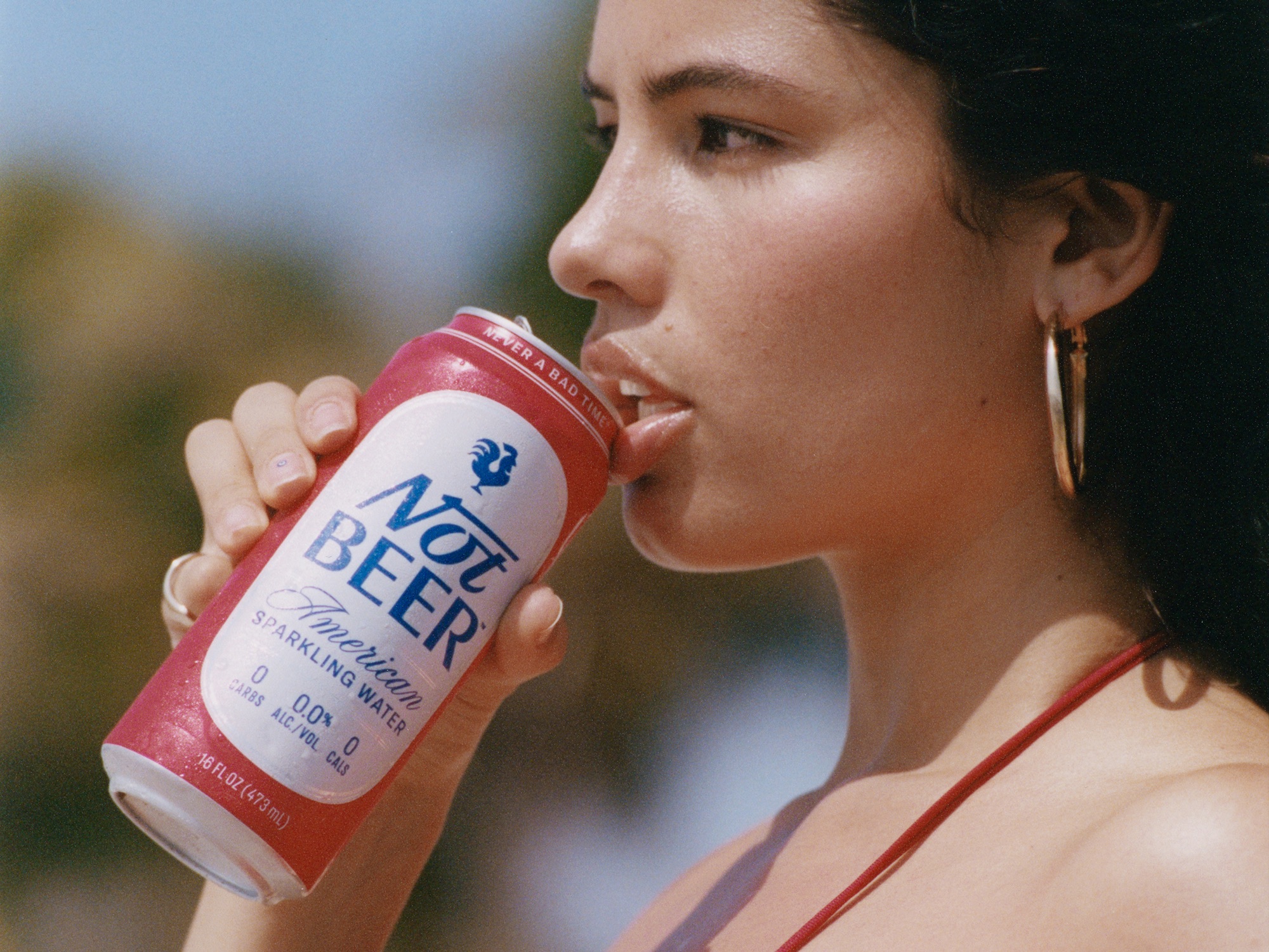
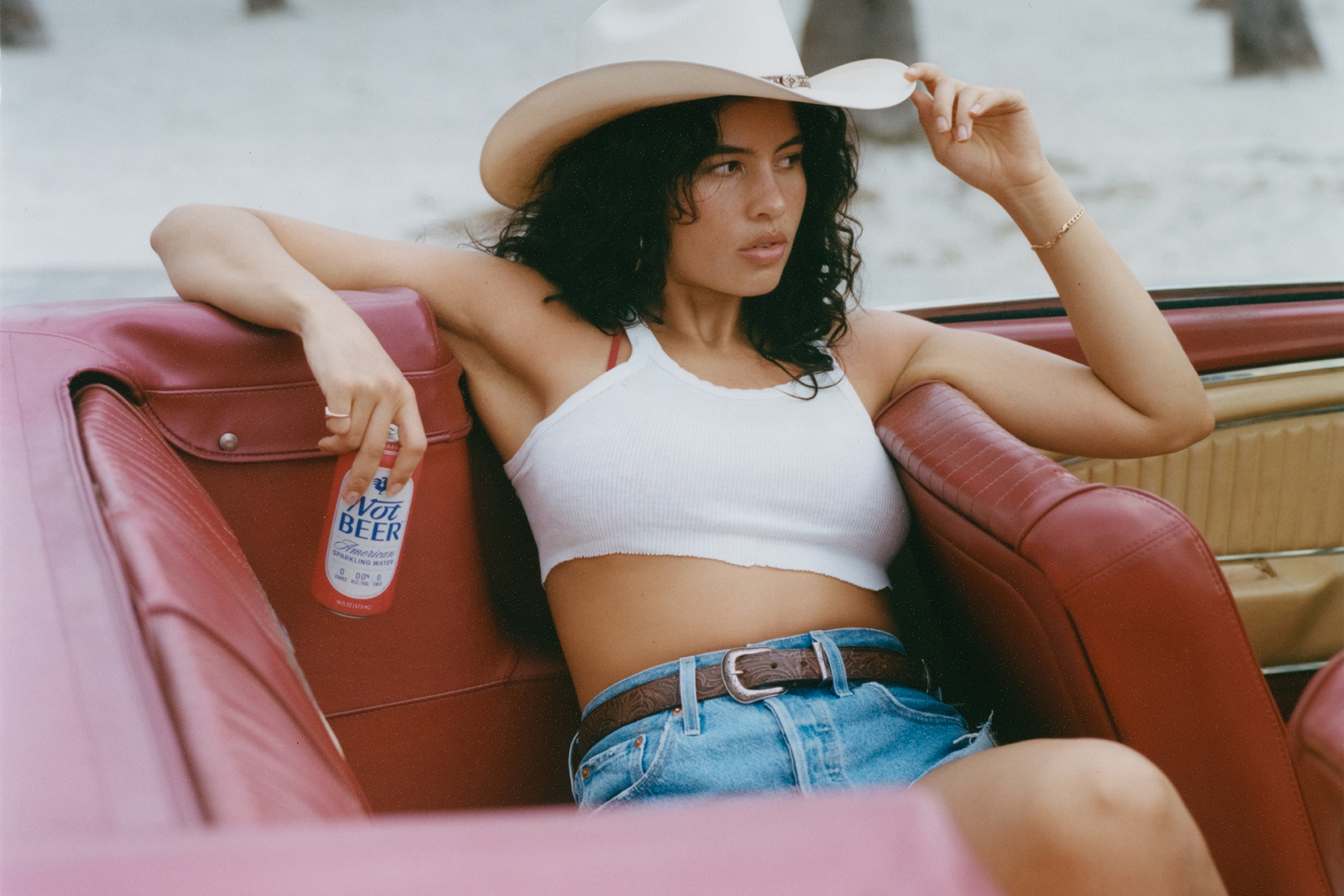
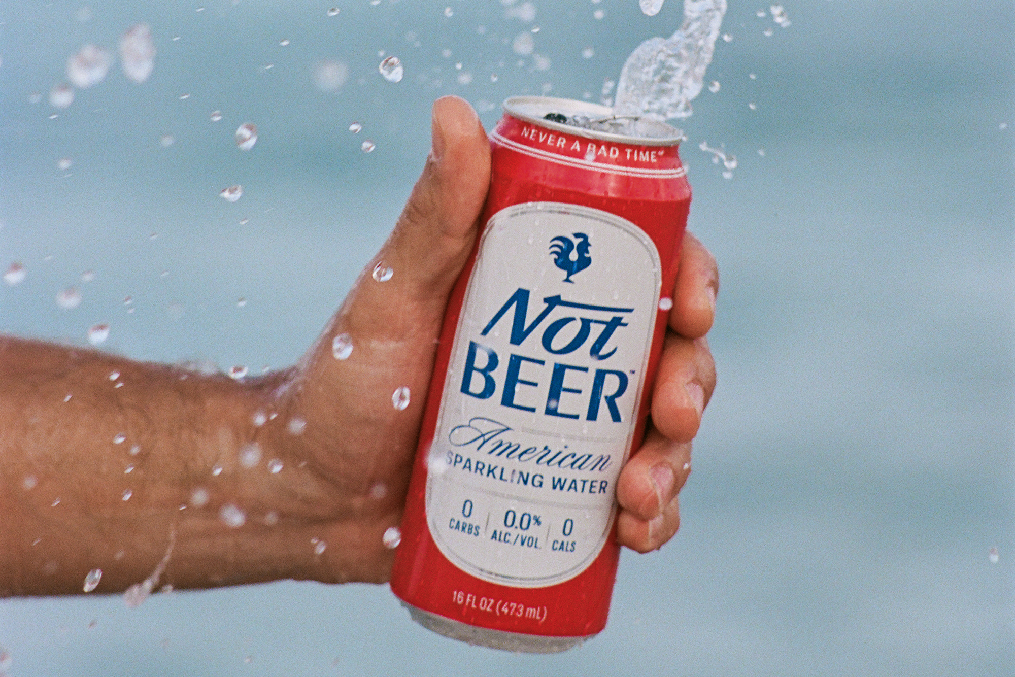
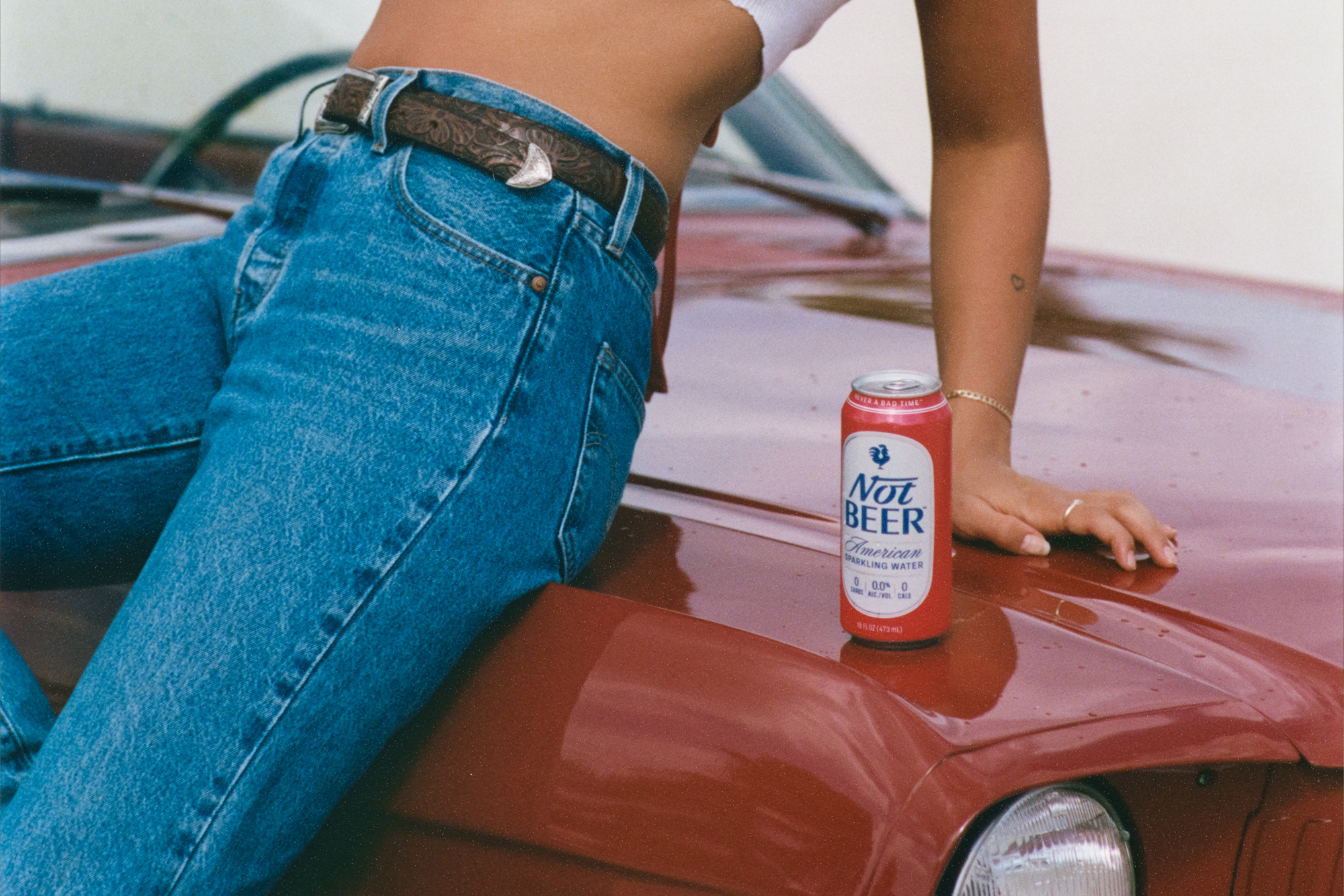
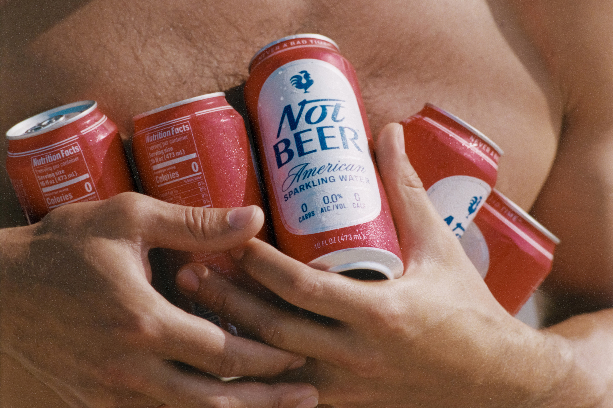
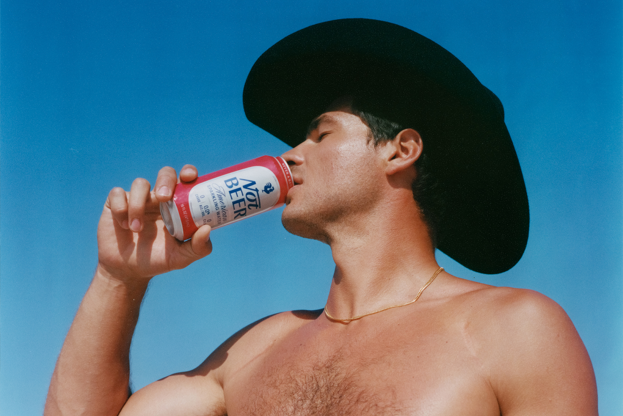
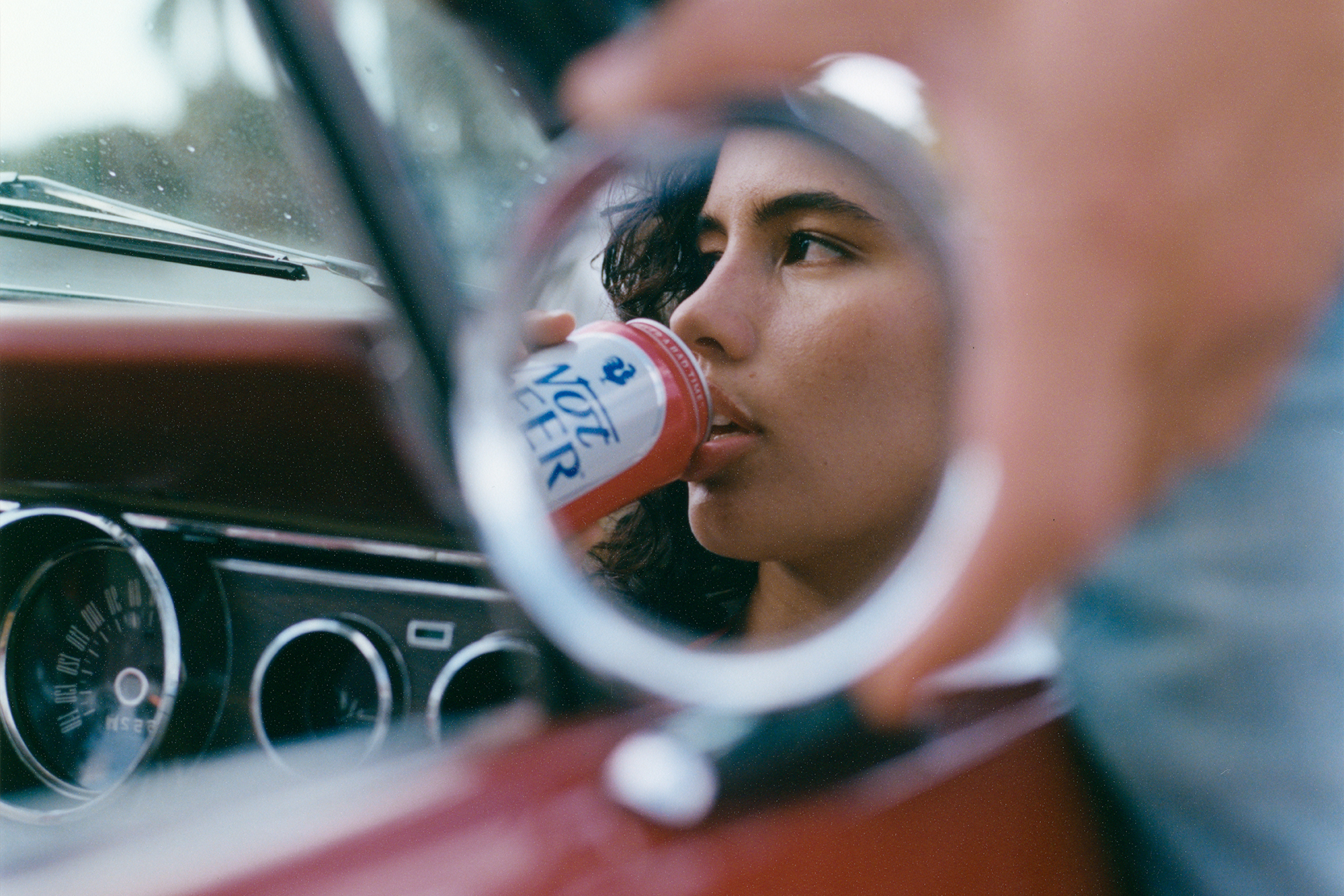
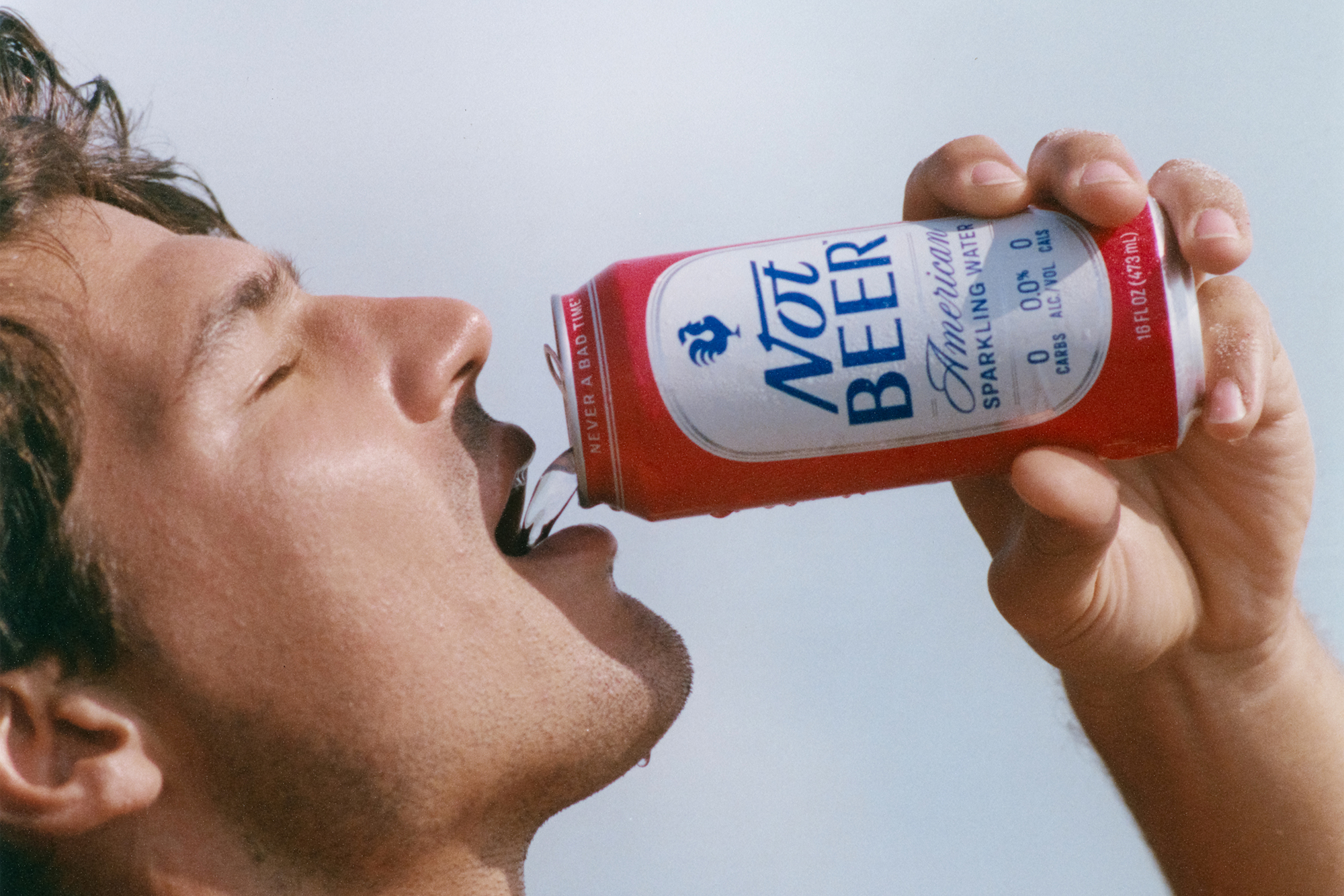
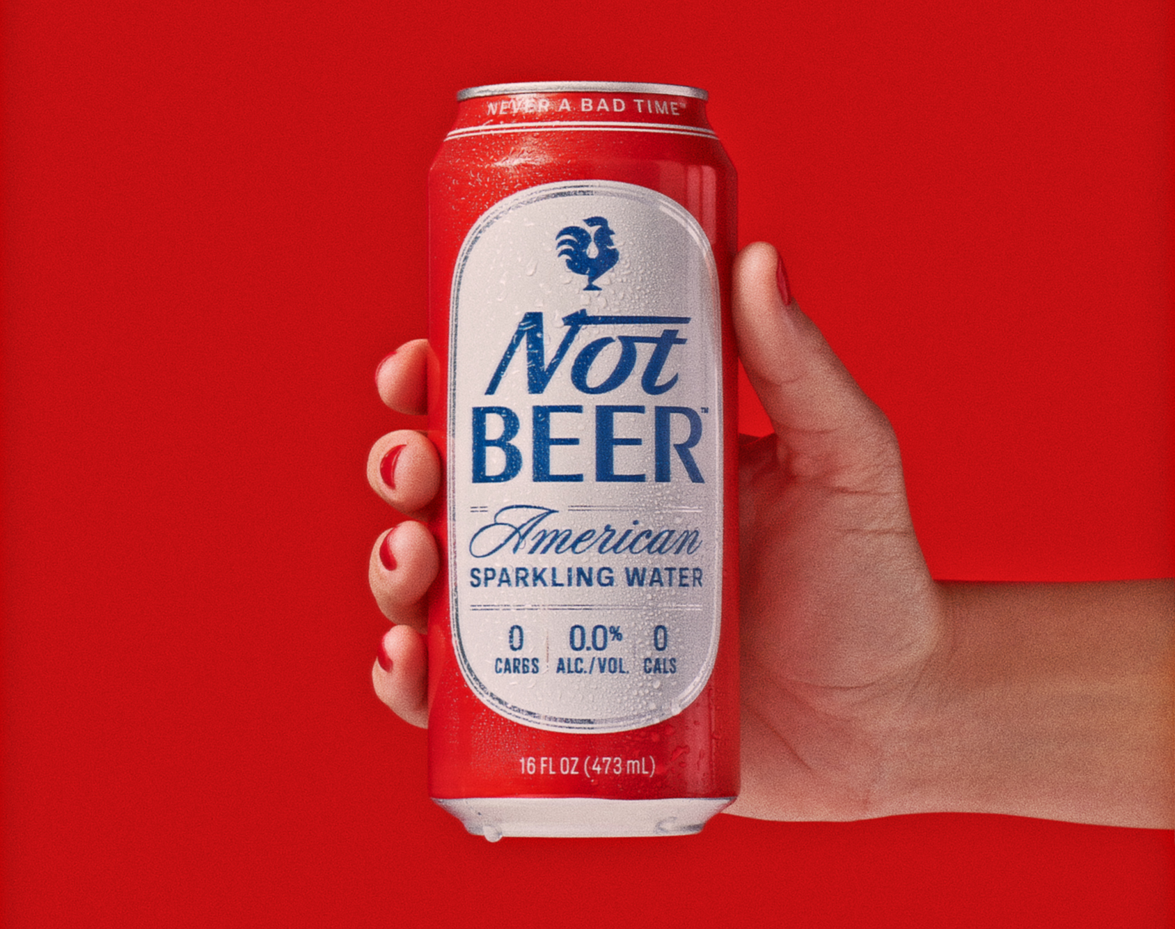
Not Beer is the world’s first zero alcohol, zero taste beer. Tapping into beverage industry tailwinds, Not Beer is a sparkling water positioned to appeal to the sober-curious without asking them to abandon the rich legacy of American Beers. According to its Dallas, Texas based founder, Not Beer, “looks like a beer, feels like a beer, tastes like premium American sparkling water.” Even the carbonation level was engineered to resemble that of a beer. Nessen Company was asked to create packaging and a logo that brought classic American spirit to life. Inspired by beer packaging of the 1980s, the nostalgic packaging leverages a traditional beer label form, script type, and ornate borders, all wrapped in patriotic red, white, and blue. A look that writer Emily Sundberg described as evoking, “Reagan/Bush’ 84/Marlboro.” Not Beer is available direct-to-consumer and through select retailers.