Designed by: PepsiCo Design & Innovation
Country: United States

Noto Vegan ice Cream Packaging Design

Designed by: Stratedgy | Country: India

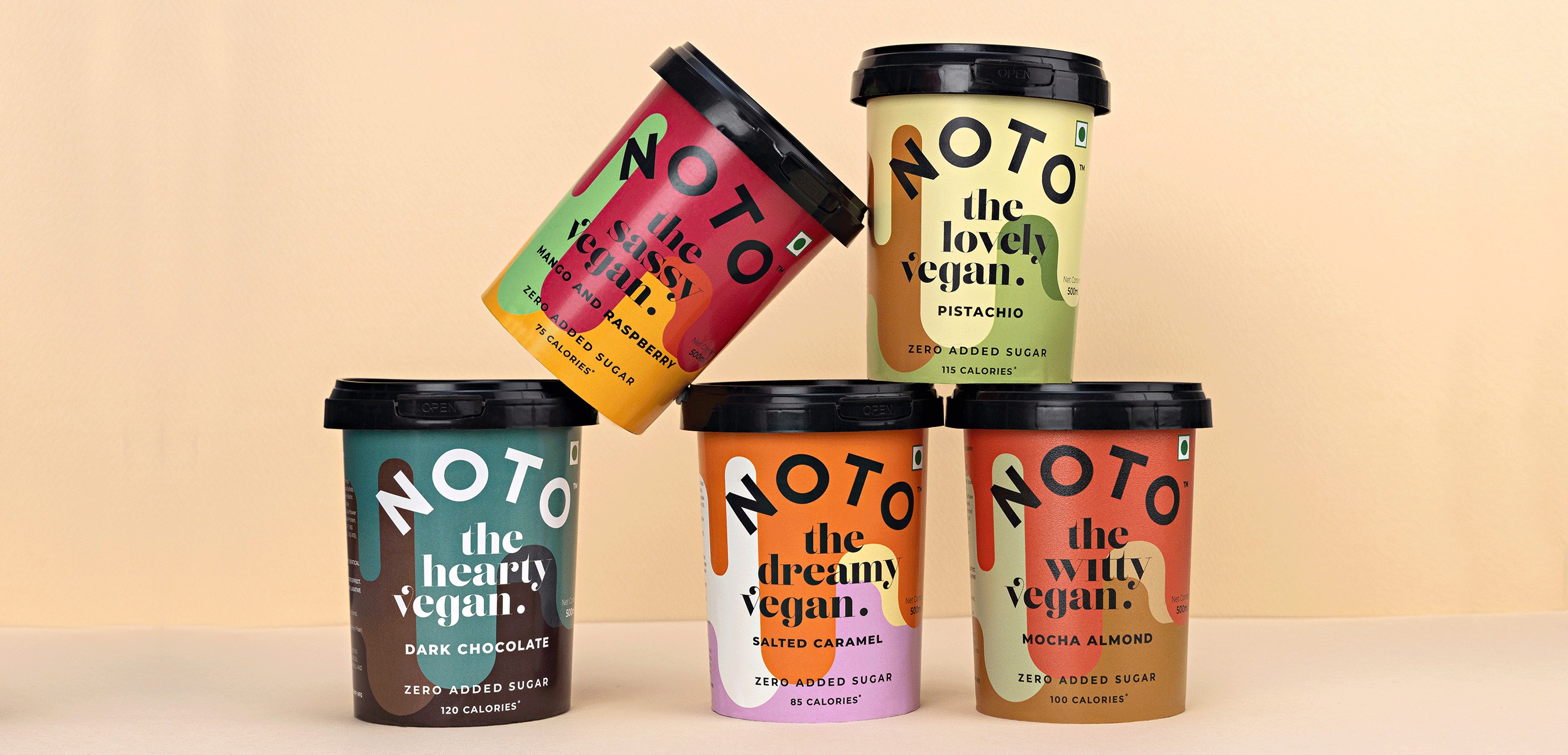
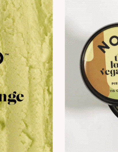
Noto has been the number one choice for health enthusiasts since its inception in 2018. In addition to quality and taste, the ice cream brand is disrupting the vegan shelf in terms of its “richly colored patterns, bold typography, and a clutter-breaking outlook.”

“Ice cream brands have traditionally used photographs or ingredients on pack. If you hide the brand name, chances are, you might not be able to tell one from another. There’s always the half bite, the scopes and the raining fruits. While there’s nothing wrong with employing the traditional route to packaging design, one does run the risk of merging with the crowd.

Noto Vegan ice Cream Packaging Design

The packaging

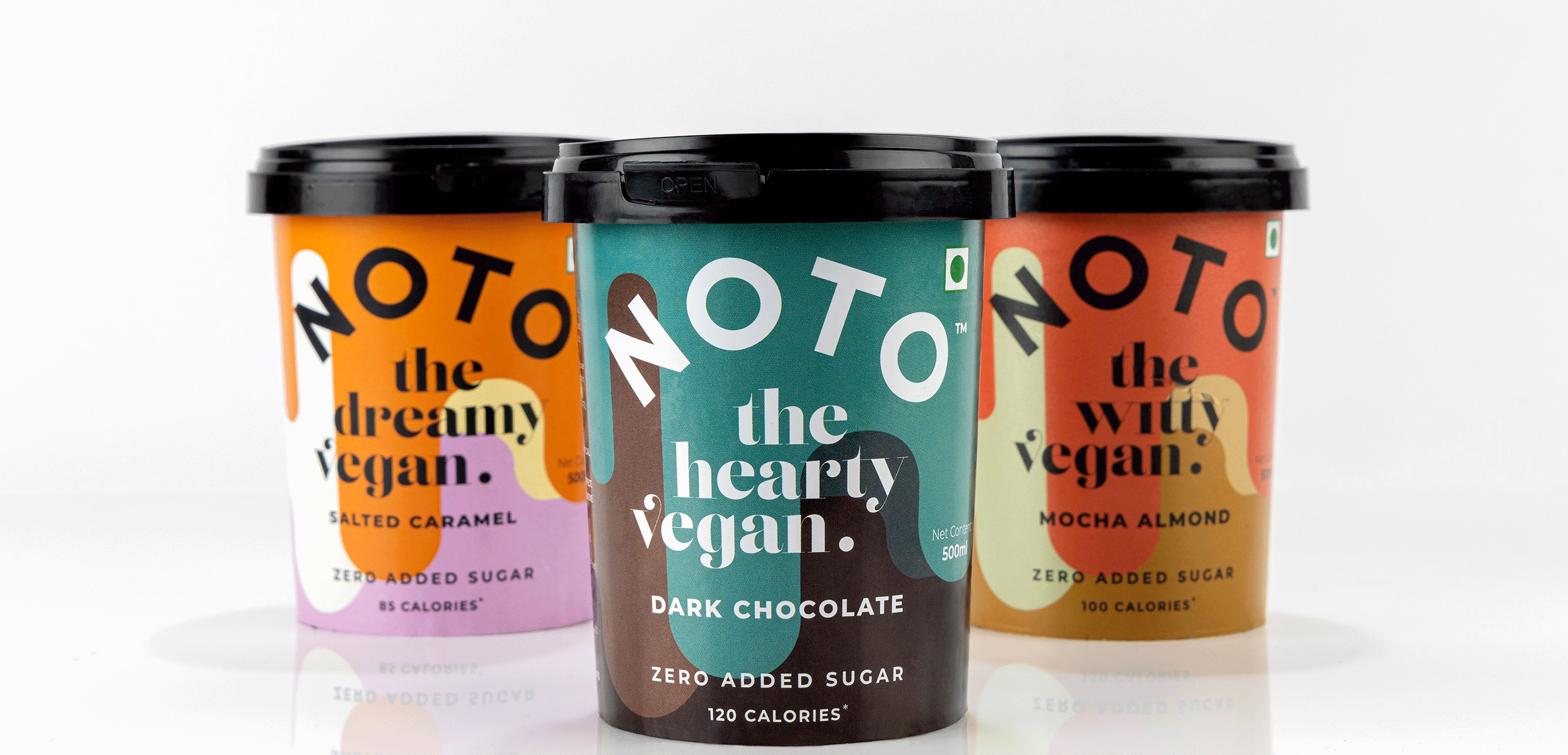
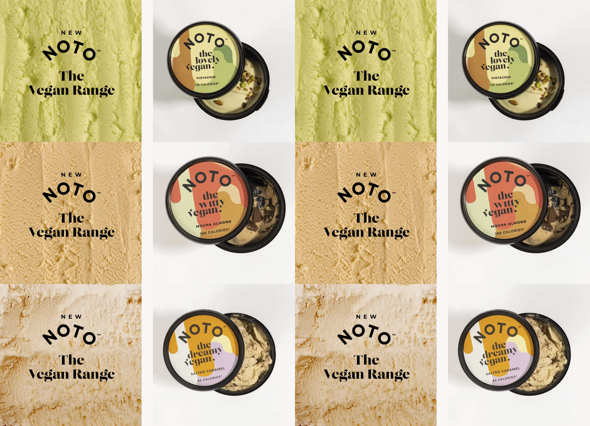
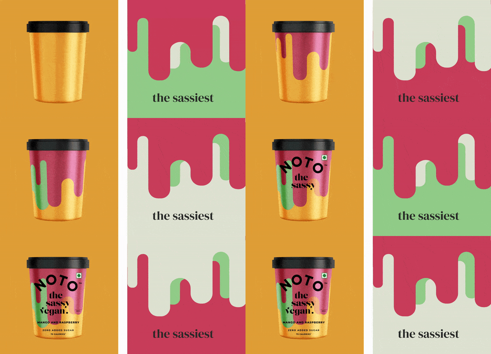
The packaging is “focused on direct expression, characterization, and information hierarchy.” Thanks to bold hues and attractive fonts on the packaging: the vegan ice cream brand stands out compared to its competitors.

“Most new-age vegan, or non-dairy ice creams tend to focus on similar attributes. While there’s nothing wrong with showcasing the product on pack, as a new entrant in the vegan ice cream space, it was important for Noto to establish that they are different from the lot. To begin with, most people who’ve tried the Noto Vegan range are surprised it is dairy free. The creaminess, the flavors and the overall texture of this range are, dare we say, almost the same as regular milk based ice cream.”

Get the latest packaging design inspiration in your inbox:

Popular designs

Designed by: PepsiCo Design & Innovation
Country: United States

Noto Vegan ice Cream Packaging Design

4

Designed by: Stratedgy | Country: India

Noto has been the number one choice for health enthusiasts since its inception in 2018. In addition to quality and taste, the ice cream brand is disrupting the vegan shelf in terms of its “richly colored patterns, bold typography, and a clutter-breaking outlook.”

“Ice cream brands have traditionally used photographs or ingredients on pack. If you hide the brand name, chances are, you might not be able to tell one from another. There’s always the half bite, the scopes and the raining fruits. While there’s nothing wrong with employing the traditional route to packaging design, one does run the risk of merging with the crowd.

Noto Vegan ice Cream Packaging Design

The packaging

The packaging is “focused on direct expression, characterization, and information hierarchy.” Thanks to bold hues and attractive fonts on the packaging: the vegan ice cream brand stands out compared to its competitors.

“Most new-age vegan, or non-dairy ice creams tend to focus on similar attributes. While there’s nothing wrong with showcasing the product on pack, as a new entrant in the vegan ice cream space, it was important for Noto to establish that they are different from the lot. To begin with, most people who’ve tried the Noto Vegan range are surprised it is dairy free. The creaminess, the flavors and the overall texture of this range are, dare we say, almost the same as regular milk based ice cream.”

Explore more great package design

Get the latest on packaging design in your inbox: