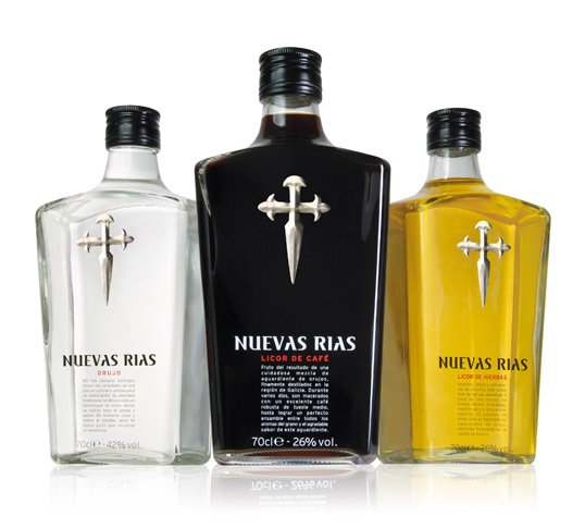
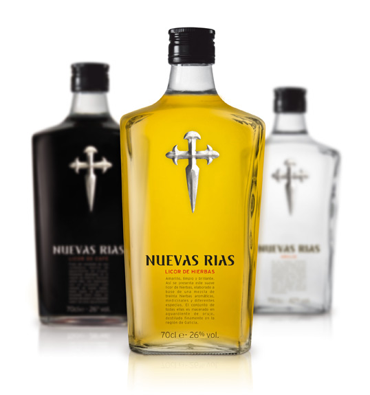
Designed by CB’a Design Solutions | Country: Spain
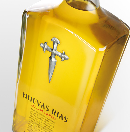
“A range consisting of three references, each one showing off a unique colour. The transparency plays an important role in the design due to the fact that it enables the different elements of the packaging to fuse together without minimizing its importance. A strong branding consisting of typography of Gothic influences, brief text explaining the characteristics of the liqueur to the consumer and a cross symbolizing of the origin of these orujos. The result, a reinterpretation of the Galician classic codes that add impact on shelves and transmit undisputed quality.”

