Designed by: PepsiCo Design & Innovation
Country: United States

Nutrio Packaging Design

Designed by: MarkaWorks | Region: North America and Europe

Supplements come packed with numerous advantages: from the body absorbing enough nutrients to managing weight to improving cognitive abilities, the benefits of supplements are manifold. Nutrio, a health supplement start-up, is looking to leverage the power of vitamins and supplements by targeting students, office workers, and sportsmen in Europe and North America.

In addition to creating the packaging designs, MarkaWorks worked on the branding of the supplement start-up.

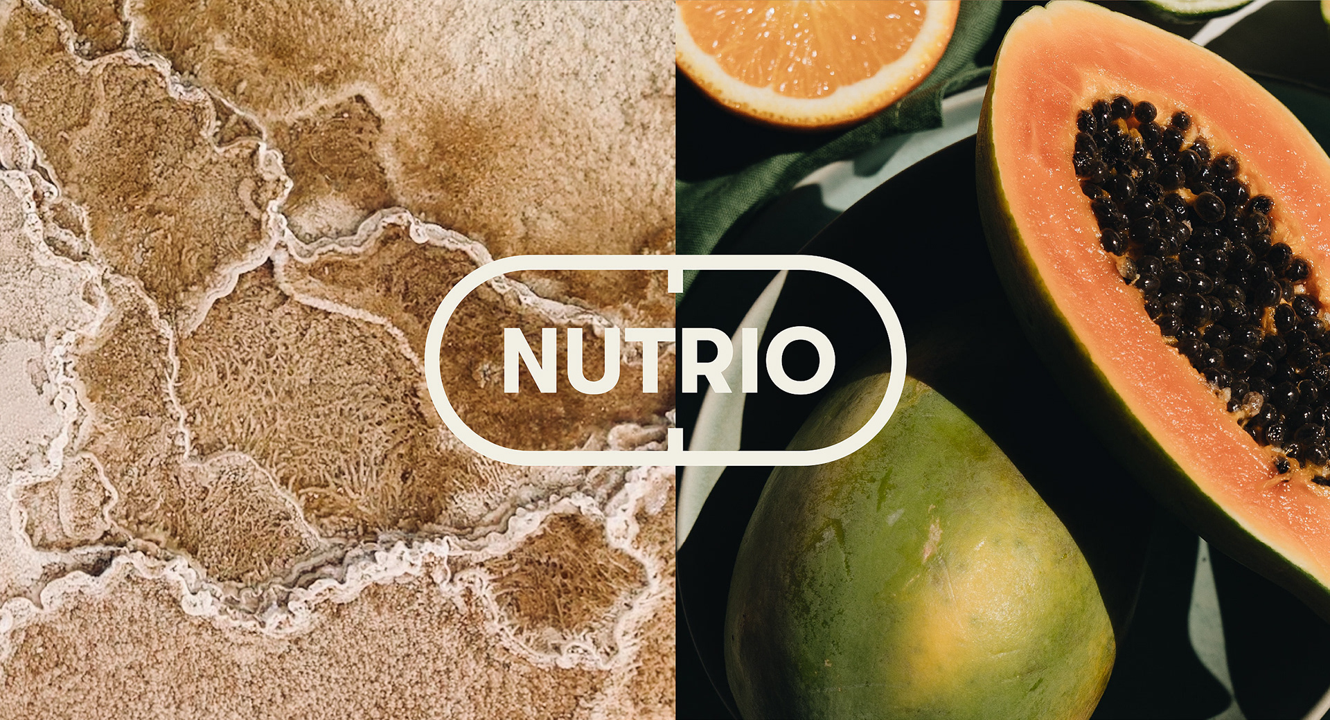
The Solutions: To build a strong association with vitamins and supplements, we created a logo emblem in the shape of a pill. The typography for the logo was made with capital letters of a classy font type to create an affirmative feel.

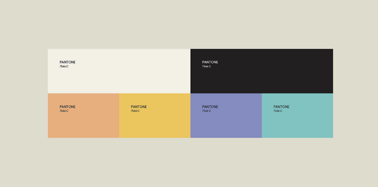
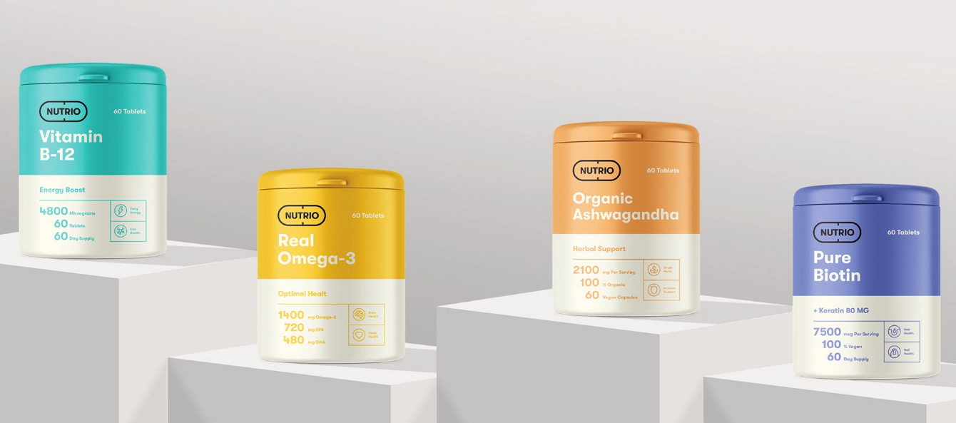
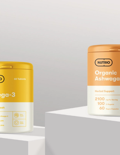
The colors we selected are vibrant pastel shades that represent different meanings and have various associations. It was done purposely for the differentiation of product groups by colors.

Nutrio Packaging Design

The packaging

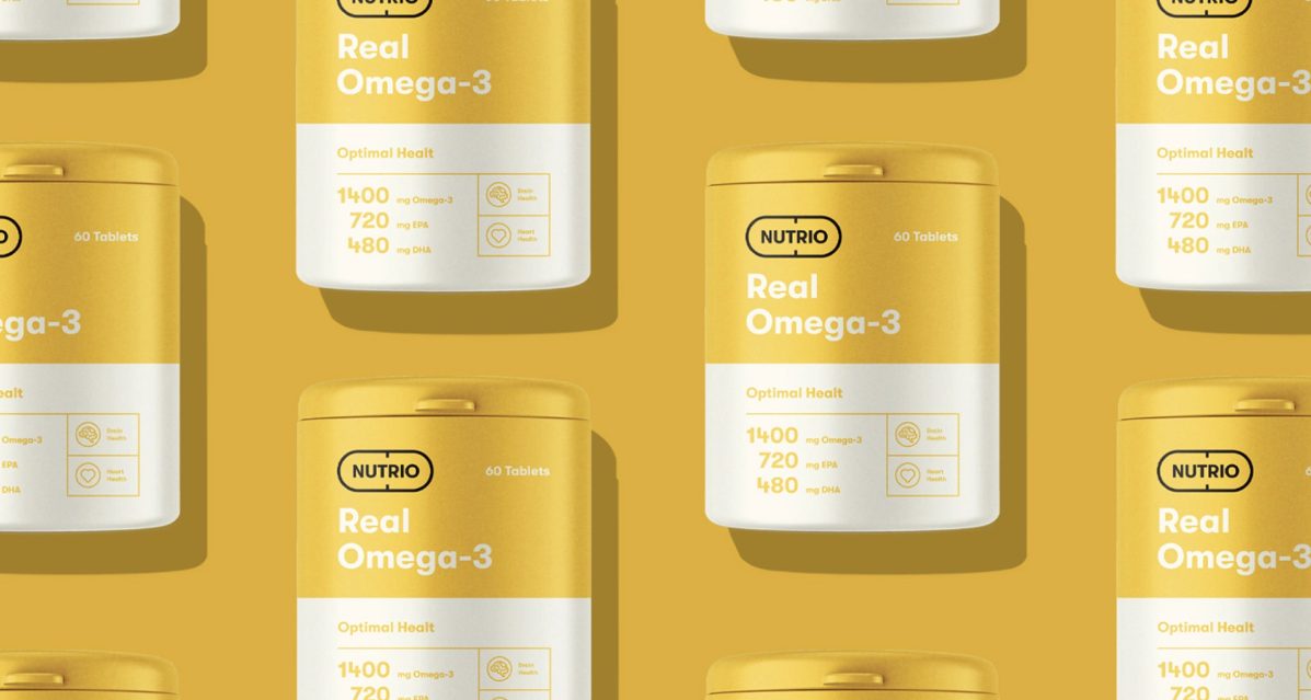
MarkaWorks, the Antalya-based creative studio, created the attractive-looking packaging designs for Nutrio. In addition to using a two-color palette for each product, the design studio used typography in sync with the branding.

For the packaging design, we came up with a two-color palette. The packaging details and product information were also highlighted in the same color we picked for the specific product to create a positive and dynamic look.”

Get the latest packaging design inspiration in your inbox:

Popular designs

Tropicana’s Branding & Packaging Redesign by Sunhouse

Tropicana rejuvenates its brand with Sunhouse, blending modern iconicity and heritage. The redesign emphasizes Tropicana’s legacy, highlighting its unique story and craftsmanship, making it stand out as the original, superior orange juice.

Unique Whisky Packaging Design Celebrates 40-Year Legacy

Stckmn crafted ‘The Only Drop,’ a unique whisky packaging celebrating liquid and cask unity. Featuring handcrafted paper pulp sculptures and transparent bottle designs, the project fetched £18,750 at auction, aiding Scottish youth.

Creating a Strong Brand Identity: The Journey of Living Things Packaging Design

“Developing Living Things packaging involved multiple design stages, feedback, and refinement. With extensive market research, collaboration with brand strategist Jose Debate and design agency Studio Nari, we created a strong, recognizable brand identity appealing to health-conscious, trend-setting millennials and Gen Z.”

Designed by: PepsiCo Design & Innovation
Country: United States

Nutrio Packaging Design

9

Designed by: MarkaWorks | Region: North America and Europe

Supplements come packed with numerous advantages: from the body absorbing enough nutrients to managing weight to improving cognitive abilities, the benefits of supplements are manifold. Nutrio, a health supplement start-up, is looking to leverage the power of vitamins and supplements by targeting students, office workers, and sportsmen in Europe and North America.

In addition to creating the packaging designs, MarkaWorks worked on the branding of the supplement start-up.

The Solutions: To build a strong association with vitamins and supplements, we created a logo emblem in the shape of a pill. The typography for the logo was made with capital letters of a classy font type to create an affirmative feel.

The colors we selected are vibrant pastel shades that represent different meanings and have various associations. It was done purposely for the differentiation of product groups by colors.

Nutrio Packaging Design

The packaging

MarkaWorks, the Antalya-based creative studio, created the attractive-looking packaging designs for Nutrio. In addition to using a two-color palette for each product, the design studio used typography in sync with the branding.

For the packaging design, we came up with a two-color palette. The packaging details and product information were also highlighted in the same color we picked for the specific product to create a positive and dynamic look.”

Previous slide
Next slide
Get the latest on packaging design in your inbox: