Designed by: PepsiCo Design & Innovation
Country: United States

Nuun

Nuun

Designed by Moxie Sozo | Country: United States | Fonts used: Gill Sans, Neutraface, Futura, Chalet

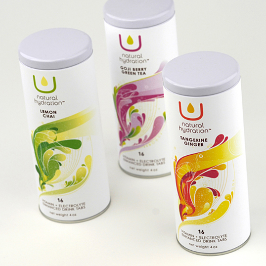
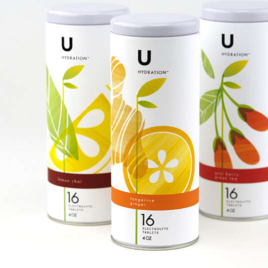
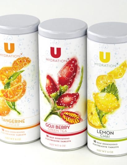
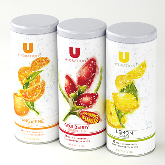
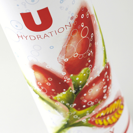
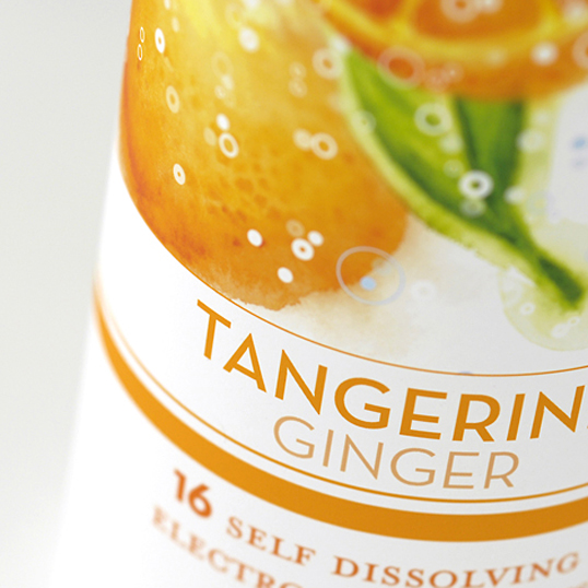
Nuun makes portable electrolyte hydration tabs for endurance athletes, from adventure racers and ultra runners to Iron Man competitors and mountain bikers. Having established themselves with the extreme sports market, they wanted to expand their product line to offer a healthy hydration alternative for everyday life. So they developed U, a low-sugar, low-calorie option for hydration. Their primary target included women between 25–40 who shopped at Whole Foods, practiced yoga, and were environmentally conscientious.

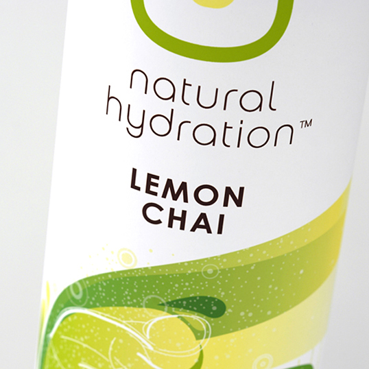
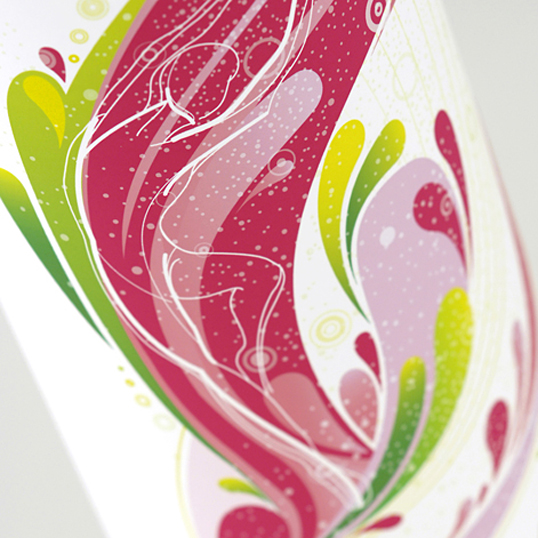
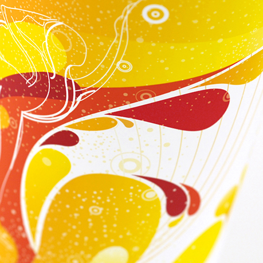
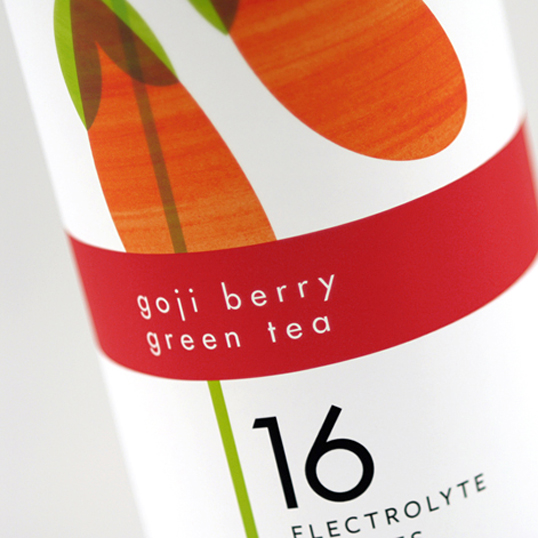
Their packaging needed to stand out on the shelves without being overt, suggest an active lifestyle without alienating recreational consumers, and justify U’s higher price point. Moxie Sozo created packaging with a feminine feel, imagery with a subtle reference to yoga and dance, and a layered design to give it a quiet elegance. Even before U was introduced at the consumer level, it was already receiving praise for its packaging at natural products trade shows and media events.
Nuun

Nuun

Nuun

Nuun

Nuun

Nuun

Nuun

Nuun

Nuun

Get the latest packaging design inspiration in your inbox:

Popular designs

Innovative Mushroom-Based Packaging Used in Haircare Industry

Explore the sustainable revolution in the beauty industry, as haircare brand The Rootist partners with Morae and Evocative to create fully biodegradable and compostable packaging made from mushroom roots. An innovative solution for eco-friendly beauty essentials.

Designed by: PepsiCo Design & Innovation
Country: United States

Nuun

nuun1

Nuun

Designed by Moxie Sozo | Country: United States | Fonts used: Gill Sans, Neutraface, Futura, Chalet

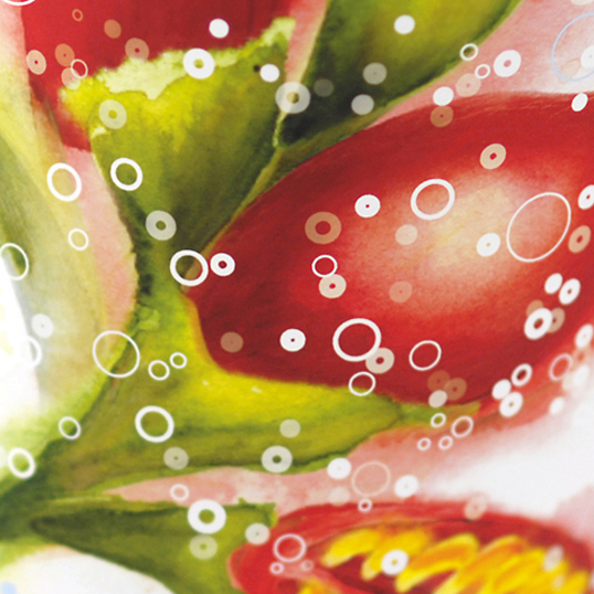
Nuun makes portable electrolyte hydration tabs for endurance athletes, from adventure racers and ultra runners to Iron Man competitors and mountain bikers. Having established themselves with the extreme sports market, they wanted to expand their product line to offer a healthy hydration alternative for everyday life. So they developed U, a low-sugar, low-calorie option for hydration. Their primary target included women between 25–40 who shopped at Whole Foods, practiced yoga, and were environmentally conscientious.

Their packaging needed to stand out on the shelves without being overt, suggest an active lifestyle without alienating recreational consumers, and justify U’s higher price point. Moxie Sozo created packaging with a feminine feel, imagery with a subtle reference to yoga and dance, and a layered design to give it a quiet elegance. Even before U was introduced at the consumer level, it was already receiving praise for its packaging at natural products trade shows and media events.
Nuun

Nuun

Nuun

Nuun

Nuun

Nuun

Nuun

Nuun

Nuun

Previous slide
Next slide
Get the latest on packaging design in your inbox: