Designed by Pearlfisher | Country: United States
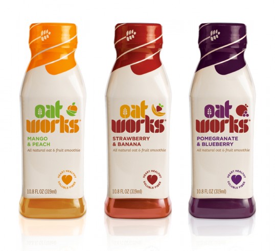
“The design for Oat Works uses vibrant color to reinforce the ingredients in each variant and emphasize the great taste cues. The background pack color is a beige tone to highlight the core oat benefits of the brand. Similarly, the oat is championed in the ‘O’ of the Oat Works identity and on the bottle top packaging. The ingredients of each variant are also brought to life through shapes inspired by the contours of oats. The heart icon on the front of the pack draws attention to the natural and heart healthy properties of the product, providing consumers with the information they need to know about Oat Works’ health benefits.
Tess Wicksteed, Strategy Director at Pearlfisher comments, “Our task was to take oats to the next level, showing that Oat Works delivers all of the benefits but none of the bores. The design moves away from current oat cliches, using bold, rich and modern typography. We have communicated the smoothness and taste of Oat Works through vibrant fruity colors and icons that reflect flavor. A future focused design for next generation oats!”