Designed by: PepsiCo Design & Innovation
Country: United States

Olden

Olden

Designed by Dinamo Design & Frost Produkt | Country: Norway

“Olden is a 100% clean mineral water that has been protected by nature through thousands of years. Under strict quality control, the water is bottled on sight at Blåfjellkilden, situated underneath the glacier in Jostedalen national park in Norway.

Olden launched a new bottle and package design September 1st 2010. Over the last years, the brand has experienced  a general decrease in several areas, reducing its brand recognition and equity. Consequently, it has lost status in comparison to other mineral water brands.

Dinamo Design created a brand strategy and package design that positions the brand as more premium, and hopefully regain its position as the purest mineral water, untouched by modern society. The bottle design was developed in collaboration with Frost Produkt industrial design agency.

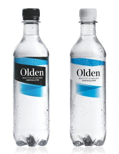
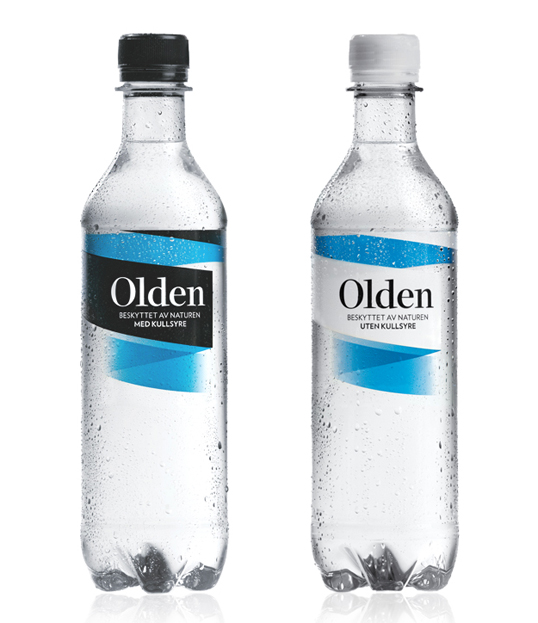
The idea behind the label is to reflect the unique way in which the water is preserved, in underground springs with the glacier as a protecting shield. In the same way the label wraps around the bottle, with the black or white color representing nature, and the blue inside color representing the water that is protected.

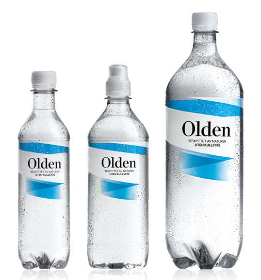
The bottle is designed for Olden to be percieved as one brand with one bottle. Therefore, subtle changes were made to the proportions of the three different sizes (0,5l, 0,7l and 1,5l) to produce a bottle that looks and feels similar across the range, while staying within the limitations of production. The resulting bottle shape is clean, sleek and iconic.

Through the unique bottle design, and the differentiated visual identity, Olden now appears distinct within its category and distinguishes this premium mineral water from its competitors.”

Olden

Get the latest packaging design inspiration in your inbox:

Popular designs

Far Out Bar

Description: Far Out Bar is a cutting-edge packaging design project created for High Life Farms’ macrodose THC chocolate bars. This project involved

Burma Love Rebrand

Love at First BiteAs an extension of the Burma Superstar restaurant in San Francisco, Burma Love Foods gives diners an opportunity to

The Port Vodka Lemon Water

Overview: In response to my client’s vision for a Cape Cod themed beverage brand, I embarked on the journey to create The Port

Pure Persian Honey

When we look closely at honey packaging, they are almost all in the usual format, and the ultimate in creativity is that

Designed by: PepsiCo Design & Innovation
Country: United States

Olden

olden1

Olden

Designed by Dinamo Design & Frost Produkt | Country: Norway

“Olden is a 100% clean mineral water that has been protected by nature through thousands of years. Under strict quality control, the water is bottled on sight at Blåfjellkilden, situated underneath the glacier in Jostedalen national park in Norway.

Olden launched a new bottle and package design September 1st 2010. Over the last years, the brand has experienced  a general decrease in several areas, reducing its brand recognition and equity. Consequently, it has lost status in comparison to other mineral water brands.

Dinamo Design created a brand strategy and package design that positions the brand as more premium, and hopefully regain its position as the purest mineral water, untouched by modern society. The bottle design was developed in collaboration with Frost Produkt industrial design agency.

The idea behind the label is to reflect the unique way in which the water is preserved, in underground springs with the glacier as a protecting shield. In the same way the label wraps around the bottle, with the black or white color representing nature, and the blue inside color representing the water that is protected.

The bottle is designed for Olden to be percieved as one brand with one bottle. Therefore, subtle changes were made to the proportions of the three different sizes (0,5l, 0,7l and 1,5l) to produce a bottle that looks and feels similar across the range, while staying within the limitations of production. The resulting bottle shape is clean, sleek and iconic.

Through the unique bottle design, and the differentiated visual identity, Olden now appears distinct within its category and distinguishes this premium mineral water from its competitors.”
Olden

Previous slide
Next slide

Explore more great package design

Get the latest on packaging design in your inbox: