Designed by: PepsiCo Design & Innovation
Country: United States

OOQI Grips


OOQI Grips

Designed by OOQI Grips | Country: Canada

“We launched OOQI grips in October of 2011, and we were all very excited about our product and our packaging. The packaging looked great and was a very nice as a concept, but ultimately didn’t perform very well in stores; people would just grab the grips and end up accidentally destroying the packaging which was just a 36pt piece of die-cut card stock (try saying that 5 times fast). Once the packaging was destroyed, shop owners would throw them in a bag and put a $30 price tag on them… where they would sell MUCH slower.”

OOQI Grips

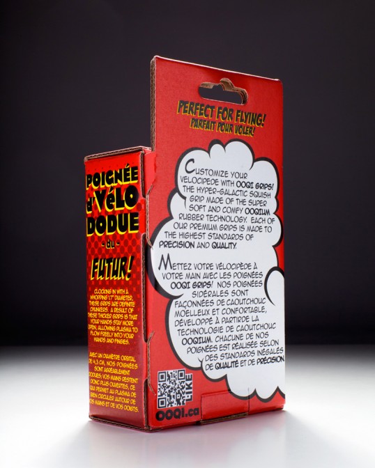
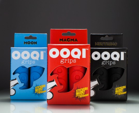
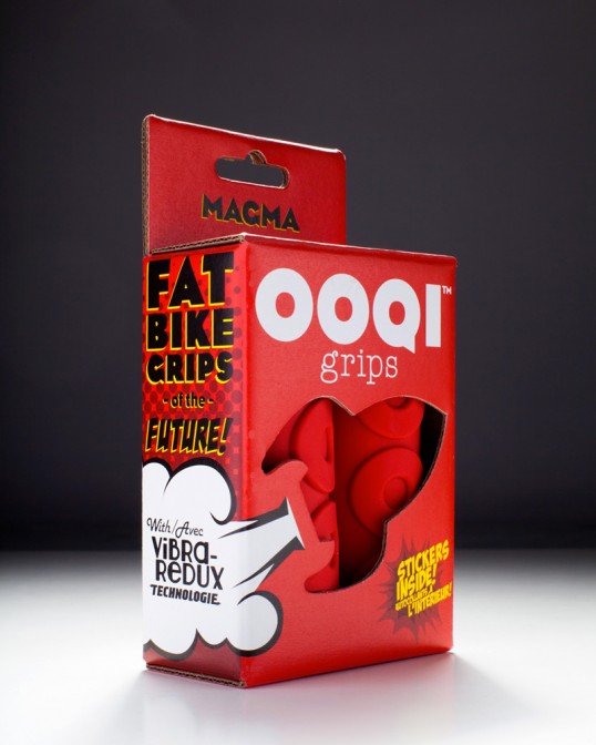
“It was a rough and rather expensive lesson to learn, but it forced us to put greater thought into how our product would ultimately perform in the real world and how people perceived it. The result is a package design that we’re even more proud of. Some pretty neat, retro wrap-around graphics mounted to custom, pretty-rugged corrugated die cut-cardboard box. Having the grips in a box also gives us the ability to put some fun stuff inside, we decided cute little rocket stickers would do the trick.”

OOQI Grips

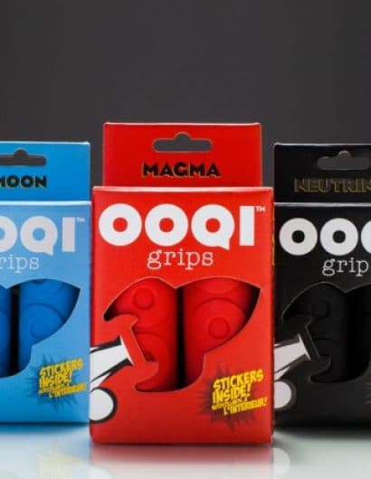
“The vibrant colors and the copy are a nod to an old-school, comic-booky feel and a reference to the “gee-WIZ” toys made in the 50’s and 60’s. We’ve found the design has resonated with all kinds of demographics from kids all the way to baby-boomers.”

Get the latest packaging design inspiration in your inbox:

Popular designs

Far Out Bar

Description: Far Out Bar is a cutting-edge packaging design project created for High Life Farms’ macrodose THC chocolate bars. This project involved

Over the wave

This Kombucha originates in Lombok, Indonesia, where its paradise beaches attract hundreds of surfers eager to ride the waves. When you surf,

Pure Persian Honey

When we look closely at honey packaging, they are almost all in the usual format, and the ultimate in creativity is that

Designed by: PepsiCo Design & Innovation
Country: United States

OOQI Grips

lovely-package-ooqi-1


OOQI Grips

Designed by OOQI Grips | Country: Canada

“We launched OOQI grips in October of 2011, and we were all very excited about our product and our packaging. The packaging looked great and was a very nice as a concept, but ultimately didn’t perform very well in stores; people would just grab the grips and end up accidentally destroying the packaging which was just a 36pt piece of die-cut card stock (try saying that 5 times fast). Once the packaging was destroyed, shop owners would throw them in a bag and put a $30 price tag on them… where they would sell MUCH slower.”

OOQI Grips

“It was a rough and rather expensive lesson to learn, but it forced us to put greater thought into how our product would ultimately perform in the real world and how people perceived it. The result is a package design that we’re even more proud of. Some pretty neat, retro wrap-around graphics mounted to custom, pretty-rugged corrugated die cut-cardboard box. Having the grips in a box also gives us the ability to put some fun stuff inside, we decided cute little rocket stickers would do the trick.”

OOQI Grips

“The vibrant colors and the copy are a nod to an old-school, comic-booky feel and a reference to the “gee-WIZ” toys made in the 50’s and 60’s. We’ve found the design has resonated with all kinds of demographics from kids all the way to baby-boomers.”
Previous slide
Next slide

Explore more great package design

Get the latest on packaging design in your inbox: