Designed by Fenetik Design | Country: Australia
“When we originally sat down with Oracle, the company had been in production for a little over a year, and with products starting to fill local and national grocery store and cafe shelves, they were ready to take a look at strengthening their labels and packaging.
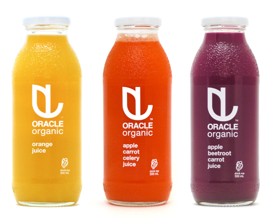
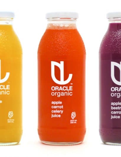
After looking at the previous bottle, which had a bit of a busied pattern effect on an opaque wrap around label, the objective for our design seemed clear – to produce packaging that let the richness of the juice shine through. By allowing the juice to provide all of the needed colour, we were able to utilise minimal white text as the display for the company branding and juice variant details. In doing so, we were able to “fill up” the logo with the product itself. As the juice colour becomes the signifier for the variant, customers can easily spot their flavour on the shelf, and in their side by side combination, the entire range starts to take on the effect of a little fruit and vegetable garden ready for picking.”


