Designed by: PepsiCo Design & Innovation
Country: United States

Orontas

Orontas

Designed by Orontas | Country: Canada

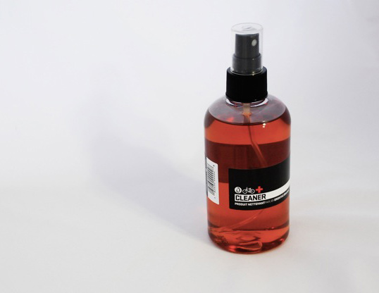
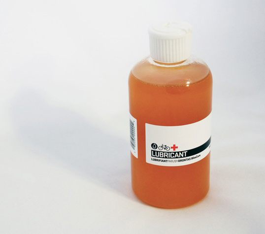
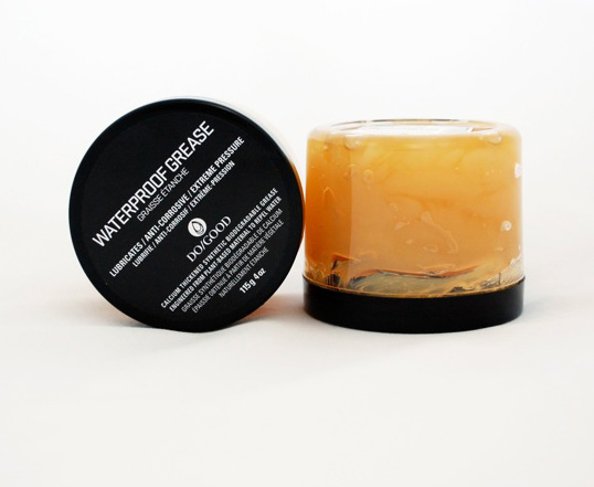
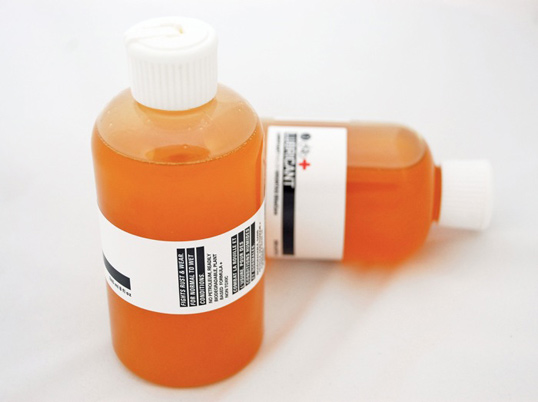
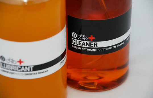
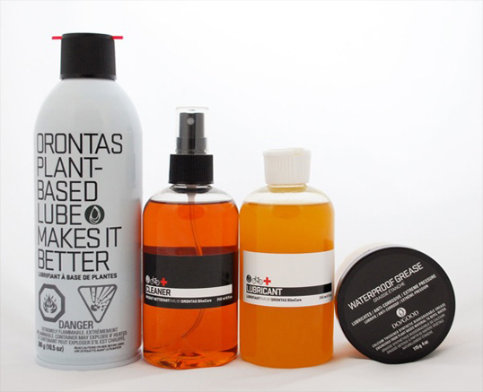
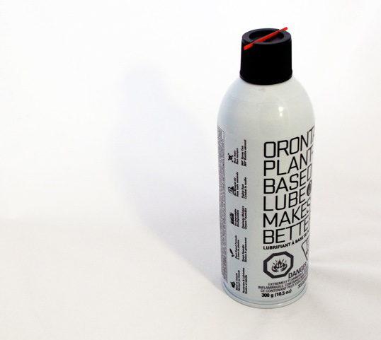
“Orontas is fundamentally about keeping things simple and being straight forward so we wanted the aesthetic of our 2011 Spring/Summer line to reflected that.

When we entered the cycling maintenance market last year with our Bike Care Lubricant in Canada we were overwhelmed by how cluttered it was with over sized product lines; some we’re toxic, some are wax, some are synthetic, some are “green”. It’s all confusing to the shopper who really just wants a product that will get the job done without making them feel guilty about using because of it’s negative environmental impact.

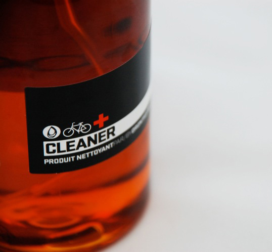
Our goal was to communicate transparency, even if it meant showing product imperfections, like sediment. That’s the reality of working with natural ingredients; it is what it is and the proof is in the pudding.

As a company we choose to do business responsibly and don’t think it’s something to be preachy about. It’s just something we do and it’s built into all of our products so although our environmental features are communicated on the package, we wanted the shopper to “feel” them, not be hit them over the head with them.

The response to the new packaging has been fantastic from customers and retailers who have connected with “what” Orontas is about immediately and note how “obvious” it feels and looks.”

Orontas

Orontas

Orontas

Orontas

Orontas

Orontas

Orontas

Get the latest packaging design inspiration in your inbox:

Popular designs

Far Out Bar

Description: Far Out Bar is a cutting-edge packaging design project created for High Life Farms’ macrodose THC chocolate bars. This project involved

Pure Persian Honey

When we look closely at honey packaging, they are almost all in the usual format, and the ultimate in creativity is that

Designed by: PepsiCo Design & Innovation
Country: United States

Orontas

orontas1

Orontas

Designed by Orontas | Country: Canada

“Orontas is fundamentally about keeping things simple and being straight forward so we wanted the aesthetic of our 2011 Spring/Summer line to reflected that.

When we entered the cycling maintenance market last year with our Bike Care Lubricant in Canada we were overwhelmed by how cluttered it was with over sized product lines; some we’re toxic, some are wax, some are synthetic, some are “green”. It’s all confusing to the shopper who really just wants a product that will get the job done without making them feel guilty about using because of it’s negative environmental impact.

Our goal was to communicate transparency, even if it meant showing product imperfections, like sediment. That’s the reality of working with natural ingredients; it is what it is and the proof is in the pudding.

As a company we choose to do business responsibly and don’t think it’s something to be preachy about. It’s just something we do and it’s built into all of our products so although our environmental features are communicated on the package, we wanted the shopper to “feel” them, not be hit them over the head with them.

The response to the new packaging has been fantastic from customers and retailers who have connected with “what” Orontas is about immediately and note how “obvious” it feels and looks.”
Orontas

Orontas

Orontas

Orontas

Orontas

Orontas

Orontas

Previous slide
Next slide

Explore more great package design

Get the latest on packaging design in your inbox: