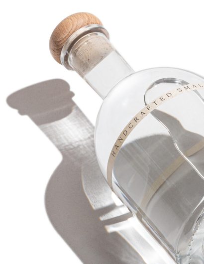
Designed by: Formascope Agency | Country: Armenia
OSKI Gin was born when high-quality natural botanicals were mixed. The handcrafted dry gin is a delight for anyone who wishes to taste authentic Armenian gin. From the flavor to the packaging design, the Armenian theme plays a crucial role.
OSKI approached Formascope Agency, a Yerevan-based design studio, to create packaging labels that would highlight the sophistication of Armenia.
“The company approached us to create a look and feel for a new Armenian gin brand, where Armenian thyme plays a crucial role as the main ingredient.
Since the gin is small batch and craft, we challenged ourselves to convey that idea with the help of a label.”
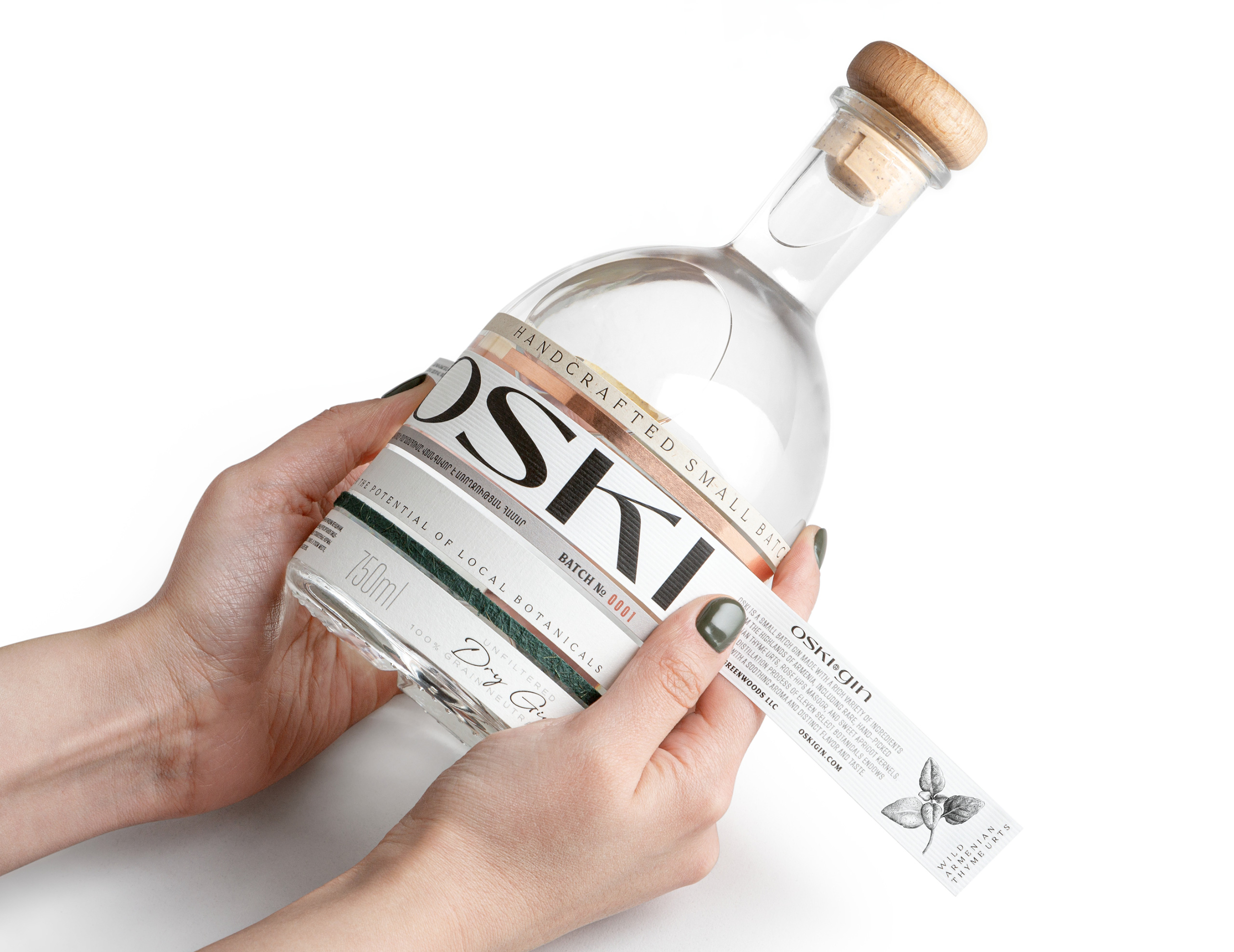
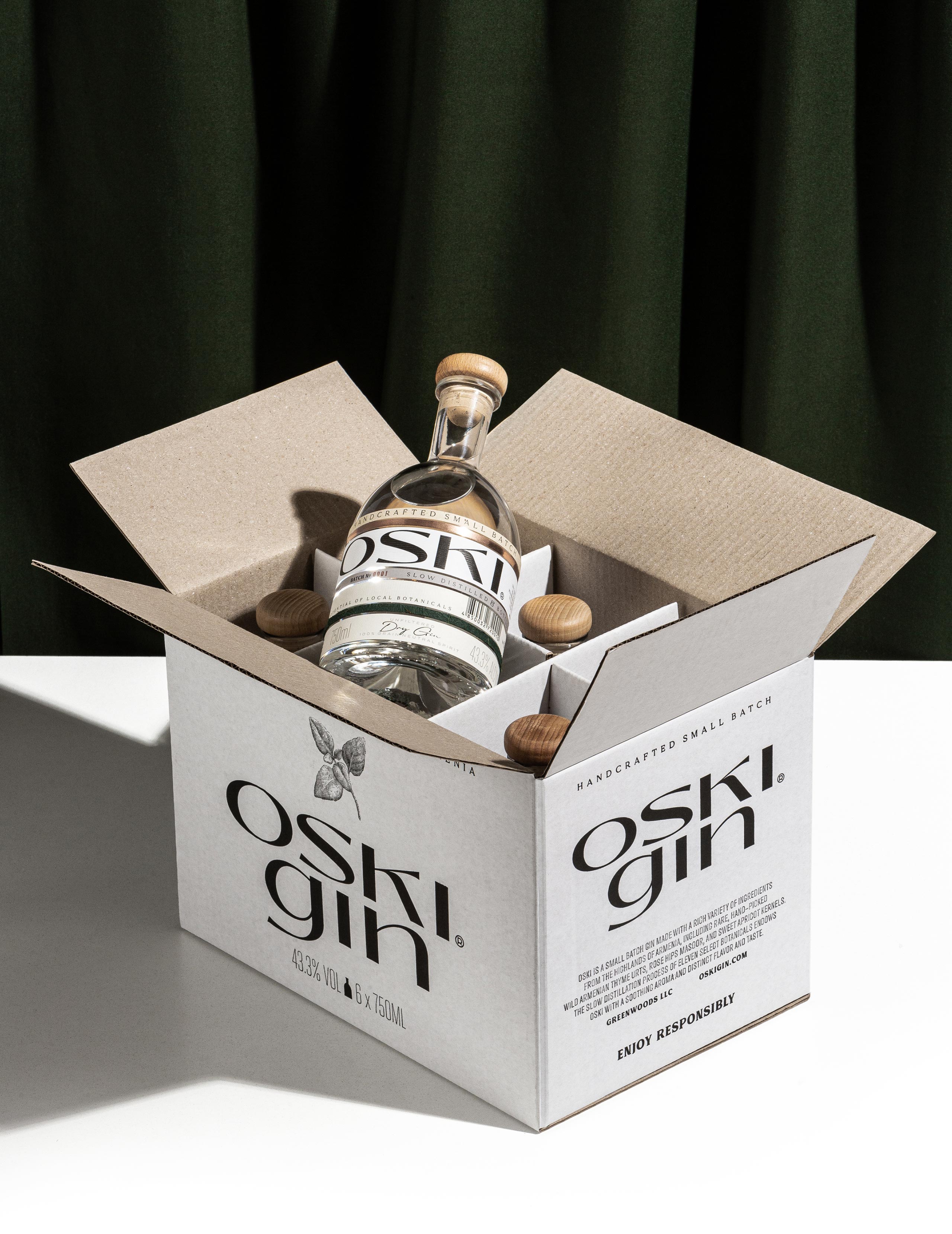

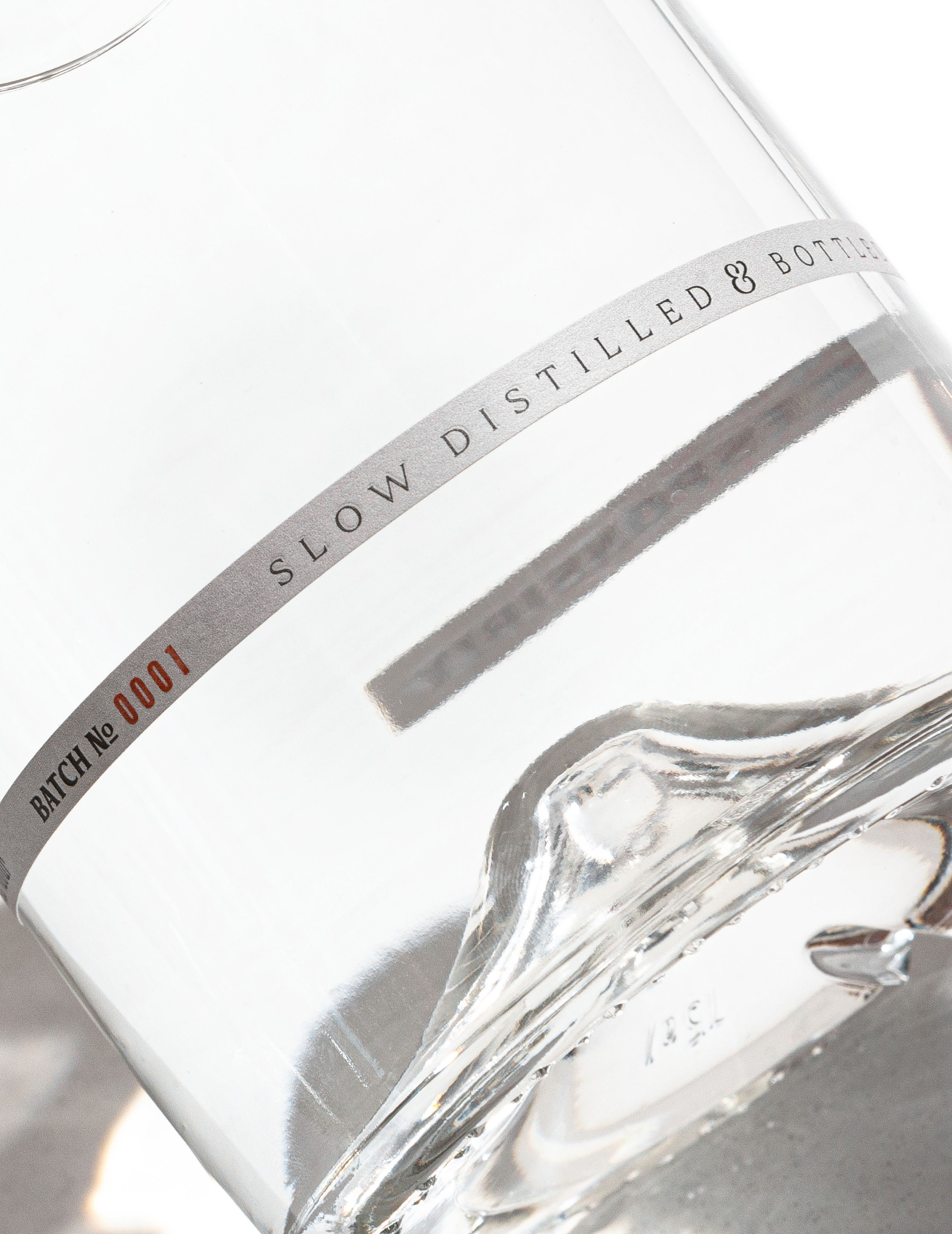
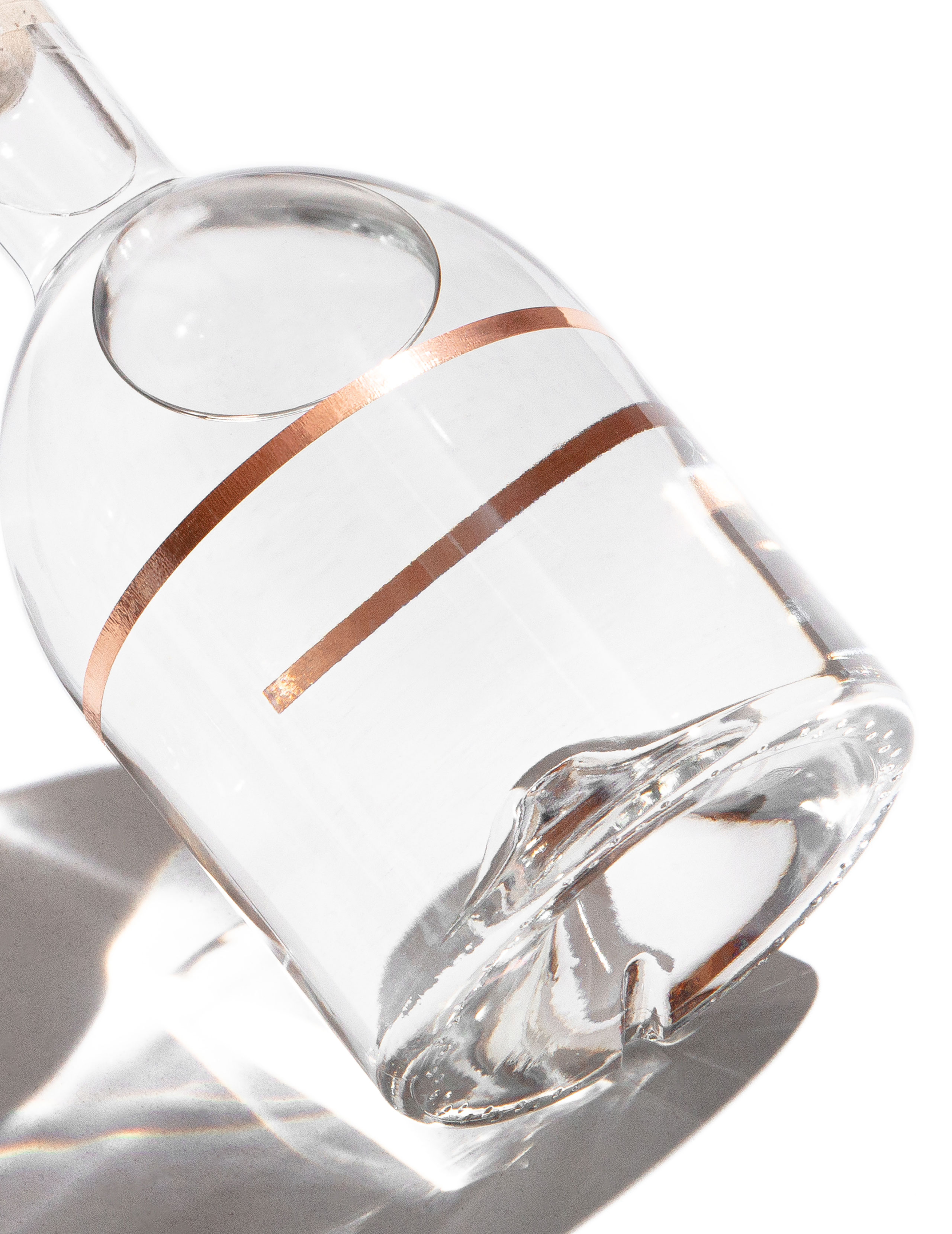
The packaging
The packaging design created by Formascope is truly unique. The packaging design depicts the seven stages of development of OSKI. For example, the copper layer of the packaging symbolizes copper alembic, which is used during the production process.” Similarly, the OSKI layer, the final of the seven, highlights the unification of all the layers.
“OSKI layer – This is the last step in gin making, where all the ingredients are brought together in a result of which a pure, clean product has been created. Horizontal lines symbolize the final and balanced recipe, and white color – the purity of the drink. That’s why our brand name is “OSKI” which means gold in Armenian – metal in its purest form.
All papers are individually glued by hand.”


