Designed by: PepsiCo Design & Innovation
Country: United States

Ovos Do Dia Packaging Design

1

Designed by: Studio Cadmus | Country: Portugal

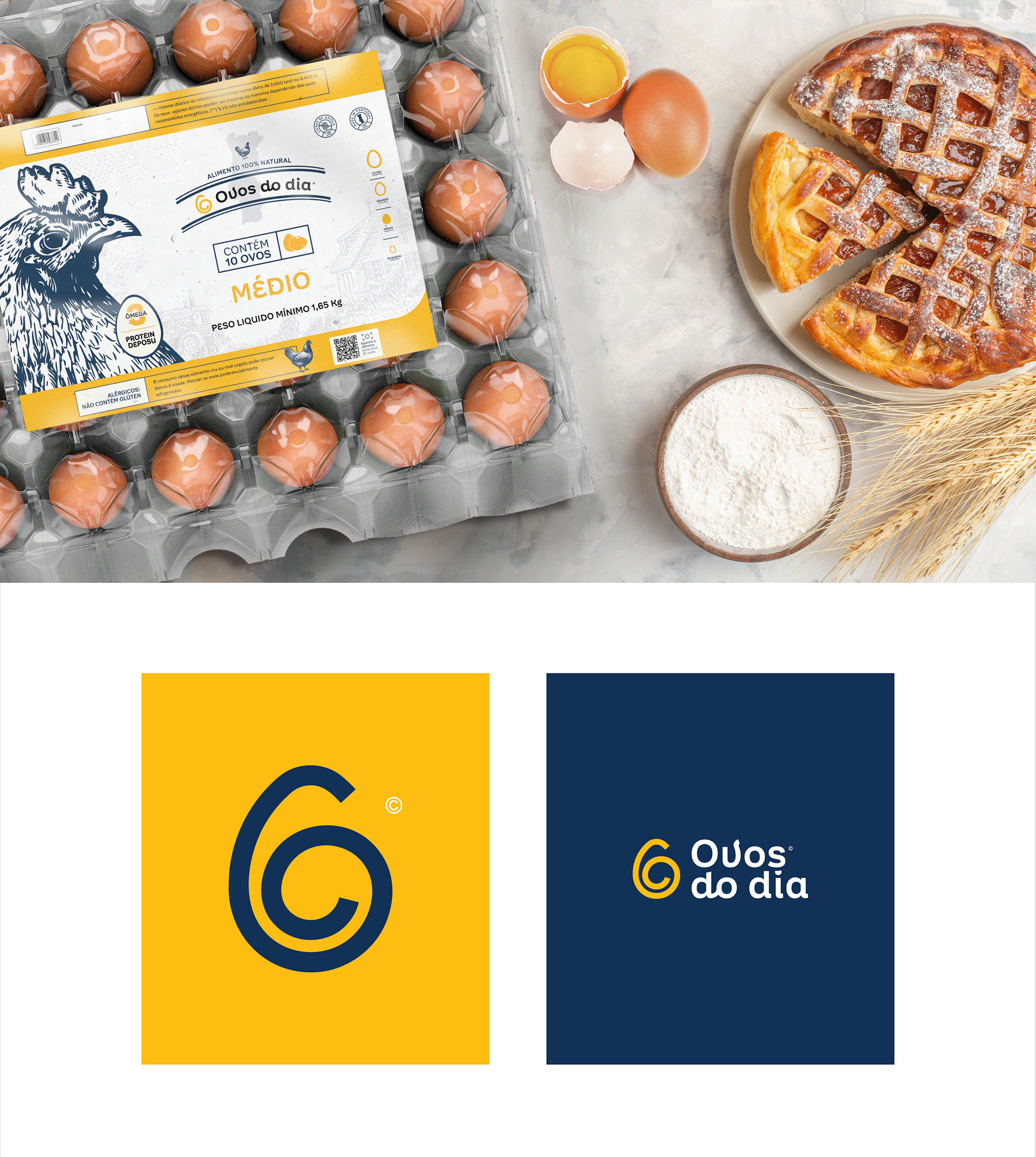
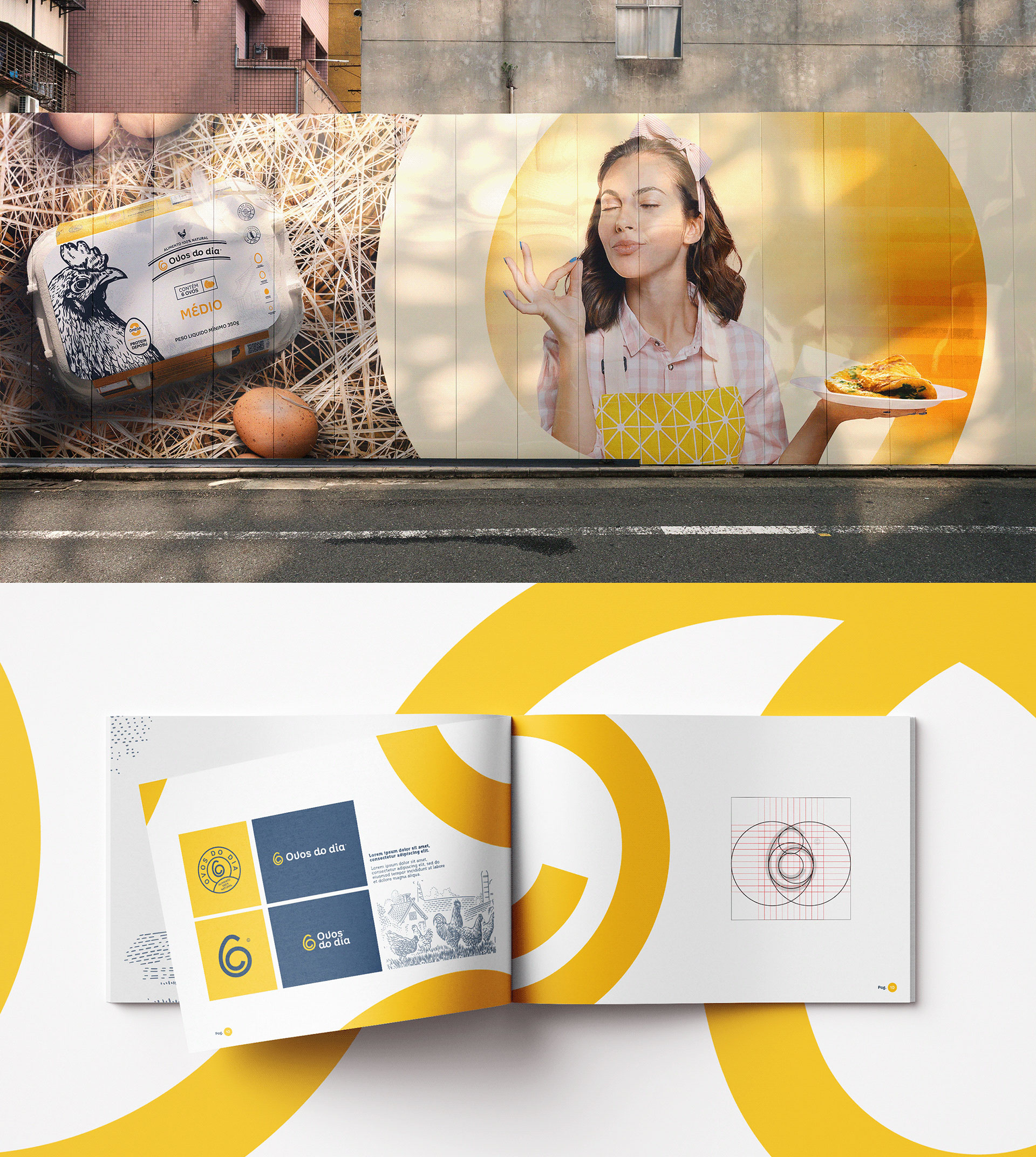
Studio Cadmus, an Acaraú-based design agency, was responsible for creating the corporate identity and packaging design for delivery boxes of different sizes. The name of the brand, Ovos do dia, was inspired by Loja do Dia—a Portuguese market involved with buying and selling tech products and services.

“When we start the day, we need to be well fed to face great challenges, so starting the day well-fed is of paramount importance, and knowing that, we have the egg, a food that, in addition to being versatile and easy to prepare, contains numerous benefits. ‘It helps in increasing muscle mass and, because it contains antioxidants, such as vitamins, selenium and zinc, it delays aging, improves the immune system and helps in the prevention of diseases.’”
Ovos Do Dia Packaging Design

The packaging

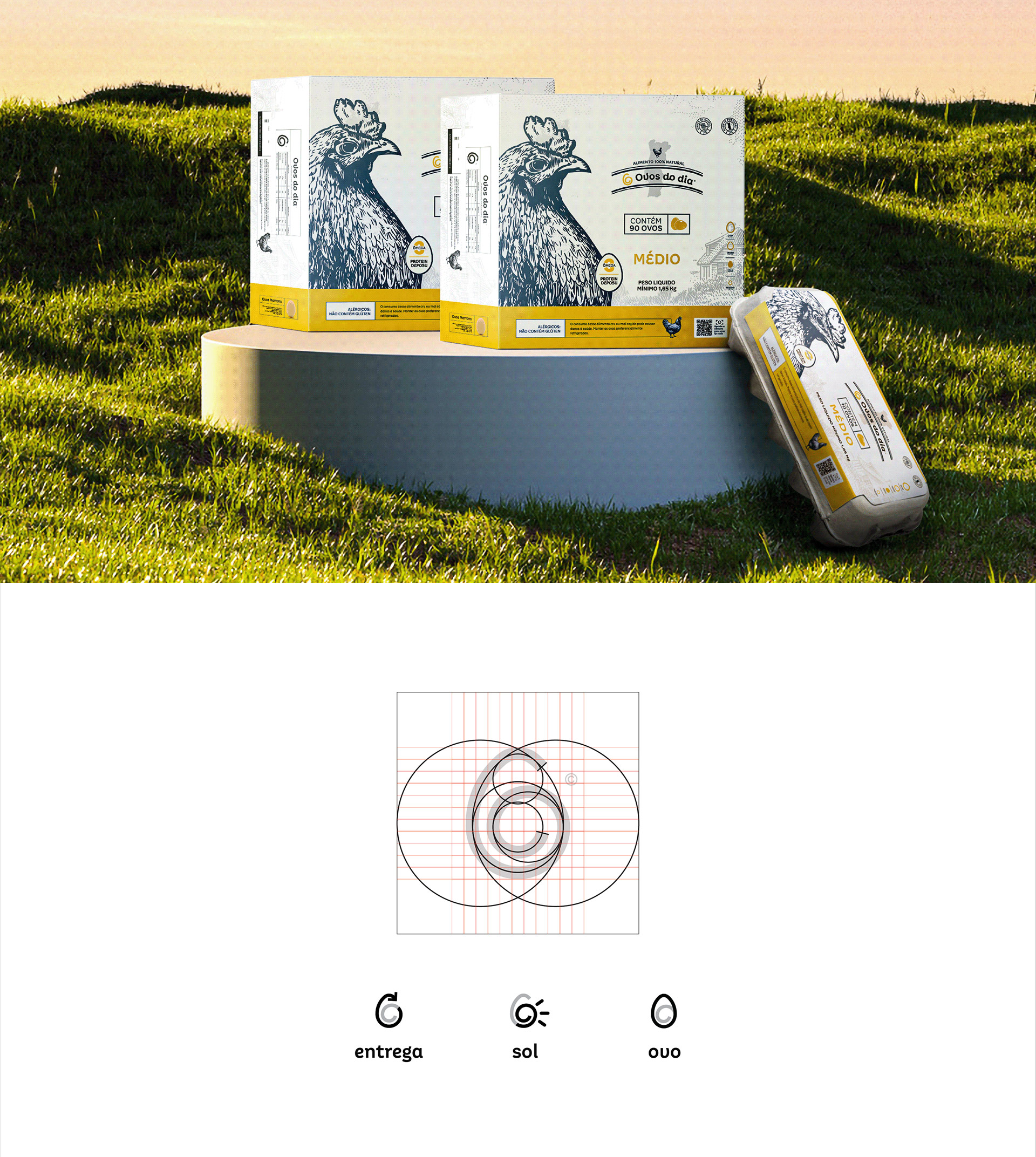
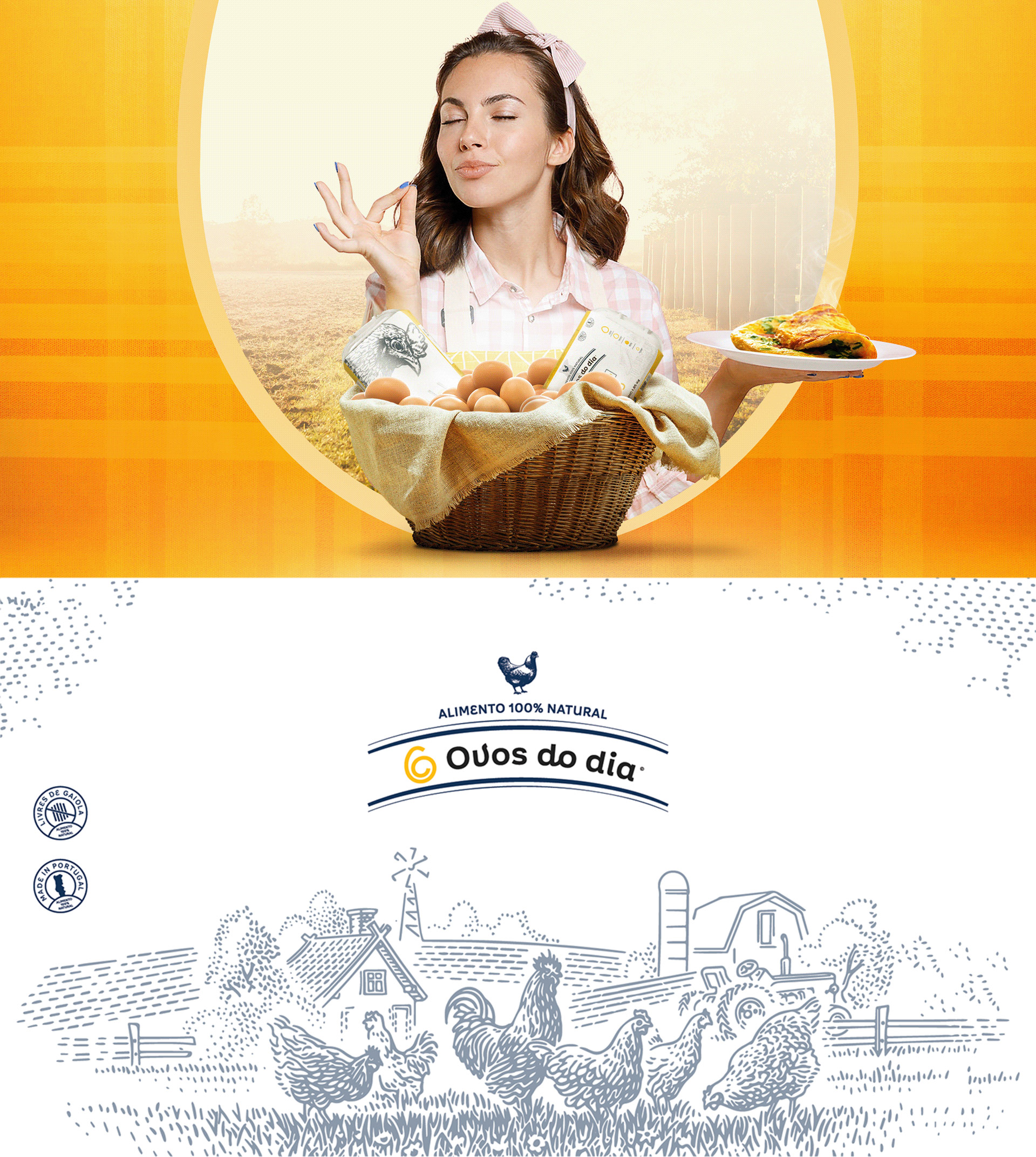
Studio Cadmus had a minimalist approach when creating the branding and packaging designs for the egg sellers. The packaging highlights the brand’s attributes by illustrating its primary product, eggs. In addition to placing a hand-drawn image of a hen on the label, the design agency beautifully worked on showcasing eggs in a spiral form, depicting movement.

The idea was to create a minimalist brand that well represents the brand’s attributes, with fluid strokes like the yolk and white (fluid), forming a spiral that represents the movement and shape of an egg, and a symbol that refers to the sun and movement, characteristics of the services provided by the brand.”   

1

Get the latest packaging design inspiration in your inbox:

Popular designs

Designed by: PepsiCo Design & Innovation
Country: United States

Ovos Do Dia Packaging Design

1
06

Designed by: Studio Cadmus | Country: Portugal

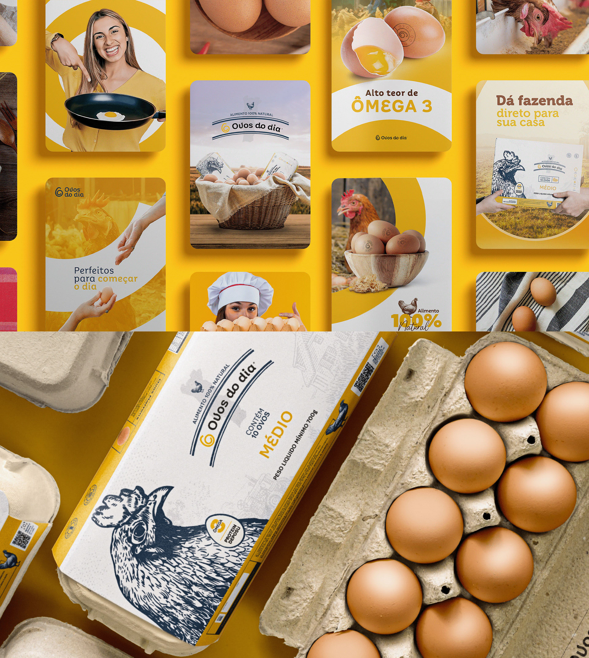
Studio Cadmus, an Acaraú-based design agency, was responsible for creating the corporate identity and packaging design for delivery boxes of different sizes. The name of the brand, Ovos do dia, was inspired by Loja do Dia—a Portuguese market involved with buying and selling tech products and services.

“When we start the day, we need to be well fed to face great challenges, so starting the day well-fed is of paramount importance, and knowing that, we have the egg, a food that, in addition to being versatile and easy to prepare, contains numerous benefits. ‘It helps in increasing muscle mass and, because it contains antioxidants, such as vitamins, selenium and zinc, it delays aging, improves the immune system and helps in the prevention of diseases.’”
Ovos Do Dia Packaging Design

The packaging

Studio Cadmus had a minimalist approach when creating the branding and packaging designs for the egg sellers. The packaging highlights the brand’s attributes by illustrating its primary product, eggs. In addition to placing a hand-drawn image of a hen on the label, the design agency beautifully worked on showcasing eggs in a spiral form, depicting movement.

The idea was to create a minimalist brand that well represents the brand’s attributes, with fluid strokes like the yolk and white (fluid), forming a spiral that represents the movement and shape of an egg, and a symbol that refers to the sun and movement, characteristics of the services provided by the brand.”   

https://vimeo.com/753207727

1

Explore more great package design

Get the latest on packaging design in your inbox: