Designed by: PepsiCo Design & Innovation
Country: United States

P2 Revitalise
P2 Revitalise

Designed by Asylum | Country: Singapore | Fonts used: Helvetica

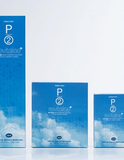
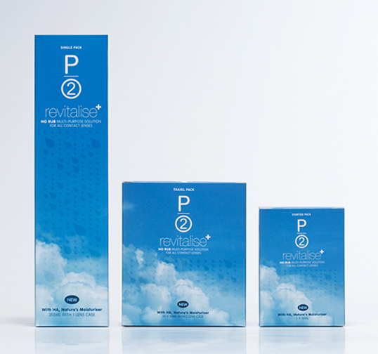
“How do you illustrate extra moisture and comfort in packaging a contact lenses solution? Give it beautiful clouds and UV varnish raindrops on it! The soft and elegant packaging allows it to stand out a mile away from others.”

Get the latest packaging design inspiration in your inbox:

Popular designs

The Port Vodka Lemon Water

Overview: In response to my client’s vision for a Cape Cod themed beverage brand, I embarked on the journey to create The Port

The Bra Guru

Most women are wearing the wrong size bra and that is a fact. The Bra Guru® is the first and only professional

Pure Persian Honey

When we look closely at honey packaging, they are almost all in the usual format, and the ultimate in creativity is that

Over the wave

This Kombucha originates in Lombok, Indonesia, where its paradise beaches attract hundreds of surfers eager to ride the waves. When you surf,

Designed by: PepsiCo Design & Innovation
Country: United States

P2 Revitalise

p2

P2 Revitalise

Designed by Asylum | Country: Singapore | Fonts used: Helvetica

“How do you illustrate extra moisture and comfort in packaging a contact lenses solution? Give it beautiful clouds and UV varnish raindrops on it! The soft and elegant packaging allows it to stand out a mile away from others.”

Previous slide
Next slide

Explore more great package design

Get the latest on packaging design in your inbox: